Taking the main understanding bit as the email on grey background, the contrast ratio is 1.9 : 1.
Taking the main understanding bit as the clock on grey background, the contrast ratio is 3.8 : 1.
The width of the lines is (roughly) 3px in the original page so qualifies as the thicker line, therefore passes.
The telephone is the aspect of the icon that needs to be understood. Both the foreground and background have gradients, so I took the least contrasting area to test - the top of the phone icon. Although the icon is thick (well over 3px) the contrast ratio is only 1.9 : 1.

(source)
The icons within the circles are reasonable thick (over 3px), and have a contrast of 3:1 exactly so they just pass.

(source for full size)
The information is available in large text with sufficient contrast, so it passes on the Incidental clause.
If the percentages in text were not available you would need to discern the blue and pink bars from each other, in which case it would fail with a ratio of 1:1.
(source for full size)
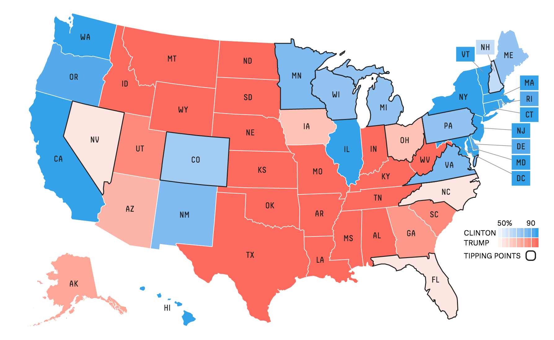
NB: For the purpose of this testing we will assume it is a non-interactive graphic, ignoring the mouse-over aspects.
In order to understand this graphic, you need to discern the states, either by the outlines or the text label over each state.
Therefore I checked the contrast of:
- The lightest blue against white (ME in the top right) - 1.9:1
- The lightest pink against white (AZ) - 1.7 : 1
- The darkest blue background with black text (NY) - 5.5 : 1
- The darkest red background with black text (NE) - 5.6 : 1
This is a tricky one, if you think the state labels are enough to understand the map, then they have good contrast. If you think you need to discern the state lines, then there is not enough contrast.
(source for full size)
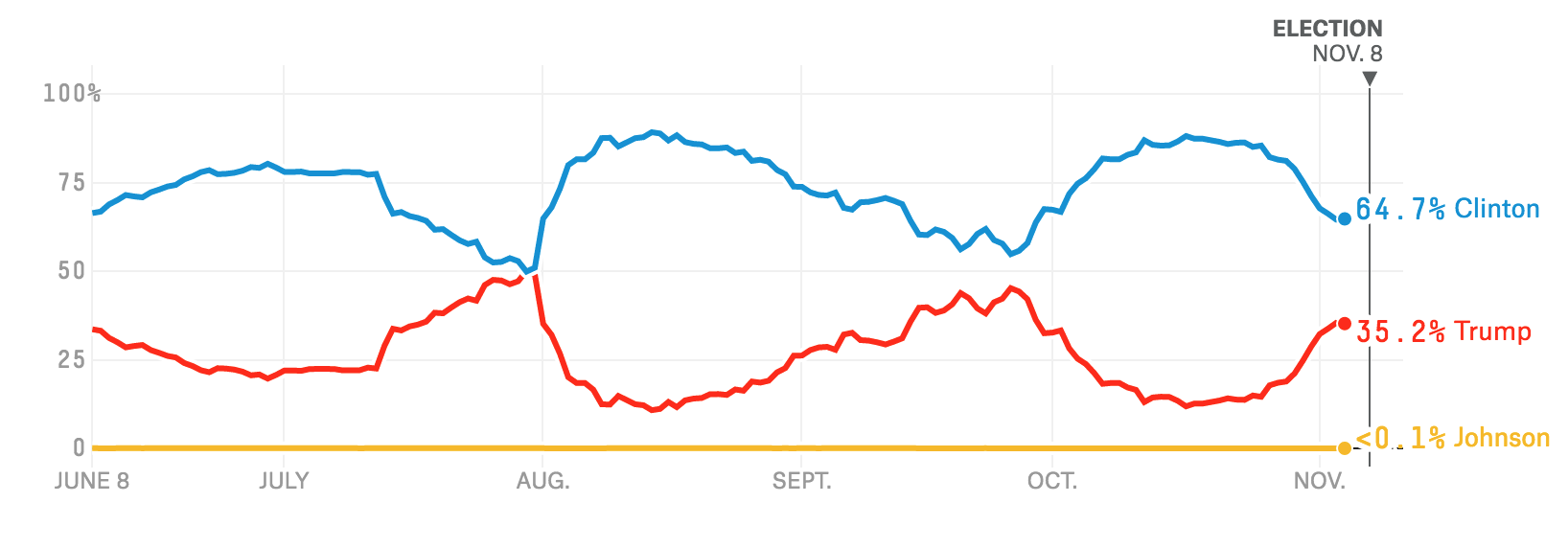
NB: For the purpose of this testing we will assume it is a non-interactive graphic, ignoring the mouse-over aspects.
In order to understand the graphic, you need to discern the labels on the right (otherwise it is using colour-alone), and the lines from the background.
- The blue on white is 3.5 : 1, and it is a thick line.
- The red on white is 3.8 : 1, and a thick line.
- The yellow on white is 1.8 : 1.
So assuming you think people need to discern the Johnson line (?), then the yellow line fails for this graphic.
(source for full size)
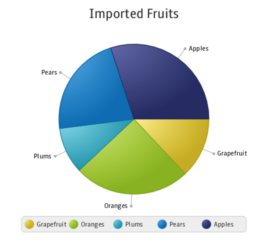
The labels indicate each pie slice (so not using colour alone). To understand the sizes you need to discern the edges of the slices.
The blue-to-blue and yellow-to-green colours to not have sufficient contrast, and there is no border between them to help with the contrast.
(source for full size)
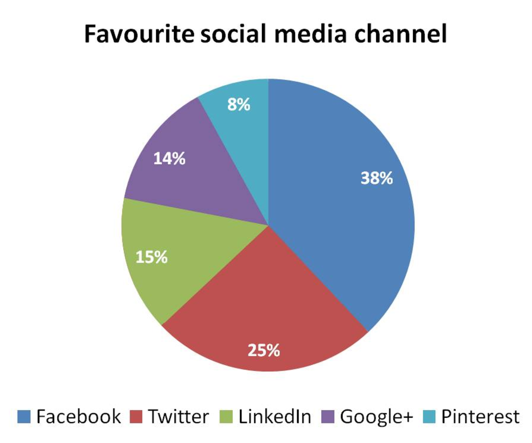
The white text on the coloured backgrounds provide the information of how large each slice is, so if they had sufficient contrast against the background slices then it would pass. Unfortunately the (quite small) text does not have sufficient contrast therefore it fails.
(source for full size)
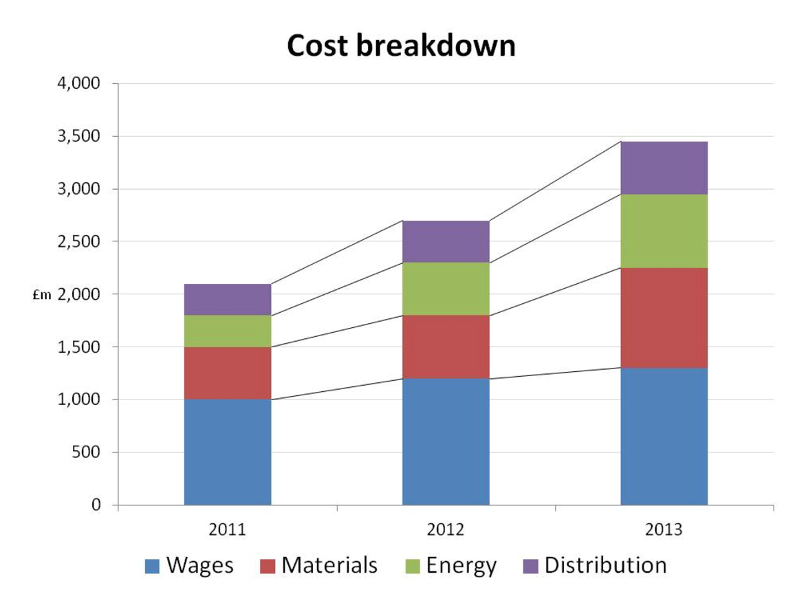
The chart relies on colour, so fails on the 'colour alone' checkpoint.
However, if it used patterns or labels, to understand the chart you would need to discern the sizes of the blocks. The reasonably high-contrast lines (5:1) do indicate the sizes, so it would pass the contrast requirement.
(source for full size)
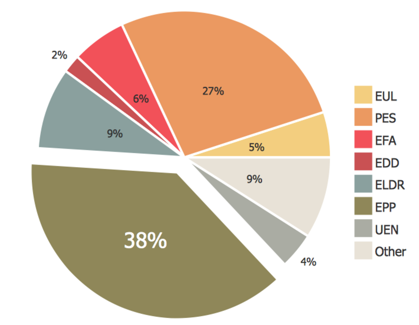
The chart relies on colour, so fails on the 'colour alone' checkpoint because you might not be able to associate the colours with the key at the side.
However, looking at the contrast aspect then to understand the chart you would need to discern the sizes of the pie. The white 'border' between each slice assists with the contrast, however, about half the slices do not have sufficient contrast with white. The labels are black though, so with a white background and a black foreground, you can discern the sizes of every slice in some fashion.
Question for people with low vision: where there are really big blocks (more than 10px squared), is a 2:1 contrast ratio ok? (e.g. the 27% orange in the pie chart.)
(source for full size)
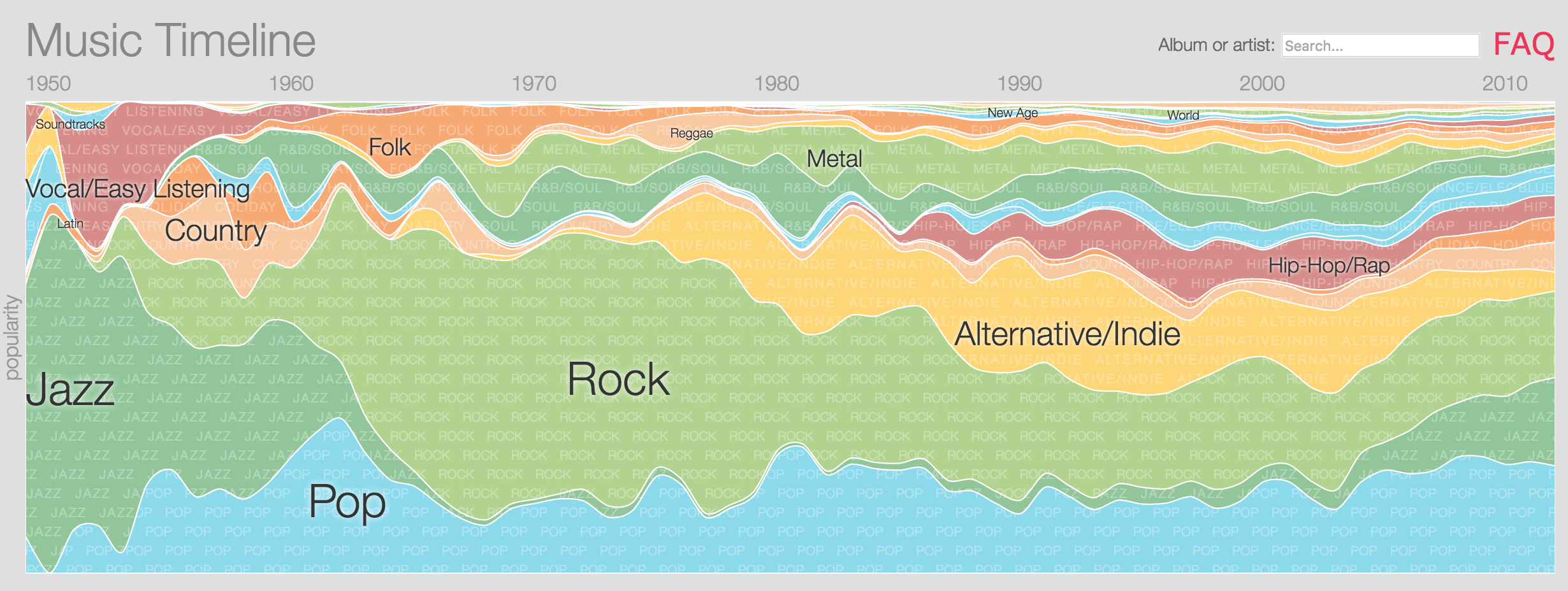
NB: The source graphic has interactions that assist with contrast, but for the purpose of this we will assume it is a static image.
The chart uses labels for each area and has a border between each area, but the contrast of the areas against white is still not sufficient.
(source for full size)
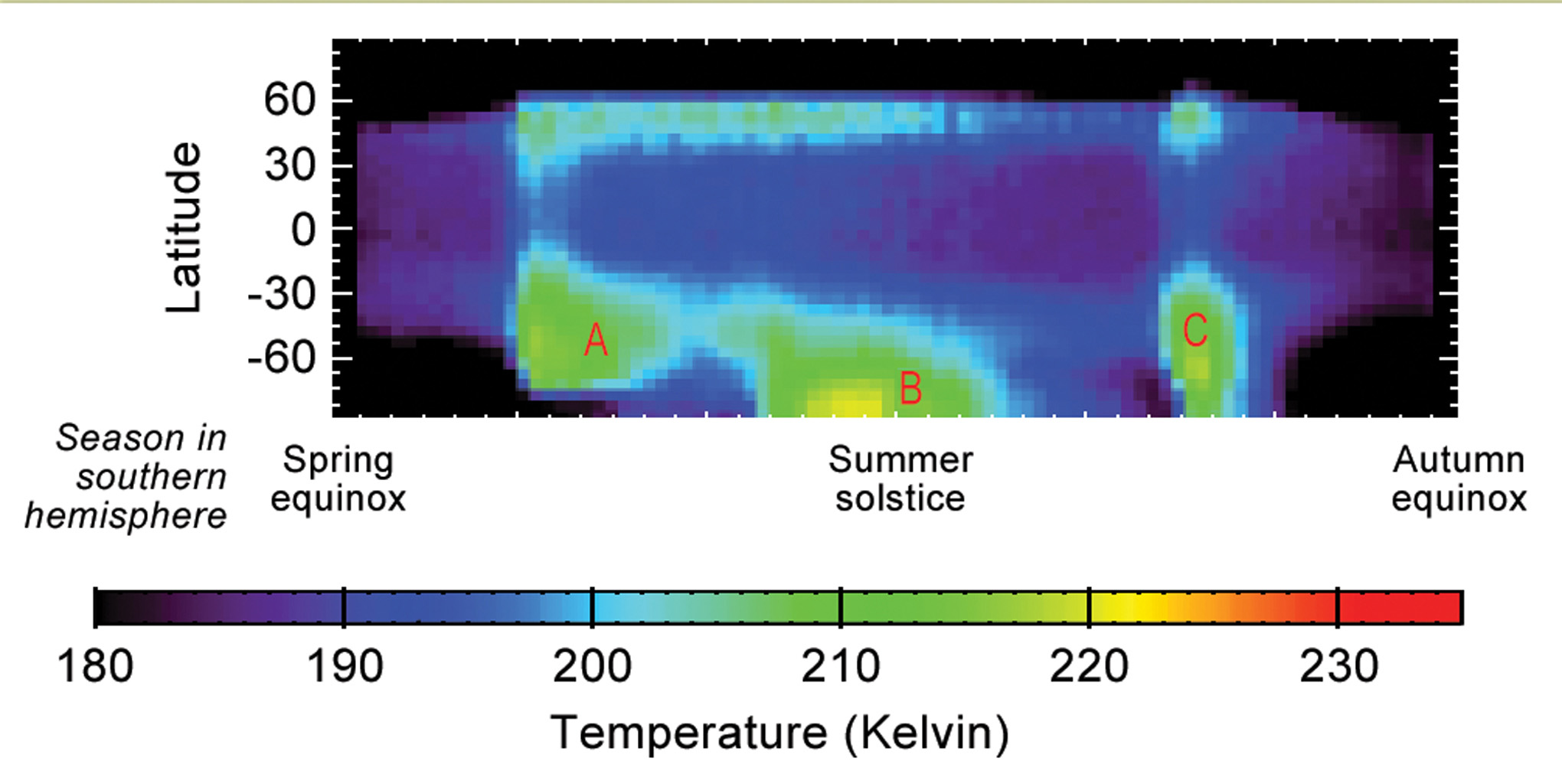
To understand this graphic you need to understand where along the X axis the strongest points of heat are. Therefore you need to discern the points A, B and C (explained in the source document) against the dark blue background. Although it is a rough gradient, I think the bright-green to dark blue is sufficient with a 3:1 ratio for quite a large area.