
A page to explain and work through how to do multi-colour contrast for graphics.
The aim of this proposed Success Criteria (SC) is to ensure people with low vision can understand graphics presented. There are two categories these fit into:
It is not trying to cover photographs or paintings. Whilst those might (arguably) convey information, it is meant in the sense of graphics created to convey information, rather than pictures (or paintings) captured.
The first case is fairly straightforward, but the second is more difficult. What it is trying to say for complex graphics is:
For each element of the graphic required for understanding, it is discernible.
This is a similar aim to WCAG2's 1.3.1 which basically says "for each element check that it is using the appropriate structure". The checking for understanding aspect is fundamental for this SC to work.
It is also worth noting that many complex graphics / diagrams already fail 1.4.1 Use of Color, it is quite hard to find examples which fail on contrast without already failing on colour-use.
Let's take a relatively good example, a line chart which doesn't rely on colour alone:
Lets take the same example, and remove everything not needed for understanding, and measure the contrast for each element:
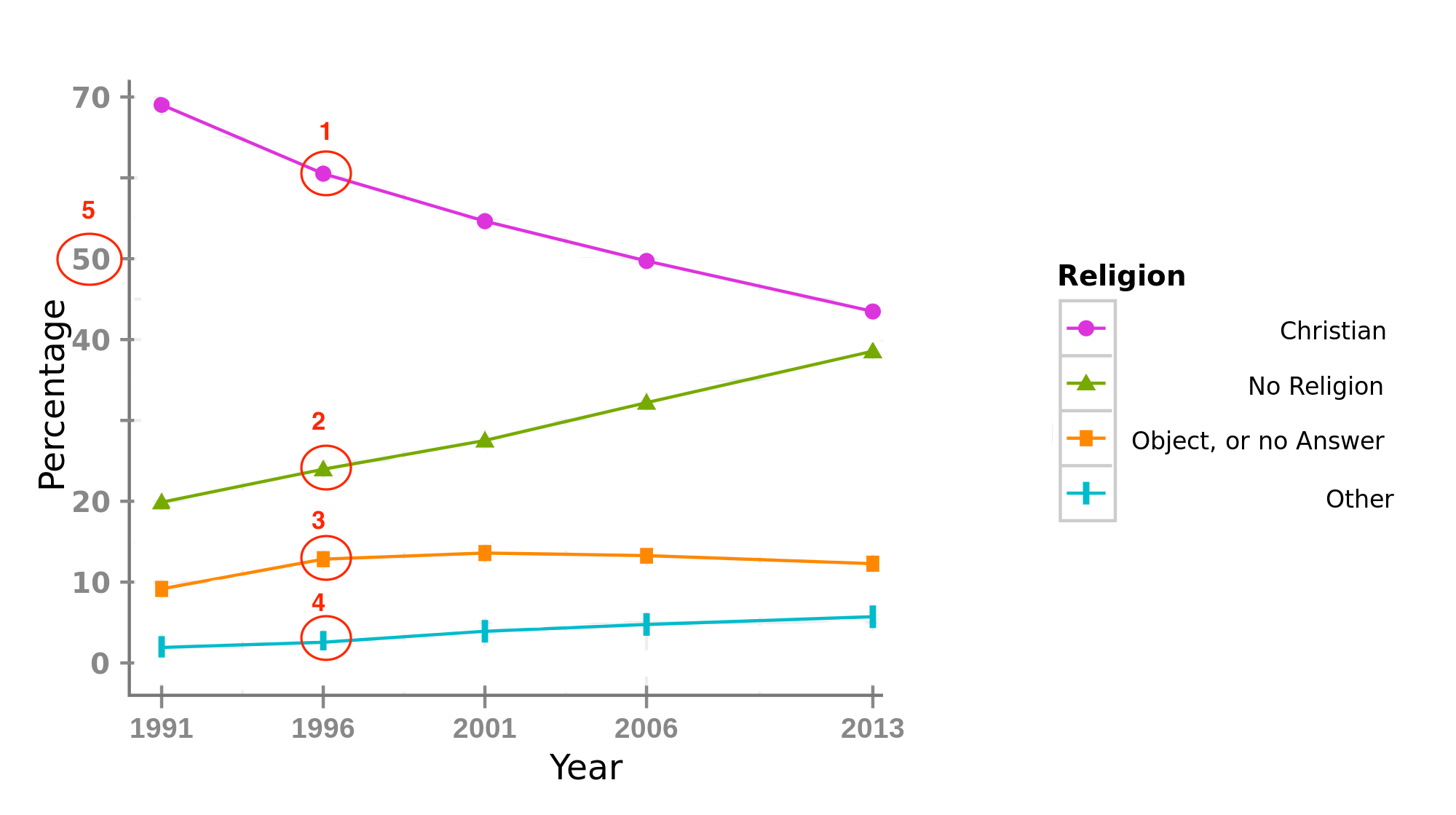
The lines and symbols at each point are thicker than 3px, but only one of the lines has sufficient contrast. This chart could pass by increasing the contrast of the lines to over 3:1, or including an alternative such as showing the values on the chart or elsewhere.
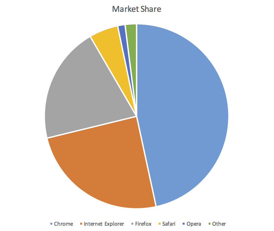
A pie chart with labels and values. (NB: the text is embed in the graphic which fails 1.4.5 Images of Text, but assume they were SVG or similar for the purpose of this example.)

As the chart has values included, the bits you need to discern to understand are:
As you do NOT need to discern the actual pie slices, this is a "Not applicable" under this SC, and would pass under 1.4.3. Adding labels and values is a really good way of passing / avoiding this SC, because you are conveying the meaning using a method that includes contrast.
There are many other examples examined previously that it is worth reviewing.
Going back to the aim: For each element of the graphic required for understanding, it is discernible.
Does the SC text meet that aim?
The visual presentation of graphical elements that are essential for understanding the content have a contrast ratio of at least 4.5:1 against their immediate surrounding background, except for the following:
- Thicker: where the minimum width and height of the element is at least 3px the graphic has a contrast ratio of at least 3:1;
- Captures: Photographs or paintings have no minimum contrast requirement;
- Logotypes: Graphics that are part of a logo or brand name have no minimum contrast requirement.
Graphical element is defined as: A type of non-text content that is intended to be discerned from its surroundings or other graphics. A graphical element could be a stand-alone single color icon, or one element of a more complex graphic such as a graph. It does not include captures of physical scenes such as photographs or paintings.
Essential is defined in WCAG as: if removed, would fundamentally change the information or functionality of the content, and information and functionality cannot be achieved in another way that would conform
.
The key terms then are "graphical element" & "important information", does that work?
A few examples to show where each aspect passes/fails the contrast related checkpoints. NB: For the purpose of these examples I'm ignoring text-in-images, to pass 1.4.5 Images of Text you'd need to implement the labels and values as positioned text, or have an alternative.
The 'understanding' we are looking for is the proportions of market share for each browser. Therefore you need to understand which slice is which browser, and either the value (percentage) or the size of the slice compared to others.
| Image of pie chart | Notes |
|---|---|
 |
Example 3This example fails on:
|
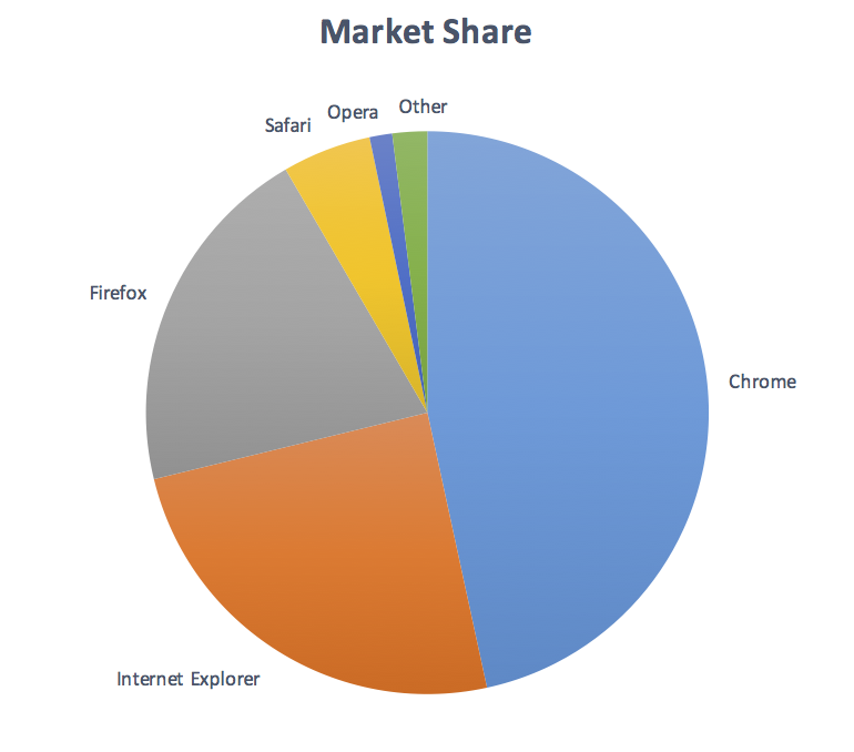 |
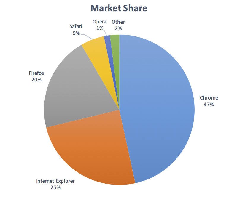
Example 4Passes colour-alone, as each slice is labeled, but without values next to each label you need to discern the edges of the pie slices in order to understand the proportions. It fails:
|
 |
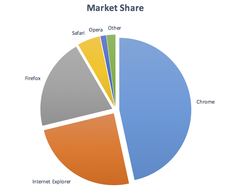
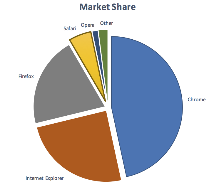
Example 5 - PassPasses as each slice is labeled with a value, so discerning the pie slices is not required. (It would just need to pass 1.4.5 by implementing the text as text, or have an alternative.) |
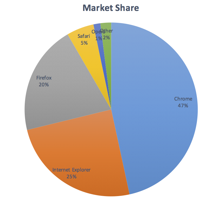 |
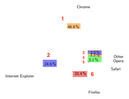
Example 6The labels and values are within the slices, so either the slices or the text needs to be discernible. It fails:
It would need to pass one or both in order to pass overall. It could take the same approach as example 5, or you could put each label on a light background to provide the contrast. |
 |
Example 7The labels do not include the value, so the slices need to be discerned against their surrounding colour/border. It fails:
|
 |
Example 8 - PassThe labels do not include the value, so the slices need to be discerned against their surrounding colours. It passes because each slice has sufficient contrast against it's surroundings. As the surroundings are white that is the basis for checking contrast, but note that the white background/border between safari/opera/other is not 'thick' (over 3px wide), so those slices need to pass at 4.5:1 against white, or 3:1 against each other. |