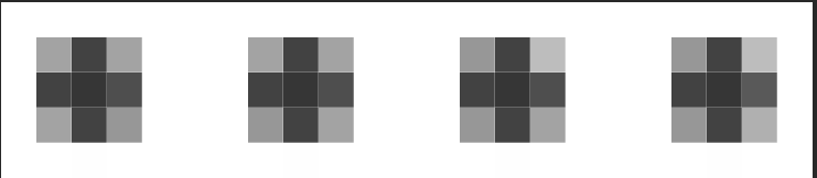
A few examples of focus styles, building from version 2 intended to test the edges of the success criteria, and the 2px minimum requirement.
2.4.11 Focus Visible Enhanced (Level AA)
When a User Interface Component receives keyboard focus, all of the following are true:
- Minimum area: The focus indication area is greater than or equal to the longest side of the focused control times 2 CSS pixel.
- Focus contrast: Color changes used to indicate focus have at least a 3:1 contrast ratio with the colors changed from the unfocused control.
- Contrast or thickness: The focus indication area has a 3:1 contrast ratio against all adjacent colors for the minimum area or greater, or has a thickness of at least 2 CSS Pixels.
Note 1: A focus indicator that is larger than the minimum area may have parts that do not meet the 3:1 contrast ratio, as long as an area equal to the minimum does meet the contrast ratio.
Note 2: For a non-rectangular shape assume the smallest possible rectangle is drawn around the shape and use the longest side of that rectangle.
No visible border, adding a dark outline on focus.
Overall: Pass
Dark border, adding a dark outline on focus, which basically doubles the thickness:
Overall: Fail
Dark border, adding a 2px dark outline on focus:
Overall: Pass
Dark background, adding a 1px dark outline on focus:
Overall: Fail
Dark border, adding a 2px dark outline on focus:
Overall: Pass
Dark border, adding a 2px dark outline on focus:
Overall: Pass
Dark background, adding a 1px dark outline on focus, bottom only:
Overall: Fail
Dark background, adding a 2px dark outline on focus, bottom only:
Overall: Pass
No background, adding a 1px dark outline on focus, bottom only:
Overall: Fail
No background, adding a 1px dark dotted outline on focus:
Zoomed in view of 'dotted' in Firefox:
Note: The dotted outline appears to be roughly 25% coverage, i.e. 25% dark, 25% light grey (<3:1), 50% white pixels. That means the dotted focus indicator cannot provide sufficient size with the longest-edge times 2px measure.
Overall: Fail?
No background, adding a 2px dark dotted outline on focus:
Zoomed in view of 2px 'dotted' in Firefox: 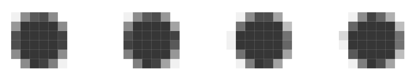
Note: The dotted outline appears to be roughly 45% coverage, i.e. 45% dark, 5% light grey (<3:1), 55% white pixels. That means the 2px dotted focus indicator can provide sufficient size. I.e. 2px on the two longest sides, plus the indicator from the shorter side.
Overall: Pass
No background, adding a 2px dark dashed outline on focus:
Zoomed in view of 'dashed' in Firefox: 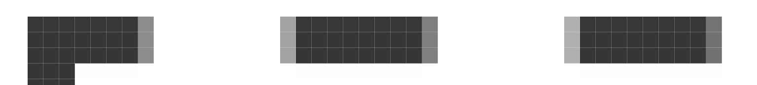
Note: The dashed outline appears to be roughly 50% coverage, therefore the dotted focus indicator can provide sufficient size.
Overall: Pass
No background, adding a 2px dark border on focus, bottom only:
Overall: Pass
Dark inner background with inner outline:
Overall: Pass
Dark inner background with inner outline:
Overall: Pass
Dark inner background with inner icon:
Overall: Pass
3 cards wrapped in a link so entire box is the component:

Some text, just a line to make up some description.
Link to another page
Some text, just a line to make up some description.
Link to another page
Some text, just a line to make up some description.
Link to another page
Overall:
3 cards in a list with a link at the bottom of each card:
Some text, just a line to make up some description.
Link to another page
Some text, just a line to make up some description.
Link to another page
Some text, just a line to make up some description.
Link to another pageOverall:
Standard button with extended gradient:
Overall: Pass
Created for the technique added for the new SC:
Overall:
Having an inner visible button with expanded hit area, the grey dotted outline is just to show where the button's hit area is for the purpose of this example:
Overall:
Having an inner visible button with expanded hit area, the grey dotted outline is just to show where the button's hit area is for the purpose of this example:
Overall: