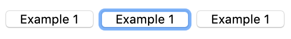
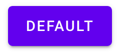
In your browser you can tab through these buttons & links to see the default user-agent focus styles:
Testing & screenshots done primarily in Firefox Mac unless otherwise noted.
Click on an image for a large clear version of that thumbnail, the context one is most useful for comparison.
| Example |
Default |
Focus |
In-context |
Pass/Fail & Notes |
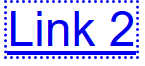
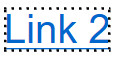
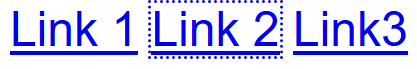
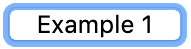
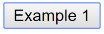
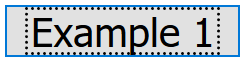
| 1. Plain text link |
 |

Firefox Windows:
Chrome Mac:

Chrome Windows:

Edge Windows:
 |

Firefox Windows:
Chrome Mac:

Chrome Windows:

Edge Windows:
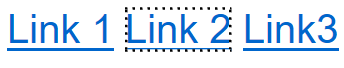 |
Windows browsers pass, Mac Chrome (& Safari) fail.
The dotted lines are generally higher contrast (9:1 or greater), the solid (but light) blue lines fail on Mac, just meet 3:1 on Windows Chrome.
|
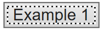
| 2. Plain button |
 |
Chrome Windows:
Firefox Windows:
Edge Windows:
 |
Chrome Windows:

Firefox Windows:

Edge Windows:
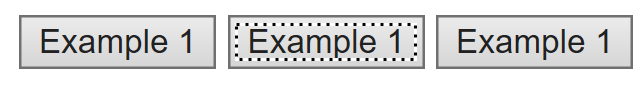 |
Mac Firefox (light blue, thick border) is 2.2:1, fail.
Windows based blue border meets 3:1; Firefox's black dotted inner border passes, as does . |
| 3. Thick solid outline (Nomensa) |
 |
 |
 |
Pass. |
| 4. Round inner outline (Nomensa) |
 |
 |
 |
Pass. Good contrast (9:1), and I'm assuming that a complete circle meets the size requirement. |
| 5. Large box, text-outline (Nomensa) |
 |
 |
 |
Pass. Interesting case, good contrast but the entire box is the link, so is the white text-outline big enough? In this case it is, but if there were only one word, probably not? |
| 6. Large box, thin outline (Nomensa) |
 |
 |
|
Fail. 1px outline on white has enough contrast, but it doesn't contrast (enough) with the content of the box, and isn't separated. |
| 7. Custom text link (Nomensa) |
 |
 |
*** |
Pass. |
| 8. Text-link custom outline / underline (Nomensa) |
 |
 |
 |
Fail, dark blue on red outline doesn't have sufficient contrast. |
| 9. Input with outer outline (Gov.uk) |
 |
 |
*** |
Pass. The yellow outline is replacing blue, and although it doesn't contrast with the white inner background, it is 2px thick. |
| 10. Dark background inversion (Gov.uk) |
 |
 |
 |
Pass. Yellow/black has excellent contrast, and large area. |
| 11. Text-link custom outline / underline (Gov.uk) |
 |
 |
 |
Pass. Although the yellow doesn't contrast, the bottom border is doubled in thickness. Interesting that if you consider the default border part of the element, the new border doesn't contrast with it. However, the original border disappears and/or the new border is moved down? |
| 12. Large-link background plus bottom border (Gov.uk) |
 |
 |
 |
Pass, with border added. |
| 13. Material design buttons 1 (material-components) |
 |
 |
 |
Fail, indicator is large but 1.3:1. |
| 14. Material design buttons 2 (material-components) |
 |
 |
 |
Fail. Difference in color change is 1.4:1. |
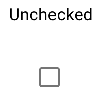
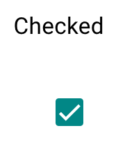
| 15. Material design checkboxes 1 (material-components) |
 |
 |
 *** *** |
Fail. Difference in color change is 1.4:1. |
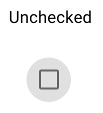
| 16. Material design checkboxes 2 (material-components) |
 |
 |
 *** *** |
Fail. Difference in color change is 1.4:1. |
| 17. Material design cards (material-components) |
 |
 |
 *** *** |
Fail. Difference in color change is 1.4:1. |
| 18. Material design radios (material-components) |
 |
 |
 *** *** |
Fail. Difference in color change 1.2:1. |
| 19. Material design lists (material-components) |
 |
 |
 |
Fail. Difference in color change 1.4:1. |
| 20. Material design sliders (material-components) |
 |
 |
 |
Fail. Difference in color change 1.2:1. |
| 21. Material design tabs (material-components) |
 |
 |
 |
Fail. Difference in color change 1.4:1. |
| 22. Bootstrap buttons 1 (Bootstrap-components) |
 |
 |
 |
Fail. In this case it is 1.8:1 with the background it is replacing, but other buttons in bootstrap vary depending on the color of the button. Each outline is a faded version of the button color, so very likely not to have ccontrast. |
| 23. Bootstrap buttons 2 (Bootstrap-components) |
 |
 |
 |
Fail. (Same as 22, but with regular vision it looks different with the lack of internal button color.) |
| 24. Bootstrap carousel next button (Bootstrap-components) |
 |
 |
 *** *** |
Fail, very subtle change of color, 1.9:1. |
| 25. Bootstrap accordion (Bootstrap-components) |
 |
 |
 |
Fail, the change is the text-underline, but it is much smaller than a 1px line on the longest edge. |
| 26. Bootstrap dropdowns (Bootstrap-components) |
 |
 |
 |
Unsure about whether the list item counts as focus withint the widget? If so, the default indicator in FF passes. |
| 27. Bootstrap split-dropdowns (Bootstrap-components) |
 |
 |
 |
Fail, 1.8:1. |
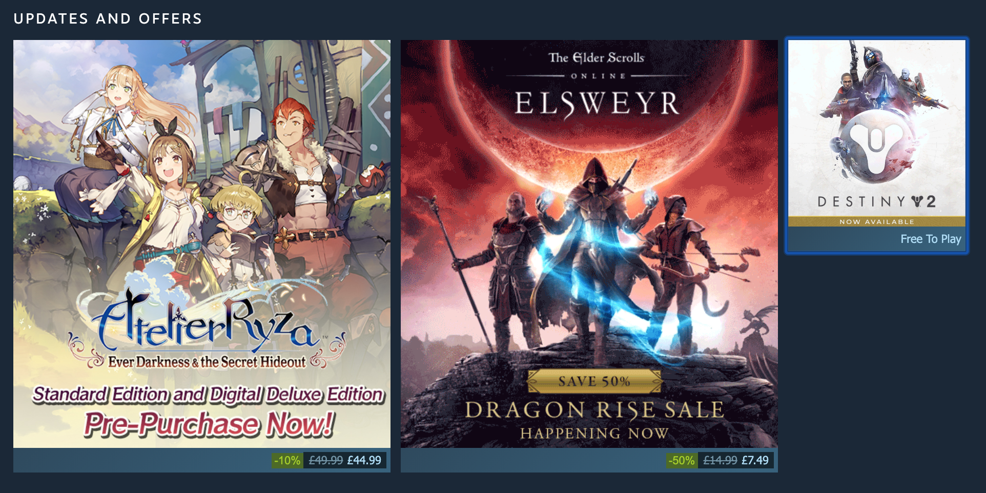
| 28. Steam homepage cards 1, default indicator |
|
|
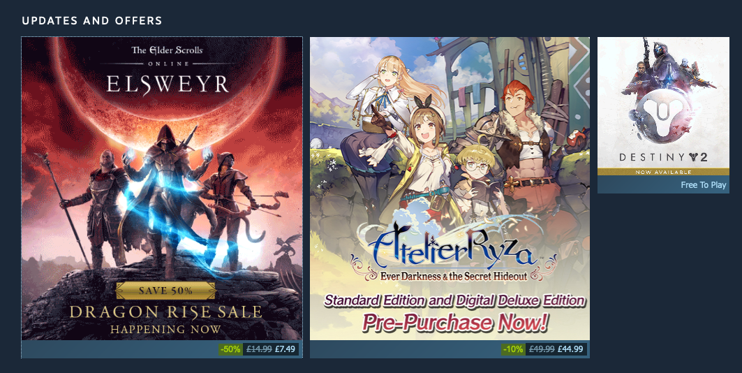
Chrome Mac:
 |
Pass on Firefox (8:1 dotted line), fail on Chrome (2:1 solid).
Note that Firefox uses 'currentColor' by default, which in this case appears to be white. Because the image is (mostly) dark it also contrasts with the inner content. |
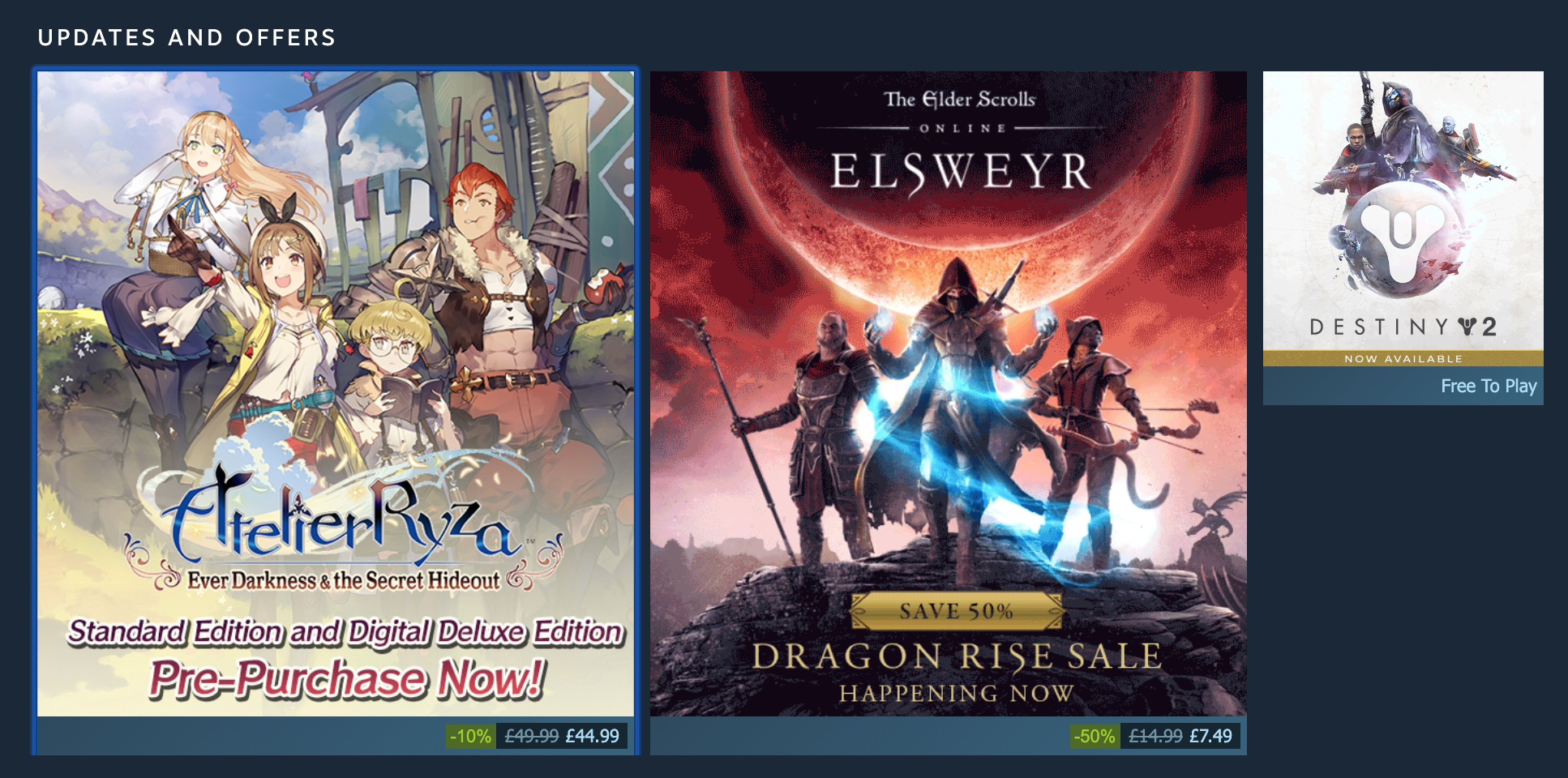
| 29. Steam homepage cards 2, default indicator |
|
|
Chrome Mac:
 |
Fail on Firefox (8:1 dotted line)? Fail on Chrome (2:1 solid).
Compared to 28, only the bottom part of the box contrasts with the white dotted outline, and as the dots are 50% 'visible', I don't think the line around the bottom 1/4 of the box meets the size requirement. If the line were solid it would meet the size requirement. However, should the non-dotted parts of the outline around the image count? Interesting. |