How to hold your iPad
CSS Pixel sizes reveal the distance manufacturers think you should hold a device
I've been thinking about writing a post about this for a while, but I didn't have the right visualisation. Unfortunately my design skills weren't up to the task, but I just came across a great article from iA that demonstrates what I was thinking:
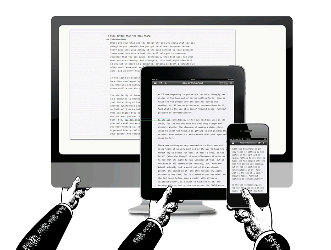
The article talks about typography being dependant on viewing distance, and at closer (typical) viewing distance the smaller text on the iPhone actually matches a desktop.
This is the same point I was making about CSS pixels: The unit manufacturers use to define how their browser renders website sizes. For example, the iPad mini has a CSS pixel width of 768px (in portait), the same as the larger iPad with retina display, even though they are different sizes and different pixel densities.
What I would like to add is some Maths. (Or 'Math' if you're from the US):
As the size of a CSS pixel is based on an angle, we can work out how far away the device should be held.
Working out the intended viewing distance was relatively straightforward, once I revised a little school level trig:
| Device | CSS PPI | Intended viewing distance (m) |
|---|---|---|
| iPhone | 163 | 0.41 |
| iPad mini | 163 | 0.41 |
| Nexus 7 | 162 | 0.41 |
| Galaxy Nexus | 147.7 | 0.45 |
| iPad | 132 | 0.51 |
| Macbook Pro 15" | 110 | 0.61 |
| iMac 27" | 109 | 0.62 |
| Trad Desktop (96 DPI) | 96 | 0.71 |
| 32" TV with Xbox IE | 32.4 | 3.5 |
Putting that into a graph shows a smooth line, as you would expect from maths based on an angle:
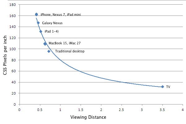
So to answer the question in the title, you should hold the iPad mini 41cm away from your eye, and the large iPad 51cm.
Does that seem right to you?
- ← Previous
Screen resolution by ratio - Next →
Peak Appification