ARIA tabs, UI problems and standards
You’ve probably already read the somewhat controversial article Danger! ARIA tabs, and the response Danger! Testing Accessibility with real people. If you haven't, that's required reading before this article as I'm not going to re-tread the same information.
I'd like to pick up some specific points from both articles, analyse the interactions and suggest a way forward.
Results vs Conclusions
In the testing Simple Accessible ran, they observed people having issues with ARIA-tabs. In any testing, but especially testing with access technologies, it really helps to know all the details. In this case it does match up with observations from testing I observed a couple of years ago so I will take their results at face value.
I wouldn't necessary say that people using link-list features in screenreaders means that tabs don't work, but there were definitely problems with what people expected the behaviour to be, which then led to task failure.
However, even if we accept that people are currently having issues with ARIA tabs (which I do), it doesn't necessarily mean the solution is to downgrade to non-ARIA tabs.
The whole point of having a standard like ARIA (and WCAG 2.0) is to provide cross-site consistency and reduce the number of different interactions to a manageable set. Consistency ultimately trumps inherent usability. For example, going back to the start of the web, blue is actually a terrible colour for links, but it was the default. So (in the early days) it is what people expected, therefore it worked best.
For any accessibility issue there are three general routes to solutions:
- Access technology updates
- User education
- Interface changes in the websites
I'll come back to solutions later, but people do tend to forget not everything is fixed in the website.
The peculiar case of tabs
For most of the ARIA widgets there have not been accessible versions commonly used on the web. When you look at sliders, tree views, grids, etc. none of these have historical expectations of how they work in an accessible way. In cases where there is no history of that interaction on the web, there are no built-in expectations of how they work, and it is fair to reference how applications work. (Which is what ARIA aims to do.)
Tabs on the other hand have been very common on websites, and even if they were not accessible, they looked the same as they do now.
To exacerbate this factor, tabs tend to be used on 'normal' websites. If you are using a more 'appy' website like gmail, you are using form controls a lot and expect to drop into forms mode (on Windows screenreaders) all the time.
When you are on a website that doesn't use much ARIA, tabbing through a page and suddenly dropping into forms mode could be disconcerting.
Visual keyboard use
If you are looking at websites and using the keyboard, over 90% (wild finger in the air guestimate) of things that look like tabs, are actually lists of links.
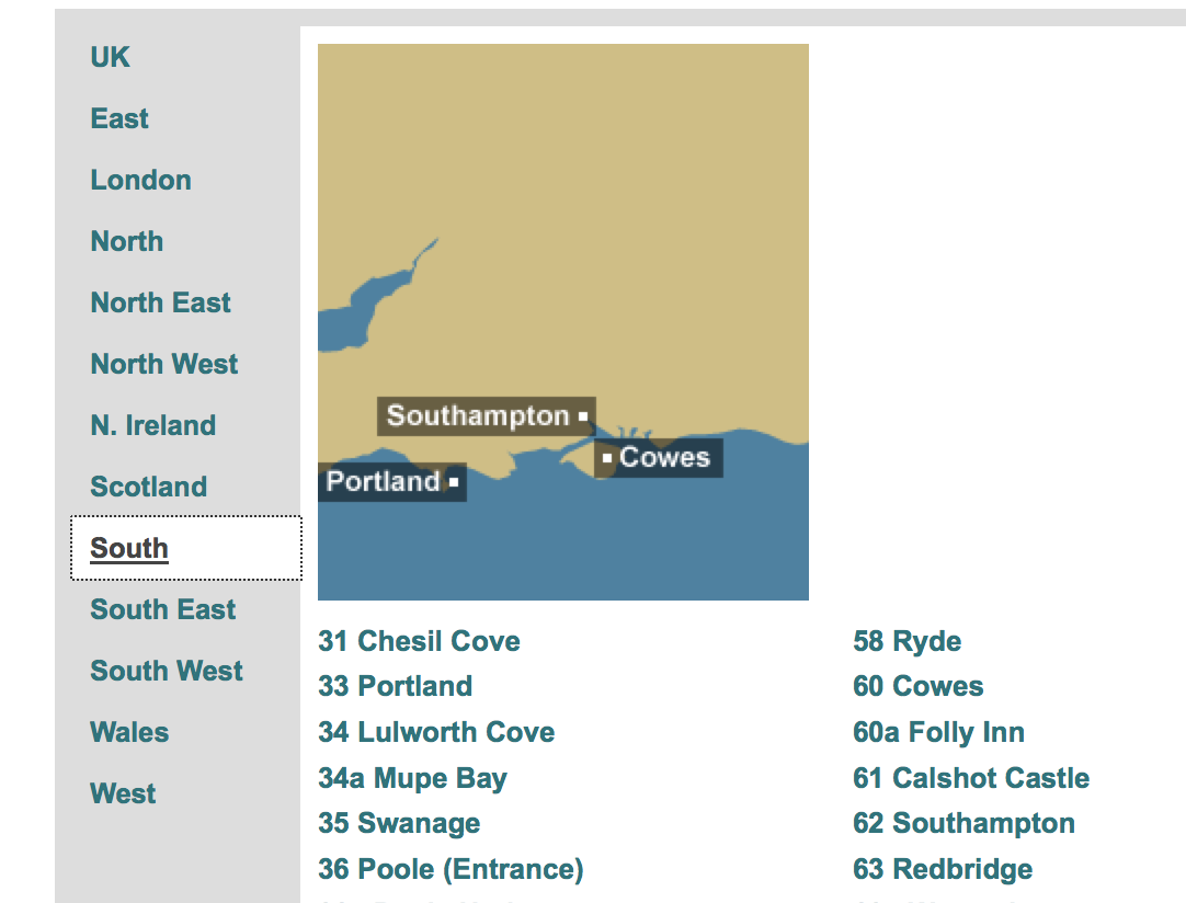
A little quiz for those that can see it (and links to the source examples if you can't), which of the following three images shows an ARIA tabs example?
1. The BBC tide tables page with left hand links/tabs
2. The top navigation of the twitter homepage (not logged in).

3. Typical looking tabs demo
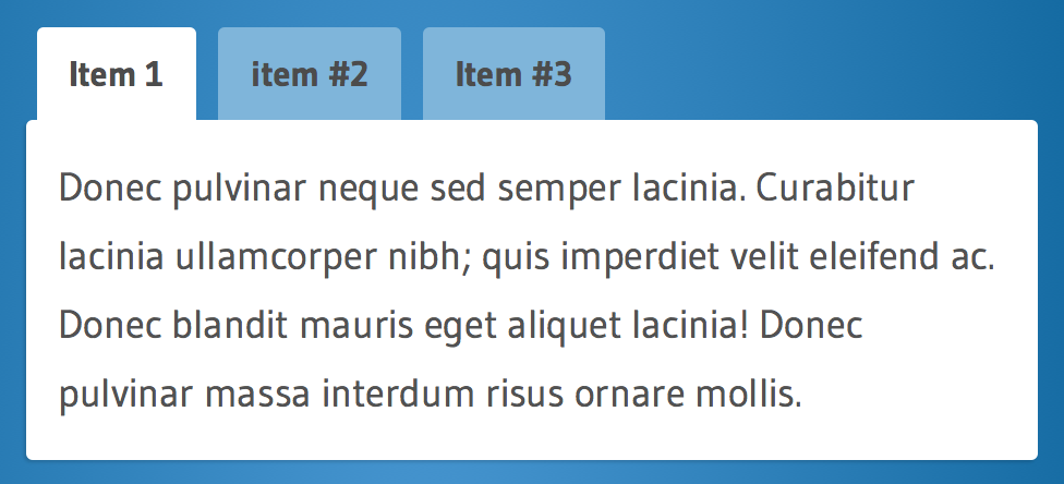
In this case, only the first of these examples actually uses ARIA tabs, and that is the one that doesn't look like tabs!
Visually, there is so little different between navigation and tabs, so you really can't blame anyone using a keyboard about getting frustrated when some of the options appear to be missing from the keyboard tab order.
Screenreader experience
I'm skating on thin ice talking about the screenreader experience given what I've said before, but I'm analysing a very specific interaction. I went through the simple ARIA tabs example with three desktop screenreaders (and VoiceOver on iOS) to see why regular users might be getting confused.
There are two scenarios for each, 'arrowing' through the content, and 'tabbing' through links & form controls.
Jaws 17 and IE11 on Windows 10, default settings
Arrowing through, Jaws has plenty of announcements for the structure, including going in and out of the tab panel content. It announces the keyboard short cut to move to the 'controlled content', which moves to the tab panel and changes out of forms mode. It also (after the short-cut key) announces the "Tab 1 of 3" to indicate size and location.
Tabbing through, Jaws changes to forms mode when you land on the selected tab, and then you need to use arrows to change the selected tab. Moving between tabs acts differently, as it changes the tab-panel content as you use the arrows. If you don't use the short-cut to move to the tab panel, you have to manually drop out of forms mode to progress.
VoiceOver on OSX 10.11, default settings
Arrowing through, tabs are announced, it also says "tab 1 of 3", and the tab-panel is a grouping structure you have to enter into to explore the content (which is normal behaviour on VoiceOver). Selecting a tab works as you'd expect (VO-space), but there isn't a short-cut to get to the panel.
Tabbing works the same as normal keyboard use, skipping the non-select tabs unless you use arrows.
NVDA with Firefox on Windows 10, default settings
Arrowing through, when you get to the tabs they are announced, but all read out in one go.
Updated: you have to use cntl-left/right to move the focus between tabs, and enter to select one. You don't have to drop into forms mode, but the tab panel is not announced and there is no short-cut to get to the panel content.
Tabbing through, selecting a tab with the arrow keys does work, but then you have to manually exit forms mode.
NVDA with Firefox on Windows 10, set to not "use screen layout"
With the settings adjusted NVDA works more like Jaws in default settings, where the tabs are individual items you can arrow through.
Updated: I found NVDA's method confusing, partly because I didn't know about move by word, which might also be because I use Windows within a Virtual Machine, and cntl-left/right switches the desktop. I adjusted the keyboard mappings to make that work, but I wonder how many NVDA users know about move by word, and know to apply it to tabs? (Assuming they know what tabs are.) I haven't seen move by word used much (if at all) when people come in for usability testing, it has been either up/down (previous/next) or left/right (move by letter).
VoiceOver on iOS works very similarly to the desktop version but without announcements for the tab panel.
UI issues
The visual-keyboard issue centres around expectations of being able to tab to things that look like navigation, i.e. links. When you can't it appears broken.
NB: I tested with a switch (on iOS) and that cycles through the tabs as though they were in the tab-order, so there may not be an issue for switch users.
For screenreader usage there are several things that I would expect to cause issues from that small interaction-analysis above:
-
The terminology may be new to people, and even clashing with familiar terms. 'Tab' is both a description and potentially an instruction to press a key. "Tab panel", and "controlled element" may also be unfamiliar. This undermines any previous affordance/expectation of tabs.
-
Changes in mode for the Windows screenreaders. Whilst this is a normal way of them working, it is easy to change mode without realising. If you are arrowing through, selecting a tab drops you into forms mode, as does tabbing through the page. It is only a short sound effect that lets you know of the mode change, and if you miss that then nothing seems to work properly.
Also, when you are in forms mode then moving between the tabs changes the content shown, which is not the case when browsing. That makes sense if you think of them like radio buttons, but otherwise it would be confusing.
-
VoiceOver doesn't provide a short-cut (that I know of) from the tab to the tab content. It announces the structure, but for larger sets of tabs it would be annoying to select one then have to go through every other tab to get to the content.
-
Updated: NVDA is relatively fiddly, it does work if you know how to move focus within the tab list, and are very good at recognising the terms.
For those sceptical that people don't know what 'tabs' are, here is an anonymised transcript from testing. The task was to find some information in tab "x":
Jaws: tab v, tab w, tab x. (Pause whilst user thinks), tab y.
Facilitator: shall we select "x"?
Participant: it doesn't say it's a link though?
Facilitator: Oh, right, ok. When it says it's a tab, what does that mean?
Participant: I don't know. (shrugs)
Jaws: (continues through the rest of the page looking for a link).
That was one example of several otherwise competent screenreader users who did not know what tab meant in the context of a website, and couldn't get to the content. Another user took the term "tab" to be an instruction, and pressed the tab key which took the focus straight past the whole panel to the next section of the page.
Conversely, without the ARIA-tabs there is no indication that content is being shown/hidden based on your actions, and no relationship between the tabs and the content.
Potential Solutions
Keeping in mind the three routes for solutions (education, user-agent, website), various solutions come to mind:
-
Removing the ARIA and making the tabs into links, i.e. they are links that move you to the content underneath. (website)
This fits the normal expectations of traditional websites, but isn't as effective an interaction for larger sets of tabs.
-
Tabbing to the tab list pops-up a hint that you need to use arrows (user-agent or website).
This would need to be both visual and prompt the screenreader (e.g. using ARIA live). It doesn't impact how it works, but actually counts as user-education.
-
Selecting the tab opens it and moves you to the the tab panel, the "controlled element" (user-agent or website).
NB: This has the potential to be confusing for people used to the application style tabs, but coming to it with fresh user-interface eyes, it makes sense for non-appy websites.
-
Allow tabbing between the tabs (website).
This is not allowed according to the spec, but for small scale cases I'm really struggling to see a downside.
The last two solutions could work together, allowing people to tab to each item and selecting an item moves you to the tab-content.
Conclusions
So this is where 1+1 may equal 3, because it isn't just about one website and these users. Whilst the results from some usability testing might lead you to removing the ARIA tab markup, there is another factor to take into account: the standards and all the other websites in the world.
If every site consistently used ARIA tabs, people would learn. From a brief check Facebook appears to be implementing tabs as-per the ARIA spec. That's good progress, however, I do think there is still an expectation gap that users are falling into.
We had over a decade of no differentiation between navigation widgets and tabs, so there is a very real expectation-gap between what people are used to on websites, and what ARIA-tabs provide.
I suspect that in a website with lots of ARIA usage and form controls many screenreader users are in the right frame of mind. The expectation mis-match comes from being on a 'regular' website and suddenly hitting application-style tabs.
Also, many people (including people using screenreaders) primarily use a browser on their desktop/laptop, therefore do not transfer knowledge about tabs usage from applications.
The bottom line is that we don't have enough data to really work out how big a problem it is. We should try and get some.
The test
I am assuming that we want to maintain the benefit of the ARIA markup, and justify changes or work-arounds.
I would propose testing a website (or just a page), with a tab panel in the content area, and three conditions for that tab panel:
- A per-spec implementation like this example from Leonie et al.
- A version identical to 1, except that it opens a hint accessible to keyboard and screenreader users when you get to the tab list.
- A version identical to 1, except that you can tab to each tab item, and selecting it moves the focus to the tab panel.
My bet would be that version 3 would perform best, but I'm open to all possibilities.
The task given to each user would be something apparently unrelated to the tabs, but require them to find or do something in a tab panel not open by default. Each person would be assigned to one version only, as you can only only test expectations once.
The participants would need to include people who use various screenreaders, and some people who can see the screen but not use a mouse.
So, does anyone have any usability testing coming up?
- ← Previous
Get off the Internet - Next →
Fixing outlines on click