The responsive order conflict for keyboard focus
We're starting to hit a problem with the new CSS methods (Flexbox and Grid), and how people using a keyboard (or equivalent) interact with a page. I'm not the first to say the keyboard order should follow the CSS, but I'd like to highlight some recent examples from work (anonymised).
The problem is not just that designers / developers won't think about the keyboard focus order. The problem is that even if you do, you still can't make it work!
Apart from Firefox the keyboard focus order follows the DOM order (see some examples from Adrian Roselli). However, with flexbox and grid, the layout can be independent from that order. This is a good thing overall, and allows a lot more flexibility and power when it comes to responsive layouts.
There are extreme examples where the order gets randomised, such as using CSS variables and flexbox order to change a table.
However, even when you use that flexibility for a more standard layout it is leading to some intractable problems.
Simple responsive layout
Recently we created some layouts for a site that is pretty simple (visually) with: Header, content area, a live block to show when an event was on (sometimes there), and a footer. At desktop(ish) sizes the content was on the left, the live-block on the right, so we wanted the keyboard order to go:
- Header
- Content
- Live block
- Footer
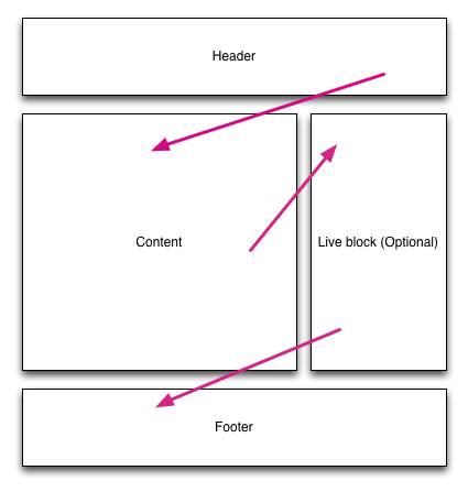
The desired keyboard order, top to bottom & left to right
This is simple to achieve with floats, flexbox or grids, the trouble comes when you also think about the smaller screen, one-column view.
If the content is after the header at desktop size, then the live block (a key widget to show at the top) will be second at smaller sizes, which is not what we wanted.
Our desired small screen view conflicts with the keyboard order for larger screens.
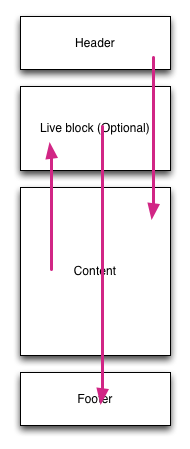
An undesirable keyboard order, skipping up and down the page.
So for people using VoiceOver on iOS (with some vision), or switch access, and probably other keyboard-equivalent inputs, this is very difficult. It pings up and down the page, making it very difficult to anticipate the next focus point or understand your place in the page.
Navigation order in a header
Another example is when you have a header with a 'meta' nav. For example, the your-account link. Something that is less important than the main navigation, so typically goes in the top-right at larger sizes.

The desired desktop keyboard order, across the top then down.
When you switch to a smaller screen you probably use a 'hamburger menu' or something to show the options. The meta-nav is less important than the navigation and would generally go underneath. With modern CSS that is pretty straightforward, but again causes a really confusing order for keyboard users.

The resulting small screen keyboard focus order, flicking up and down.
Some might be wondering "But who uses a keyboard on mobile?", and I would point out that switch access is very effective on iOS. It also affects anyone who has some vision but uses VoiceOver on iOS or Talkback on Android.
The Filament group have been testing this, and noted it impacts many websites:
the majority of layouts we see on the web do not strictly follow HTML source order, and for good reason: across viewport sizes, the usability of a design can be dramatically improved by shifting the visual hierarchy, scale, and order of the elements in a page. Indeed, the great promise of CSS was to free us from the constraints of binding our HTML to any particular visual presentation.
And there are no great solutions:
Given the choices of A) dynamically adapting our HTML source order for every breakpoint, B) sending different HTML sources to each client, or C) renumbering the tabindex attributes of all focusable elements to match their rendered order, we emphatically choose option D) "Nope".
I agree. They could only mitigate the problem with navigational cues and skip links. It wasn't a lack of effort, it was a lack of a reasonable solution.
What's the solution?
It has to be solved by the browsers.
For Flexbox the easy answer is for Firefox to maintain this 'bug' and follow the order set in the CSS. Other browsers should implement this as well.
I haven't used Grids in anger, but I suspect that it would be possible to infer an order from the grid definition. Across each column, then down each row. I think Opera used to have an algorithm for this in the pre-blink days?
The bottom line at the moment is that the new (and much needed) CSS layout methods are going to cause more and more issues for keyboard users as they become more used.
Even when developers try to provide a good focus order it will become very confusing in some scenarios because re-configuring the order at different screen sizes does not apply to the keyboard focus order.
Updates
Thanks Jennifer Sutton for pointing me to the filament group's article which I've now quoted from, and good further reading from an MDN article, Léonie Watson's article on flexbox & keyboard, and Susan Robertson's article on CSS Grid: Responsive and Accessibility.
Counter point
Patrick pointed to a scenario where the source order not matching the visual order can be useful.
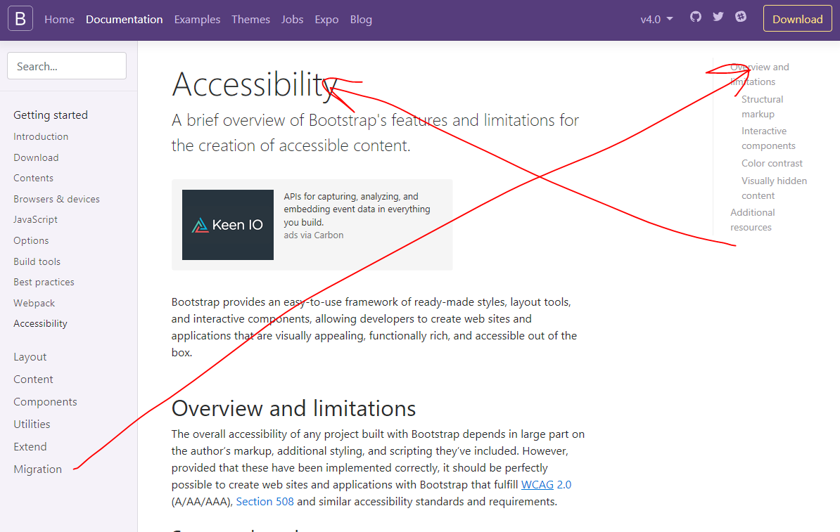
Source order desired for bootstrap documentation in bug 22849.
It would not be good to tab through all of the content before getting to the table of contents, in fact it makes the TOC pointless for that audience.
However, I can't help thinking that this is the exception that proves the rule, it is one of the infinitesimally small number of times when someone who fully considers the accessibility of the layout makes a conscious choice about the ordering and adjusts the source order with that in mind.
When discussing what the default should be, I still think we should optimise for the un-thinking case.
I spotted a discusion of this on the WICG discourse site which I've joined in.
- ← Previous
Units for Media Queries - different conclusion - Next →
EME at the W3C