

An update to Non-text Contrast examples, showing a series of examples showing the visual display (in images, sorry) for various UI components for the improvement of the understanding document on non-text contrast.
Should be seen in the light of the criteria text, particularly the first bullet:
The visual presentation of the following have a contrast ratio of at least 3:1 against adjacent color(s):
User Interface Components: Visual information required to identify user interface components and states, except for inactive components or where the appearance of the component is determined by the user agent and not modified by the author;
Graphical Objects: Parts of graphics required to understand the content, except when a particular presentation of graphics is essential to the information being conveyed.
The pass/fail process below is intended for discussion by the AGWG, not for direct use in an official document. It is important to consider Focus Visible (2.4.7), text contrast (1.4.3), and Use of color (1.4.1.) during this process.
For each active UI component styled by the author (including styling of colors behind/adjacent to the component) the following must be true:
A set of examples for things that could pass (or be out of scope), ignoring un-styled components:
Testing & screenshots done primarily in Firefox, where browser defaults were used I've added other variations underneath, mouse-over each or select it to see the file name with browser name.
Click on an image for a large clear version of that thumbnail.
| Example | Default | Focus | Hover | Active | Selected | Pressed | Checked | Visited/unvisited | Expanded | Pass/Fail & Notes |
|---|---|---|---|---|---|---|---|---|---|---|
| 0.1 plain submit | 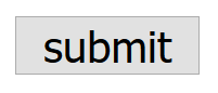 |
 
|
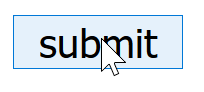 |
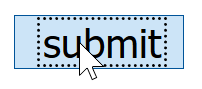 NB: Note that the text moves slightly on mouse-down.
 |
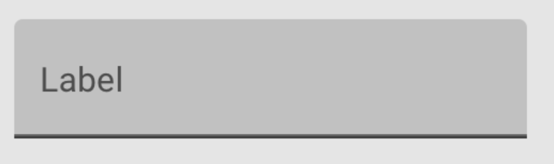
Same as 'active' | Same as 'active' | NA | NA | NA | Pass: As the plain, default view of a button it falls into the 'unmodified' exception.
If there were a background, including a simple |
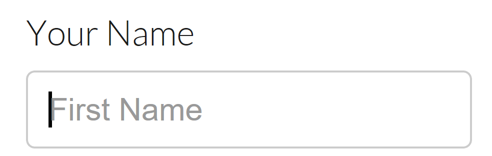
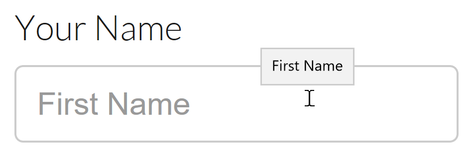
| 0.2 plain text input | 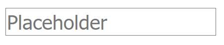 |
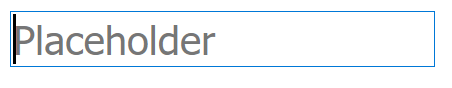 Addition of blinking carrot line |
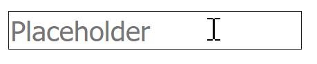 Change in pointer. |
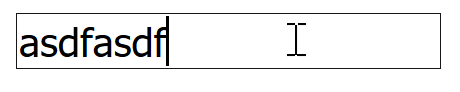 Placeholder replaced. |
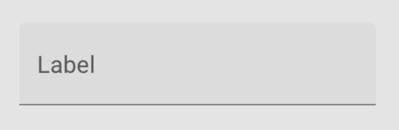
NA | NA | NA | NA | NA | Pass: Default view of a text input it falls into the 'unmodified' exception. |
| 0.3 plain text link | |
  
|
 Change in pointer. |
NA | NA | NA |  |
NA | Pass: Default view of a link falls into the 'unmodified' exception. | |
| 1. Knowability search |  |
|
 |
 |
NA | NA |  (Using 'checked' as filled in. |
NA | NA | Pass: Text and icon convey existence and approximate boundary, with contrast. Focus state clear. Change in pointer for hover, no other state changes. |
| 2. Github repo-nav (<a>) |
 |
    |
 |
NA | Same as default | NA | NA | Same as default | NA | Text and icons convey existence, with contrast. Focus state is the default browser indicator. (Not good in many browsers, but comes under the exception). Selected state (if you consider the orange bar selected?) is 4:1 against white, so would pass. |
| 3. Github unfollow <a> role=button, aria-expanded/haspopup/label |
 |
 |
 |
NA | NA | NA | NA | NA |  |
Text and icons convey existence and approximate boundary, with contrast. Focus state is the default browser indicator. (Not good in many browsers, but comes under the exception). The arrow indicating there is a drop-down has contrast. Expanded has a minimal change on the button, but the presence of the drop-down counts as a visible change. |
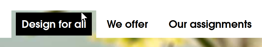
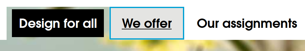
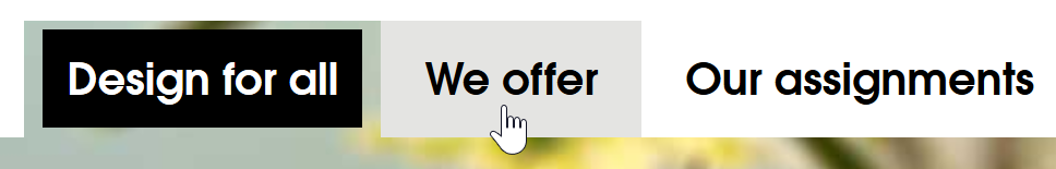
| 4. Github other buttons. NB: Not sure where to find these. |
 |
 |
 |
 |
 |
 |
 |
 |
 |
|
| 5. WAI site nav |  |


 NB: Firefox reversed the colour of it's focus, using white instead of black dots.
|
 |
Same as default. |    Has aria-current="location", note that selected & focus creates a new state with slightly different colour scheme.
 |
NA | NA | Same as default | NA | Pass: Contrasting text indicates presence and approximate area. Focus passes with the yellow underline being added (NOT due to default outline indicator). Hover and the combined focus+selected states not required to differentiate. |
| 6. CNN nav. |  |
 NB: The dotted line is author-set. |
 |
Same as default. | NA | NA | NA | Same as default. | NA | Pass: Contrast of the text indicates presence and approx area. The focus state is small, but white on black. |
| 7. Adobe nav <a> role=button, aria-expanded/haspopup |
 |
     |
 |
Same as expanded. | NA | Same as expanded. | NA | Same as default. |  |
Contrast of the text indicates link.
Focus state is the default browser indicator. (Not good in many browsers, but comes under the exception). |
| 8. Levelaccess link |  |
 |
 |
NA | NA | Same as focus/hover. | NA | Same as default. | NA | High contrast throughout, slightly odd area for focus outline which is larger than the hit area but doesn't confuse the location of the link. |
| 9. Funka menu |
 |
 NB: Blue line is author provided. |
 |
 |
 |
NA | NA | Same as default. | NA | Pass: Contrasting text indicates existence and position. Focus passes due to underline being added, the blue/grey changes against white is 2.9:1. Selected (current page) reverses the contrast (black/white), so very 'contrasty'. |
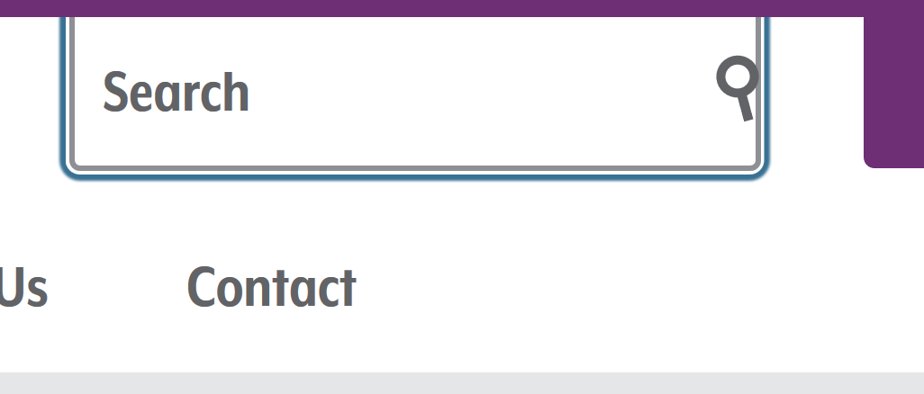
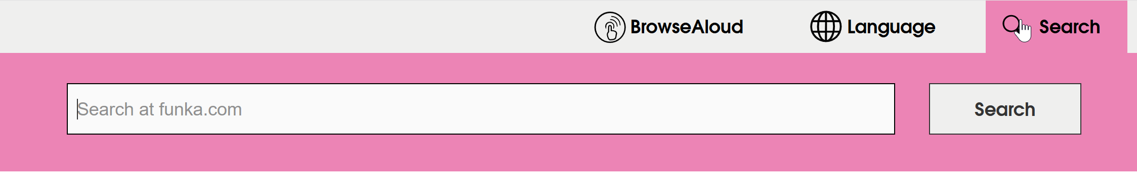
| 10. Funka Search |  |
 |
 |
 |
 |
 |
 |
 |
 |
Text and icon indicate existence and area. Fail: Focus indicator doesn't have sufficient contrast (and isn't the browser default), blue against grey is 2.5:1, against white is 2.9:1. Selected: Visual indicator of the search box opening underneath would pass. |
| 12a. Material design, underlined inputs | |
|
 |
 |
 |
 |
 |
 |
 |
Pass: Text (5.6:1) and the bottom-border (3.1:1) indicate presence of text input. Focus passes because the bottom-border changes (gets thicker), and the text & bottom-border maintain contrast. Selected (if that's the correct state name for a text field when typing in?) maintains contrast with purple on grey, and and the purple / grey contrast 3.1:1 with each other, and the carrot is added to the content of the field. |
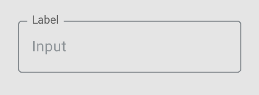
| 12b. Material Design, outlined inputs | |
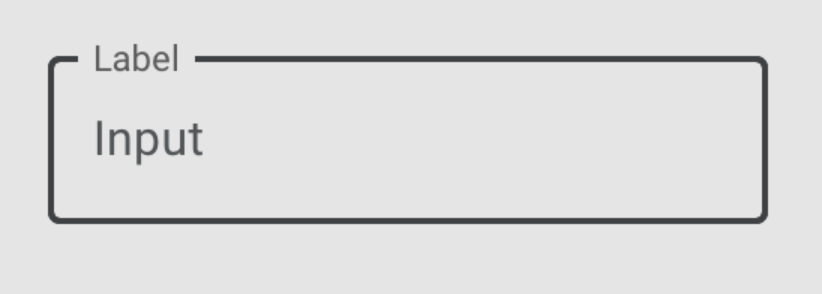 |
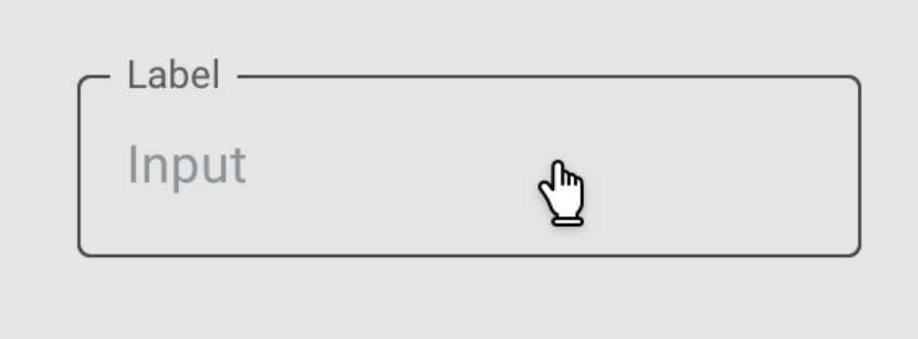 |
 |
 |
 |
 |
 |
 |
Pass: Text (5.6:1) and the border (3.1:1) indicate presence and area. Focus passes because the border changes (gets thicker), and the text &border maintain contrast. Selected (if that's right for a text field?) has over 4:1 contrast with purple on grey. |
| 13. Material design checkboxes | |
  |
  |
NA | NA |   |
 |
NA | NA | The dark grey and purple provide good contrast for the default state. Fail focus visible: The focus indicator (a round shaded area) is 1.3:1 against the adjacent colour. Hover uses the pointer, and the "checked" tick has good contrast. |
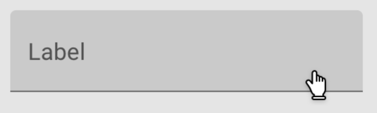
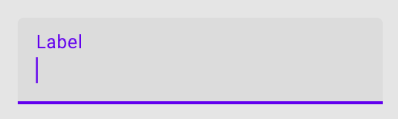
| 14. Gofundme donate name | 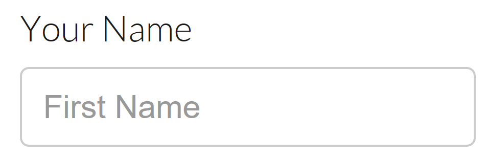 |
 |
 |
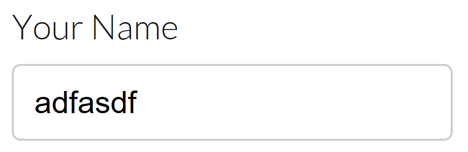 |
NA | NA | NA | NA | NA | Fail: The text (placeholder) is not contrasting (2.9:1 at 18px regular weight), the border 1.6:1. Focus also fails, there is no indicator except the flashing text-edit carrot. Hover is ok, changes the pointer, and adds a hover effect (which would probably fail Content on hover or focus). Active/text-entry is ok with contrasting text. |
| 15. Click on a state quiz | 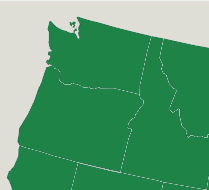 |
NA (not keyboard accessible) |  |
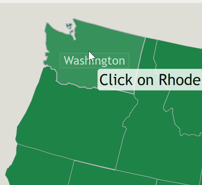 |
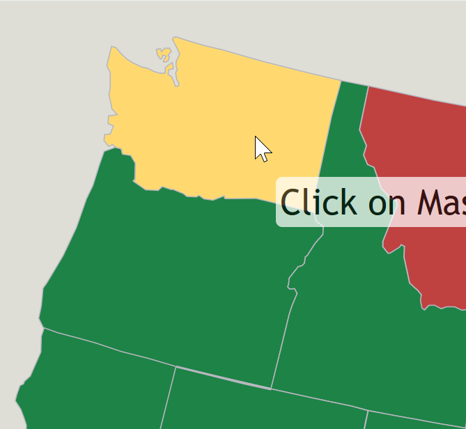 |
NA | NA | NA | NA | Fail: The grey border between green sections is 1.9:1. Active (clicking the state) also fails, adds small text at 2.7:1. Selected also fails sometimes, depending on the colour (yellow ok, red terrible), but also fails for relying on colour. |
| 16. Facebook marketplace |  NB: Groups is selected, but look at 'browse' for the default state. |
     NB: Default browser focus indicator, which disappears on the 'selected' item. |
 |
Same as selected/default. |  |
NA | NA | Same as default | NA |
Contrasting text passes, showing existence and approx area. Selected passes due to bolding the text. Fail: Focus on the selected item fails as there is no focus indicator (fail of 2.4.7, not 1.4.11). For other links it is the default indicator. |
| 17. Bootstrap checkbox |  |
 |
 |
 |
 |
 |
 |
 |
 |
Fail: The default state is a light-grey on white box, 1.3:1. Focus also fails, with an indicator that has 1.3:1 contrast with white. Checked is ok, the blue on white is 3.9:1, so both the component and the white tick within the are ok. |
| 18. Bootstrap Accordion |  |
 |
 There's an almost negligible darkening of the text on-hover. |
NA | NA | NA | NA | NA |  No difference from default unless hover or focus are triggered, in which case see those examples. |
Fail text-contrast: The (small) blue text is 3.6:1 on the light grey, and the border/background has less than 2:1 contrast with white. Focus passes, due to the text-underline being added. Expanded: There is no visual indicator, no reliance on colour/contrast, therefore pass? |
| 19. Bootstrap outline button |  |
 |
 |
 |
NA | NA | NA | Same as default. | NA |
Fails on text contrast (3.9:1). Fails on focus contrast, not the browser-default and only 2:1 for blue/white. Hover and active good. |
| 20. A11yPortal Nav |  |
 |
 |
NA |  NB: Focus overrides selected, so when a selected link is focused, it appears as per the focused example. |
NA | NA | Same as default. | NA |
Good text contrast, no requirement to have a border for hit area. Default browser focus indicator plus a grey bar at the top is added (contrasting with the white it replaces). Shows the selected link / path (not required), but interesting that focus styles replace selected styles when focused. |
| 21. Modern (flat) radio buttons | 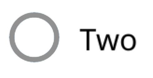 |
NA | NA | NA | NA | NA | 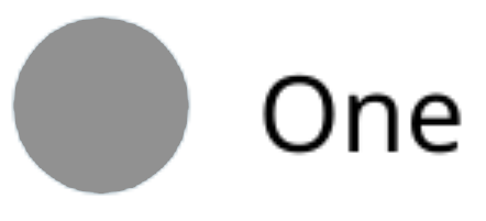 Alternative: 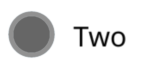
|
NA | NA |
Included to show how 'adjacent' colors can work. The checked state fills the radio button circle, so the adjacent color becomes the outside (white) of the circle. The alternative checked state with a darker inner color also passes as it contrasts with the outer background color (White). |
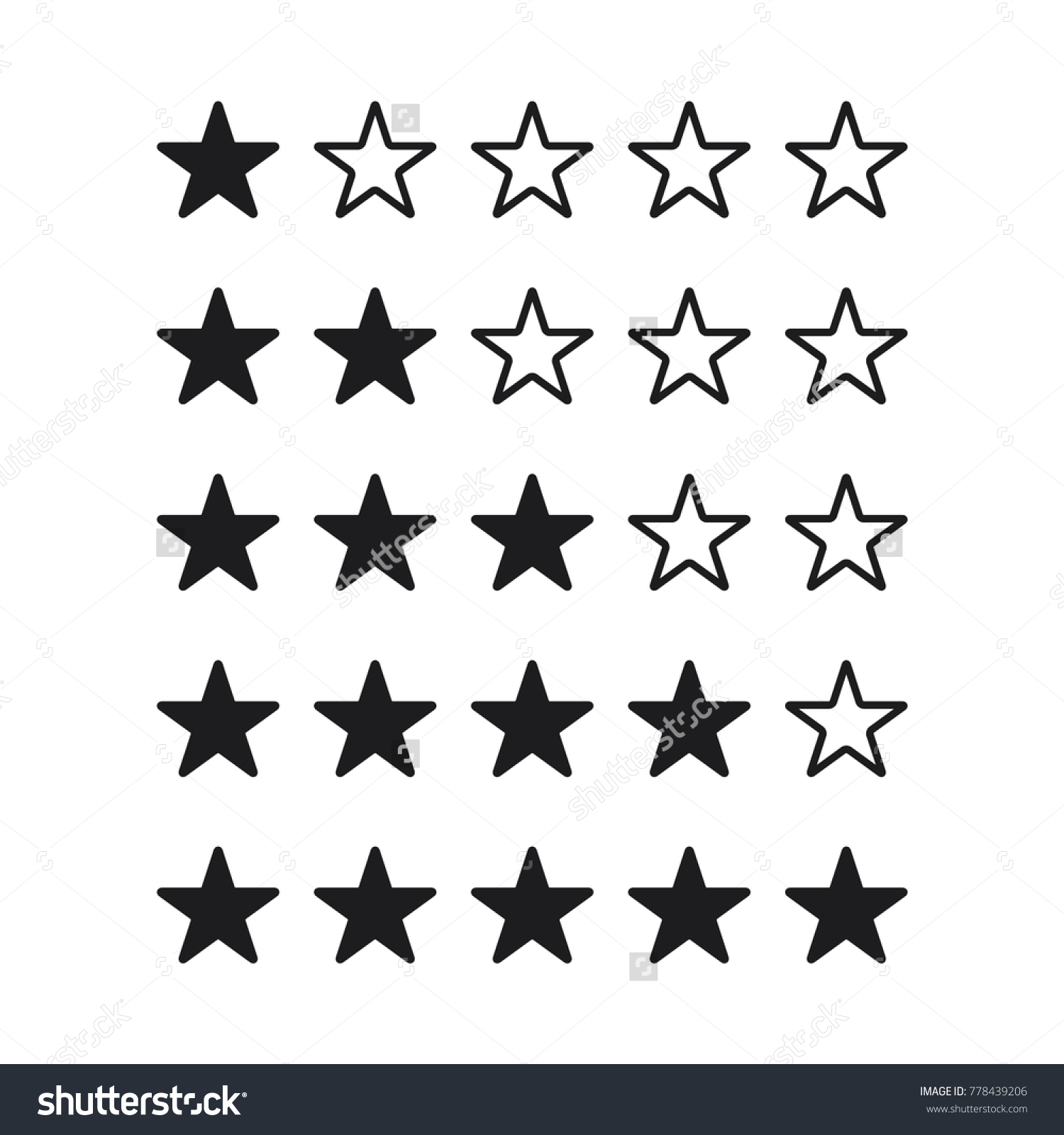
22. Star ratings, outline with filling |
 |
NA |  |
Each star (assuming each is selectable) is a component, so the dark outline on white meets the criteria. The state of selected (full) also has good contrast. |
||||||
23. Stars variation 1, grey/yellow filler. |
 |
NA | NA | NA |  |
NA | NA | NA | NA |
The yellow/blue has good contrast (>5:1), the grey/blue does not (2.8:1).
I can see an argument that it fails due to Use of color, yellow vs grey. However, I think Pass because the grey does not contrast with the adjacent color. If you merge those together, it becomes like the next example (23a). If the yellow and grey did contrast against each other, and their adjacent colors, that would pass both Use of color and Non-text contrast. |
23a. Star variation 2, yellow / no filler. |
 |
NA | NA | NA |  |
NA | NA | NA | NA |
The yellow 'full' indicator contrasts with the blue, the empty components contrast with their adjacent colors. If you agree with this example, can you disagree with the previous one? |
23a. Star variation 3, yellow fill / white border. |
 |
NA | NA | NA |  |
NA | NA | NA | NA | The yellow 'full' indicator contrasts with the blue, the empty version has a contrasting white border. |