Raising the bar of mobile browsing
Mobile browsing has been, frankly, rubbish so far. Molly E. Holzschlag described it well just over a year ago when she said: anyone who has done wireless development already knows cross-device and wireless agent development is much more insane than anything we deal with on the desktop.
In the same way that we (i.e. web developers) can deal with JavaScript or not, but not a Frankenstein monster in between, so it is with CSS in the mobile world. This is my home page rendered by the default Nokia/Orange browser (apologies for the poor pictures):
Not too good, mostly because it understands the @import but does no better than Netscape 4 in rendering CSS. There is little you can do about it in practice, apart from perhaps create a different version for each of the 40+ different mobile user agents, trying the futile dance of user-agent detection.
New league of mobile browsing
There are two new mobile browsers that confound the generally dire opinion of mobile browsers. Jon Christopher highlighted the first in August, the Opera Mobile browser. Relative to the other mobile browsers, this is practically desktop quality.
In terms of rendering, the Opera mobile browser is pretty damn good, in 'Desktop' mode it is very similar to the desktop Opera browser but with scrolling:

The default mode is actually more useful in practice, it re-formats the page to fit the screen width:

With my shiny new Nokia N80, I can use either the Opera mobile browser, the Opera mini, or the new Webkit based Symbian web browser that uses the same base as Safari. (Using any of these will drain the batteries remarkably quickly, but that's another story!)
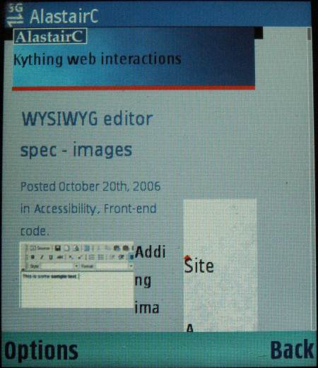
The Webkit browser also renders my home page very well:

This simple fact puts both Opera & Webkit in a league of their own in mobile browsing, as my site was developed (quickly and easily) for desktop browsers, no thought was given to mobile browsers apart from hiding the CSS with an @import method.
Notice also that the Webkit browser uses a pointer, and the way you scroll around and use the interface feels very similar to using a screen magnifier on the desktop.
One of the main things the Webkit based browser does differently is applying a max-width to the items with text. Although it uses the standard desktop sytle layout, any element (like <p>s) is given a max-width of the size of the screen. In general this is very useful, and is a great compromise between Opera's desktop and standard modes.
The easiest way to show this is with another of the Webkit browsers features, the page map that you can get to by pressing 8:
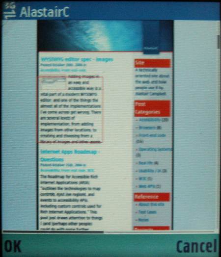
The red outline shows the screen size, and this view allows you to scroll through a page quickly to the place you want and start reading.
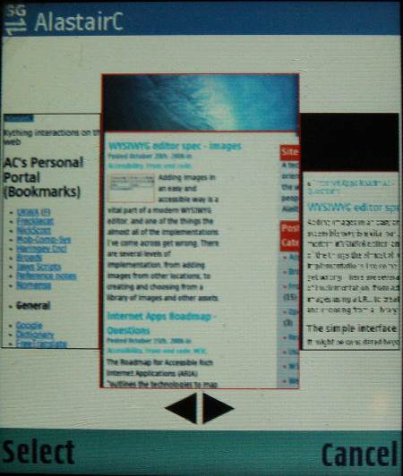
The browser must do some kind of thumbnail caching for each page, as pressing back brings up this type of picture, and you can cycle through them like the gallery's carousel:
There are great features of both Opera and Webkit, after a brief use of each, my first impression is that Opera has better advanced features, and Webkit has the edge in the basic browsing mechanisms. Which one you might use will probably come down to personal preference, or the price tag of each. (Opera is available on many phones for a price, Webkit is only available on a few, but is the default browser when it is.)
Mobile browsing paradigm shift?
"Paradigm shift" isn't a phrase I've used before, but these browsers do break the mold. I saw Cameron Moll's presentation at @Media this year (a good primer is Mobile Web Design), and he suggested that good mobile sites or applications should assume that the person is mobile, not just the browsing, and that the tasks and content possible should be oriented towards that scenario.
I agreed with his conclusions, they are something that you would expect to hear from a usability bod like myself. However, these browsers afford easy reading, even articles like this! I've been using the Webkit browser for a couple of months, and whilst stuck on a train or on holiday without a laptop, I can follow my usual browsing habits. (I.e. reading articles, checking webmail etc.)
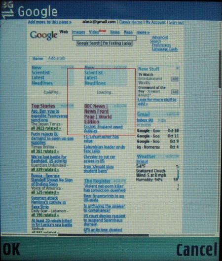
One of Cameron's 4 mobile development options is 'do nothing', and the quality of that option is now a whole lot better. I even (just about) managed the AJAX style drag and drop of the items on my google home page! That might be an unique advantage of Webkit, as other mobile browsers do not have a pointer.
These new browsers do not change the scenarios where the mobile web is most useful, but they do add a scenario of use that is more similar to desktop browsing. It is entirely possible that only the first-movers or web-geeks will notice though? Although the Nokia N80 is on the forefront of mobile phones with computing power, you have to wonder how long it will be before this browser is standard?
The Opera browser makes use of handheld media style sheets in the standard fit-to-screen mode, but not when in desktop mode, which makes sense. It's just a shame that you can't target the Webkit mobile browser (that I know of), items like the boxes on the Nomensa.com home page are somewhat crushed due to the max-width. (Although the JavaScript 'big hit area' works fine.) Out of interest the user agent string is:
Mozilla/5.0 (SymbianOS/9.1; U; en-us) AppleWebKit/413
 (KHTML, like Gecko) Safari/413
- ← Previous
WYSIWYG editor spec - images - Next →
Browser Zoom Comparison