Elastic layout - wrong term?
This post is far too late, I really should have said this earlier, but I think the terms being used for various layout types are confusing. The top two articles for "Elastic Design" on Google are Roger Johansson Fixed or fluid width? Elastic! and Alistapart's Elastic design by Patrick Griffiths. Both good articles, and recommended reading (before this article if you aren't familiar with them).
So why the post? Well, I think "elastic" is the wrong term for what the Alistapart layout achieves. There needs to be another term for font-based layouts. Also, there is a mistaken assumption about the accessibility of font-based layouts.
Terms
Many moons ago I read a post from Roger Johansson on his re-design of a University site. This was the first time I'd seen conditional comments used for applying a max-width in Internet Explorer, a real eye-opener at the time and the reason I remember it. The design used a percentage based layout with a max-width. The term elastic wasn't used at the time, but was later in Fixed or fluid width? Elastic!: Flexible up to a point, and then it stops flexing, just like elastic.
Current Definitions
The current definitions since the Alistapart article for layout terms seems to be:
Fixed
A layout that does not flex in any way, defined with pixel widths.
Fluid/Flexible
A layout that flexes with the window size, based on percentage widths.
Elastic
A layout that flexes with the font size.
Unfortunately elastic is being used for font-based sizing, which I find confusing.
I would prefer elastic be closer to it's off-line counterpart, referring to the use of a max/min width technique so that whichever flexible option (percentage or font) is chosen, it doesn't fall apart under extreme conditions.
However, I don't have a pithy name for font-based sizing, any suggestions?
Proposed definitions
Fixed
A layout that does not flex in any way, defined with pixel widths.
Fluid/Flexible
A layout that flexes with the window size, based on percentage widths.
Font-based
A layout that flexes with the font size.
Elastic
The technique for capping the possible sizes of the layout.
NB: I'm going to use these terms for the rest of the article.
I do realise that layouts can combine elements of all of these, for example you could have fixed width columns within a flexible container. However, there is generally a 'top-level' method used for the layout as a whole, which is what concerns me most.
Accessibility of font-based layouts
I'm not an accessibility extremist, I don't think it's practical to have everything completely flexible. Actually, it's because I've seen the trouble it can cause that I think that.
One of the largest groups with a disability (that affects how they use the web) is those with mild or moderate visual impairment, i.e. those that need magnification but not a screen reader. You would think that a font-based layout would be great for this audience, as it scales with their font-size. But there is a problem:
People with a visual impairment often combine a low resolution (800/1024 wide) with large font sizes.
I've usability tested a quite a few web sites with this audience, and a font-based width will perform worse than a fixed width. The simple reason is that so much of the content was off-screen that people missed things. They also had to contend with a lot of horizontal scrolling.
Recommended approaches
The best performing sites across various conditions were those that used a fluid+elastic layout, i.e. percentage based with a max/min applied. Optimise for around 1000px wide, but making sure it works well at 800 and 1,280 resolutions as well.
That isn't to say there isn't a place for font-based layouts, but there is a problem: IE6 doesn't allow a max width on a font-based layout. I.e. you can't get the same effect as:
#mainwrap {width: 60em; max-width: 100%;}The effect of this problem is similar to IE7's zoom, in that it creates lots of horizontal scrolling. Note that IE7's handling of font-sizing is the same as IE6 (with regard to pixel fonts), and it's zoom doesn't handle max-widths (test case): 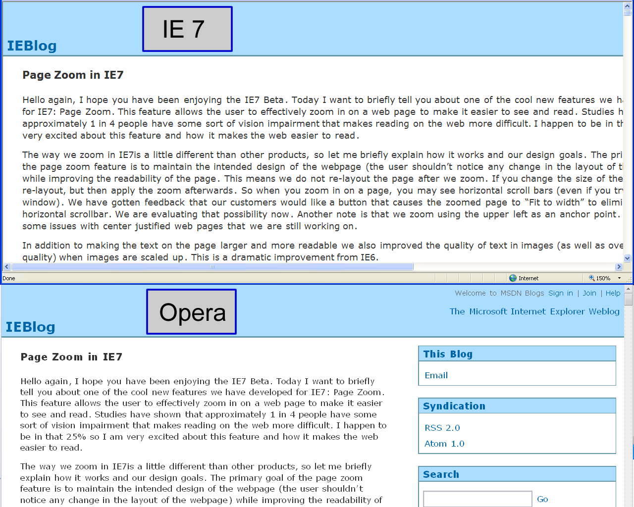
This makes IE7's zoom good for (small) fixed width sites, but not for those designed with accessibility in mind.
I've unsuccessfully tried a few methods of creating a font-based+elastic layout with conditional comments and CSS expressions, but I'm still open to suggestions. If there were a solution to this issue, font-based layouts could be as accessible as percentage based ones.
See also a follow up article about font-based layouts.
- ← Previous
Mobile GMail - Next →
OpenID and trust