I attended the 6th London Accessibility meetup, and the 1st organised by Alistair Duggin. It was a great event, with three speakers (for two talks). I took some rough notes that might be useful until the videos are published.
Both talks are about incorporating accessibility at large organisations, the first from the FT, the second from the BBC.

Talk 1: Yes! Your site can (and should) be accessible
Speaker: Laura Carvajal, senior dev at FT.com
 Laura’s talk was grouped into several lessons-learned from introducing accessibility to her organisation, I didn’t get down all the titles accurately, so please check out her slides for the original, and read on for a little commentary. My comments are in square brackets and in italics.
Laura started with a little anecdote about access being fair, rather than making people jump through hoops to do the same thing. (E.g. an escalator where the alternative lift is a long way away, as pointed out by her 10 year old daughter.)
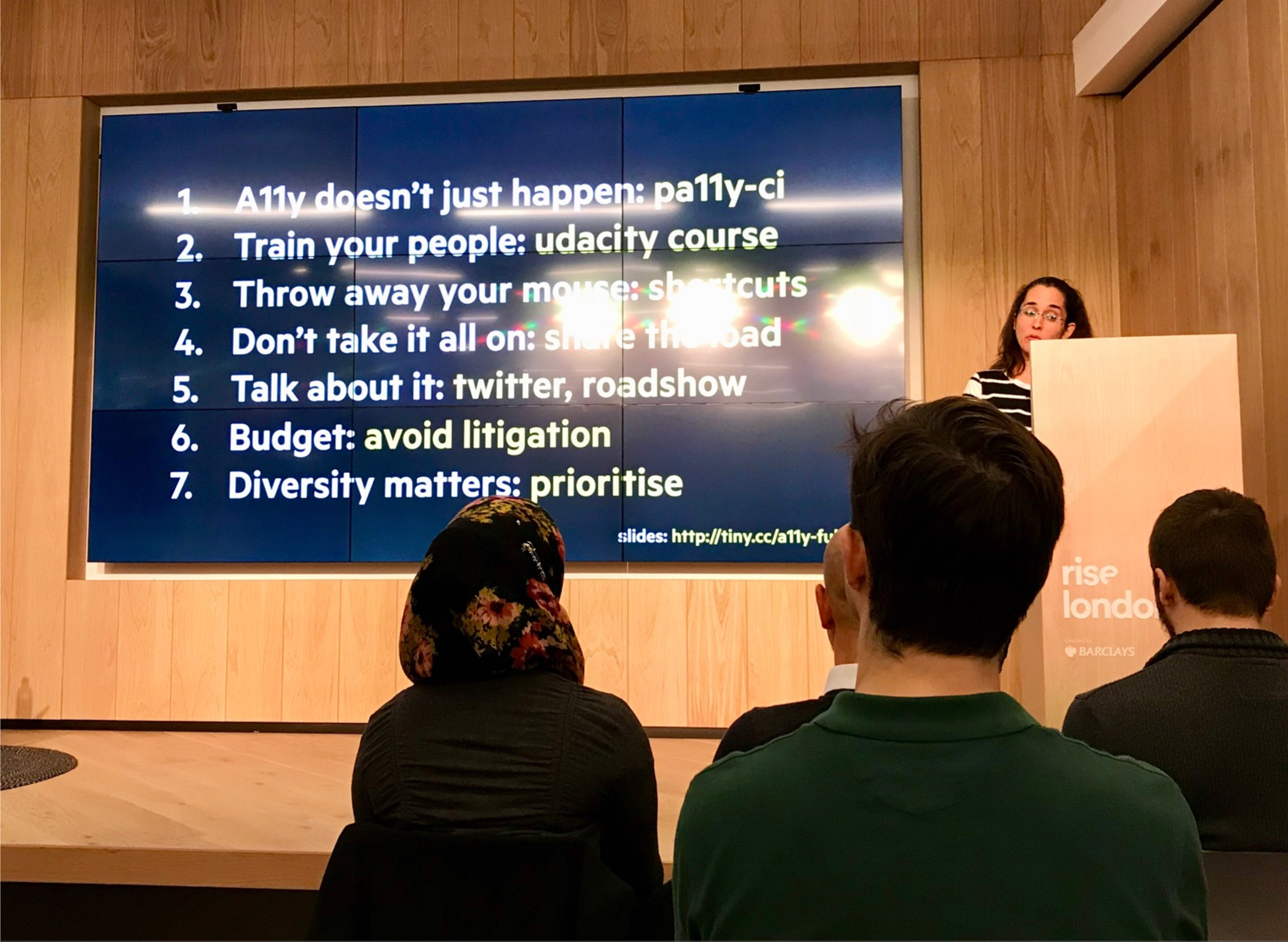
1st: Note that it doesn’t just happen, you have to make it happen.
For the FT, they thought it was about 26% of users, due to the older skew of their user base. It is very overwhelming to know where to start. Started with pa11y, an automated checker that goes through [some of] the web content accessibility guidelines.
[Note: I wonder what issues you’d find that aren’t found by pa11y, but clear from a quick check with keyboard/zoom/screenreader? My bet would be you’d find more critical issues more quickly.]
FT contributed a ‘threshold’ argument to pa11y, so it would not break the build before going live. Went through a process of fixing errors in each app. Found that only a couple of people were really getting into it, others were not trying, not keen on broken builds.
2nd: Before you set the build on fire, train people.
Make sure people know what to do with the results before you trigger lots of errors.
Common issues found by pa11y:
- Contrast issues, e.g. footer. Fixed those fairly easily.
- Alt text issues. Many missing, added them. Had 3 types of images, decorative, convey info, convey complex info.
- FT think of ‘header’ images for stories as decorative, applied null-alts. Found that some assistive tech would still read it out, so added
role=pres. [I haven’t found that before, I wonder what combination it was?] - Conveys info: images embedded in the articles.
- Complex info: e.g. line charts / graphs, currently PNGs. Considered long-desc, but that seems to be depricated. So they give alt as summary, then link below the image to an actual description. Exploring SVG, so can leverage the accessibility there. Underway, but not sure how it will pan out yet.
- FT think of ‘header’ images for stories as decorative, applied null-alts. Found that some assistive tech would still read it out, so added
- Forms: You can get a lot wrong with forms.
- Labels required, e.g. with form & ID. Nothing to tell you that you’ve broken it. [Um, except clicking on the label shows if it is attached properly]
- Adding ‘required’ to each label, and hide the star from AT. Better for consistency.
- Ads: These are 3rd party things, but they are injected into your site. They wrapped them in an
aria-hiddenblock, however, you could still fall into the iframes as a keyboard trap. Addedtabindex=-1to each of them. - Duplicate content:
- E.g. two links to ‘Latest on Russian politics’. Have on the right at the top, and at the bottom which is several screens down. For a screen reader user this was quite duplicative, and unclear why they are there. They hide the right hand ones.
- E.g. many links to ‘add to my FT’, no context when tabbing through. Used hidden text to add the context. Been asked about the class used, have a couple, such as this example.
For training, Laura recommended a free Udacity course from Google.
The FT now have pa11y integrated into all projects, but these are only 20-30% of the possible accessibility issues.
You should also consider:
- External audit
- Customer research
- DIY. If you have no budget, you can still do what we did. But recommend doing the others.
The FT got an external audit (from DAC), and Laura went to see the testing lab (video played). They did a 200 page report, even after all the pa11y errors had been fixed.
Then spent several months fixing things, and got ‘accreditation’ from DAC.
Lesson 3: Lose your mouse
Something that really helped was going keyboard only, really really keyboard only! That really made a difference, you really use it properly. It’s harder than it looks, but you become this really weird power user. Laura shows an image of her desk with all the keyboard shortcuts printed out. Over time the paper goes away, it’s really worth it.
To help with this, Laura removes all the ‘goodies’ on the trackpad, tap to click etc. So it is less comfortable when she does use a mouse.
Lesson 4: Don’t take it all on yourself
Trying to fix everything on your own is not the best answer. You’ll burn out, it isn’t efficient, you become a bottleneck. Does a dis-service to your team. You’ll probably find your team is willing to help. Try to find time to train everyone around you, rather than keeping to yourself.
Also added it to the recruitment process, get some accessibility questions in there.
They put together a little roadshow, a space in the office where they setup a stand. Invited everyone to complete a form using a screen reader, to win a prize. The form was blurred-out, so people really had to use it. Many people had never heard of a screen reader before this.
Gave them lots of links (after the skip to content link), all it asked was a name/email and how many times have you filled in this form? Fastest wins, multiple tries allowed.
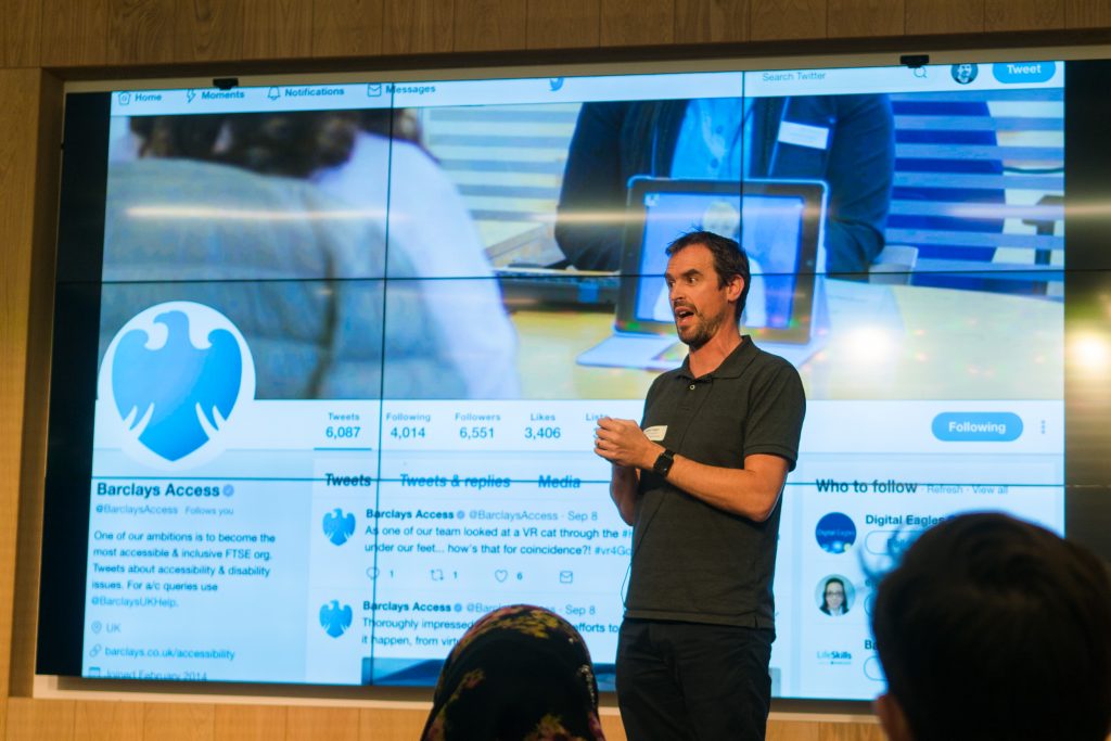
Big takeaway was ‘mind blown’ (picture of one of the developers).
Lesson 5: Talk about it a lot
The more you talk about it the better. People over-hear, might provide budget!
(Missing training from that list of things you can do?)
Lesson 6: “It’s the right thing to do” doesn’t get you a budget.
Need to sell it. Alice Bartlett has researched the business case, which turned out to be mainly not getting sued.
[A comment from the audience (Jonathan Hassle) mentioned that other people have found much better (positive) business cases. Still, if the FT can’t find that, perhaps they need to be put around more?!]
Lesson 7: Diversity improves your product, your team, your life
The main thing was: Just do it!

Talk 2: BBC Homepage redevelopment
Speakers: Catharine Green, Accessibility lead & Sarah Heidari, Developer
It was a 16 month project to rebuild the homepage. The accessibility champion doesn’t have to be an expert, just willing to stand up for the case.
From the outset we had more than one champion, but over the project got everyone engaged.
Part 1: Getting the team engaged
Step 1: Engage all the disciplines, everyone has a part to play.
Product owner, BA, designer, dev, tester. Gave them each a checklist, so it could be considered at any stage.
- Product owner: They commission the research, lab based an home visit. 1st for the news/homepage (?)
- BA: Created acceptance tests for things like screenreaders.
- Designer: Considering colour contrast, touch area size, content/tab order. Accessibility reviews took place on designs, and discussions on markup.
- Had a more detailed checklist, JSXa11y, ands BBC-a11y, a BBC specific test set, against their guidelines.
- Tester used assistive tech, and the acceptance criteria from the BA.
Step 2: Define AT priorities
Input devices range from voice input, Braille, screeneaders, more. Wrote the prioritise based on the Gov survey 2016, desktop to mobile, and
Step 3: Accessibility laptops, easy access for all to assistive tech.
Got some PC laptops for some AT, such as a zoom text, dragon, JAWs, NVDA.
Laptops shared by the team, anyone could use them. No more slow VMs.
Step 4: Testing steps.
Wrote simple steps for using each, people should be able to walk up and test with these.
Step 5: Accessibility swarms, everyone knows the experience.
Before a ticket moves from dev to test, everyone tests it with AT.
All can join in, consider the whole experience, more fun as a team.
Part 2: User research
Did some research because it has a new layout and structure, before we start rolling out to other pages, want it checked.
Got an external agency, lab based, getting participants (public) to feedback.
Aims:
- What could be improved?
- Give team awareness of the UX for people using AT.
- Increase engagement in the department.
Did 12 participants, lab and home visits depending on participant. 90 min per person, to allow for setup time.
Used a list of AT based on the Gov.uk survey.
Asked a bit of background info, getting people setup in the room.
Let them free explore the page, get initial reaction, general comments. Might use their primary and secondary devices (e.g. phone & laptop).
Had new features we wanted to test, e.g. selecting your location. Navigation, landmarks, heading structure,
Results
Overall positive, some areas could be improved, users loved the mobile layout. Sighted people didn’t think it was too overwhelming, other sites are. Mind the gap, between planning and reality. Whatever can go wrong will go wrong…
Not exactly what we recruited for.
E.,g. Most of the session went well, but then realised they didn’t need AT. “Sure, I zoom in on text all the time” is not the same as using Zoomtext! Can’t predict everything…
Moderation wasn’t solely undertaken by an expert, it was an an accessibility expert doing half sessions, a UX person the other half. The accessibility expert didn’t have the UX expertise, which was a problem.
Research sessions: long lead time. Budget approval. 3 separate internal researchers leading on it over several months, so had to re-go over things a lot.
Participant profiles were too specific, Had difficulty recruiting people. Had to relax those constraints. E.g. one of the recruitment requirements was to use Dragon NS. The participant only used the ‘dictate’ aspect, not for whole computer usage.
The agency took on board the feedback. We re-ran 7 of the sessions (out of 12!), which fed into the report.
[Ouch, one or two participants mis-recruited or dropping out is fairly normal, but over 50% is… unfortunate.]
14 people came to observe, including all the disciplines, and people watched the live streams. 55% had not seen any similar testing before. 90% felt more informed afterwards. E.g. learned that not all SR users are experts. 95% thought their awareness had improved.
Questions
Why didn’t people (10%) think it helped?
A: Because they didn’t see the people who needed AT, they saw one of the duff sessions.
Next time
Join the London A11y meetup page, there should be another event soon.

axe rules better than pa11y 🙂
What if a screen reader or keyboard-only user *wants* to read or activate a third-party advert?
I did wonder that, but it was in the context of those third party adverts being particularly in-accessible, so probably better to miss it than get stuck in an iframe.