Category Archives: Mobile
Zoom for fixed and responsive sites
I also considered calling this "Why zoom sucks on mobile", as that is the biggest issue with zooming & web development.
To understand why I'll walk through the different ways zoom works on desktop and mobile.
UX Bristol 2013
 I had a great day at UX Bristol, it was a great mix of workshops and talks with plenty to keep you interested. This is a little roundup from the sessions I took notes in. Not all of them I'm afraid, but hopefully it provides a taster.
 How to hold your iPad
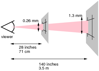
 Taking my arguments about pixels being relative another step, the CSS pixel sizes that device makers use actually tell us the distance away from your eye that they think you should hold a device. Applying a bit of maths lets us work out what that distance is.
 Screen resolution by ratio
 Daniel Davis posted a simple survey of screen sizes which jogged my memory and I thought I would add some more data. I looked at the Google Analytics (GA) for a site I have access to with traffic in the low millions per month, and took a sample of that for December.
 Text size and screen ratios
 The recent 'vexing viewports' article on Alistapart is a call on device manufacturers to choose a reasonable CSS-pixel resolution for each device so that responsive design works. This is something I totally agree with and support, but I'm not sure the iPad mini example they use is as clear it seems.
 In defence of pixels
 I keep reading recommendations for using EMs or other typographical units for layout, which I still don't understand. At best it is an extra layer of abstraction, at worst it is misleading and likely to cause more issues than it solves. I will try to demonstrate why pixels are the best relative unit.
 Relative pixels
Layout methods in web design have gone through a transition in the last few years, unfortunately we're still using floats a lot, but flexible layouts have made a comeback in the form of responsive design - which is great. Recently though, I have been puzzled by people suggesting that we should use EMs for layout...
Detecting touch-based browsing
 I came across a situation recently where a JavaScript widget didn't 'work' on the iPhone. It did technically work, but without knowing about two-fingered scrolling (and when you need to use it), it didn't appear to work. So how do you differentiate the iPhone (and other touch based devices) from a regular browser?
 Stackoverflow dev day London – Roundup
 I’ve just gotten back from a great day at the Stackoverflow Dev Day, I didn’t take my usual copious notes, but I thought a flavour of proceedings would be good to get down. For those who don’t know me, I have to add the caveat that I’m not a …