 The recent ‘vexing viewports‘ article on Alistapart is a call on device manufacturers to choose a reasonable CSS-pixel resolution for each device so that responsive design works. This is something I totally agree with and support, but I’m not sure the iPad mini example they use is as clear it seems.
From the article:
One would expect to see a
device-width[for the iPad mini] more in line with those of similarly sized tablets like the BlackBerry PlayBook or second-generation Samsung Galaxy 7?—around 500 to 600 pixels, as shown in this chart.
However, the tablet comparison doesn’t seem to account for the difference screen size?
The width of the Nexus 7 is 3.75″ inches, and of the iPad mini is 4.75″. which is a multiplier of 1.267.
The CSS pixel width of the Nexus 7 is 600px (in Chrome), so how many pixels wide should the iPad mini be?
600px * 1.267 = 760px.
That isn’t very different from what the iPad mini actually is: 768. I put up a test page and took a photo of them both at 16px, side by side:
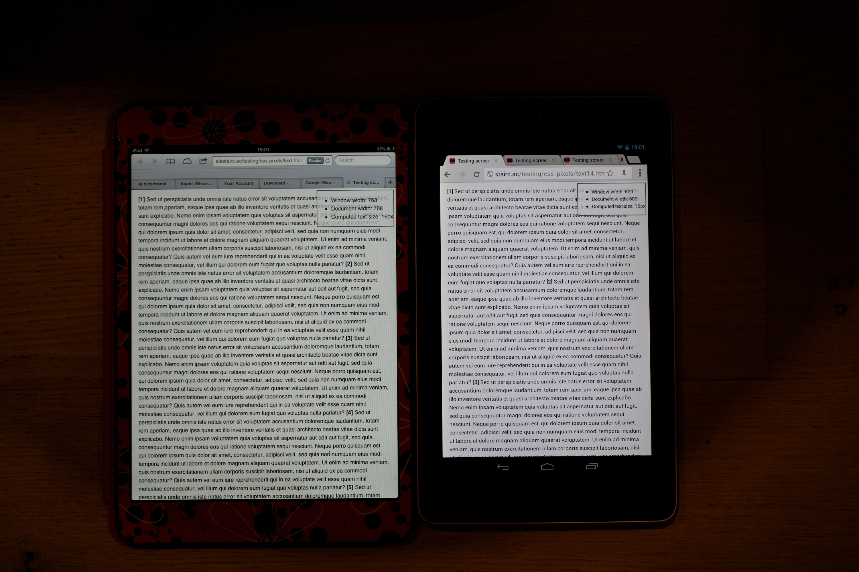
Cropping down to just the text:

The snippet above is full size (from the camera), cropped to show the same bit of text side by side. The iPad is on the left, the Nexus 7 on the right. They seem the same size to me, although the Nexus’ high pixel density looks better.
Interestingly, I’ve been taking screenshots of the Nexus 7 on some test pages for a while, and Google have recently upped the default text size. At the (now) default 17px the text is slightly bigger:
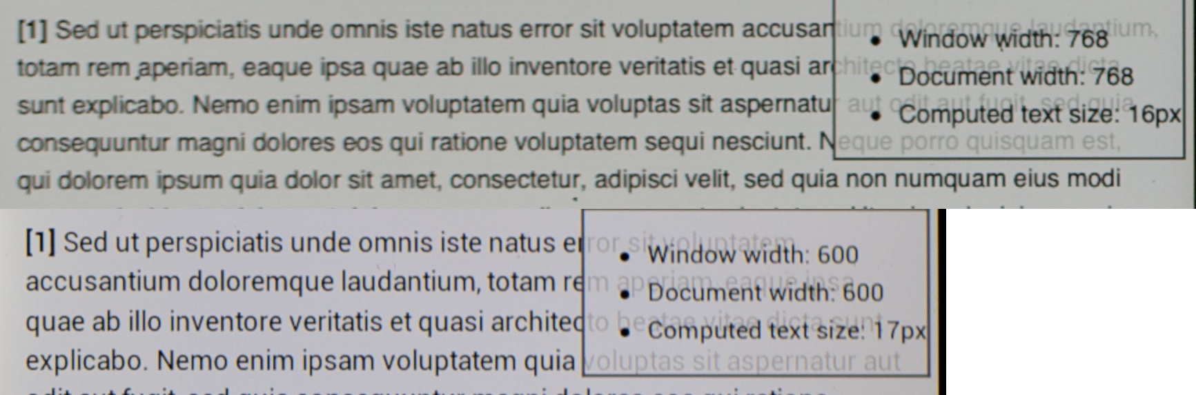
But, that doesn’t affect when media queries will trigger, it just means text will take more space than expected.
It’s about the ratio
I’ve owned the Nexus 7 since it was released in the UK, and I like it, but I’m going to sell it because of the ratio.
The 16:9 ratio of the screen makes it either very tall (narrow columns) or a letterbox. It is great for movies, ok for reading books, but rubbish for websites. Reading websites matters to me more than movies.
Having played with the iPad mini I find the wider (4:3) screen more useful on websites, especially non-responsive ones. The picture below shows an BBC article. On the left I had double-tapped on the first paragraph, on the right the (default) mobile version on the Nexus 7.

In practice I’ve found text on the iPad mini is often bigger than the Nexus 7. The increased of text-size in Chrome helps, but I still find the narrow width in portait makes reading less optimal than a 4:3 screen, and navigating most websites is quicker at full size.
Another interesting point is that Firefox on the Nexus 7 uses a viewport width of 533px, making things appear larger. Perhaps we should consider that the iPad mini is smaller and lighter, and intended to be held more at phone-distance than laptop/iPad distance? The large iPad is actually more akin to laptops in terms of CSS pixels per inch.
So overall, I agree with the conclusion of the Alistapart article. However, the iPad mini has roughly the same CSS pixels per inch as similar devices like the Nexus 7, so perhaps they all need to decrease their viewport width?
Interesting article on viewing sizes – I recently purchased an iPad Mini and I’m trying to see if a Nexus 7 would have better font legibility. The main problem with the iPad’s text is that Apple tends to antialias the crap out of their fonts, leaving blurred forms that strain the viewer for long periods of time. Having defined forms, even if pixelated, is why low resolution faxes or photocopies can be considerably more legible than what we see on the iPad Mini.
HI Mark,
If you have a look at the photo (click for full size), you should be able to see the difference.
I would suggest we swap if I hadn’t already ordered the iPad mini! I’m going the other way, as (despite the worse display-pixel density) the iPad has more display area, leading to larger text in many cases.