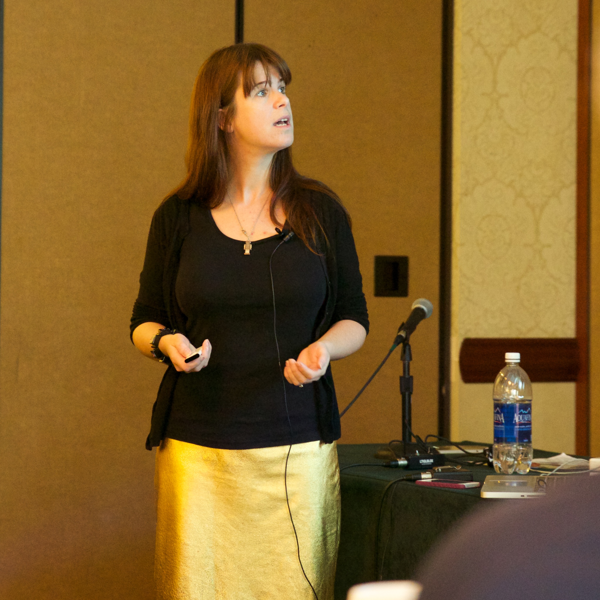
Henny Swan talks about the BBC’s approach to creating a recent mobile application.
Introduction
Possibly for the benefit of the international audience, Henny explains a bit about how the BBC works, license fee etc. This has impacts on how they treat accessibility.
Importantly the accessibility team there is a support function, the product owner are responsible for accessibility (a common theme). The accessibility team are responsible for strategy, policy, third party liaison, tools training/resources and complaints handling.
The BBC have various guidelines (based on WCAG), including of course the Mobile accessibility guidelines.
NB: Non-testable guidelines can only go in as “should” items in the set, even though they are very important.
The BBC have a 4 level scale from total loss of core functionality, to minor experience issues.
Found that some team there would be a QA check like “loss of accessibility”, which doesn’t mean anything. So they have been working on updating the wording and understanding across teams.
Beyond the guidelines
The rule they try and follow is that every new release should exceed the accessibility of the previous version.
Another principle is that there should be choice, more than one way of doing things.
Also, it is vital to manage expectations, if you ask for unicorns you get a cat with an inflatable horn. Make sure you, and the people on the project have realistic expectations.
User research
Review existing apps/content, usability test the ideas for new features. Often ideas for the general population will be great for accessibility, and vice-versa.
NB: They are trying to merge typical usability testing usability testing of people who have disabilities to track the commonalities.
Annotation and documentation
UX work gets thrown over the fence to the developers, and there can be a lot of stuff missing.
Annotated designs & wireframes are vital, including colour, structure, how touch and keyboard access should work.
Henny showed a great looking design with her annotations for the developers.
Development
The BBC works in an agile environment, which has upfront requirements but they are fairly fluid. In each project you do tend to distill those down to say here’s how we are going to apply it.
Remember it is not a unique deliverable, it is an integral part. There are accessibility user-stories and tasks in every sprint, it is part of the acceptance criteria, and embedded into the Definition of done.
There is no single “accessibility sprint”, it must be integrated throughout.
Occasionally you might do an accessibility focused sprint post-testing, but that is the exception. Also make sure that you (the accessibility person) are at stand ups, sprint planning, demos, reviews.
Each sprint should deliver shippable features that work as expected.
See also Karl Groves’ article on Agile & Accessibility.
Minimum viable product must also include accessibility for core features and functionality.
Case studies
iPlayer
The iPlayer apps for iOS and Android pre-dated the recent guidelines, and the teams were learning as they went.
In this case, accessibility was squeezed from the MVP because there were not stable testing procedures.
Now it is incrementally updated, simultaneous changes across iOS and Android.
There are some issues with how VoiceOver works in version 5, 6 and 7.
So, controversial point, but they started screen reader tracking. Numbers, OS versions, usage. Interesting just to get top-level understandings, and since iOS 7 there has been a huge drop in older versions. It was around 60 people on 5 & 6.
We wouldn’t use that data to server different content, perhaps change the architecture to fit screen readers and everyone else.
BBC weather
Launched June ’13 on iOS and Android. Bit of a dream team, including Alistair Duggin who really drove the accessible development.
It was really honed, and some of the things that were improved were:
- Grouping of elements into single touch areas.
- Simplifying the terms, so “UV extrme index 5” becomes “UV low”.
Standard media player
There used to be dozens, which they are trying to replace with one, responsive, cross-platform player.
There is a large ‘vision piece’ for ideas, and accessibility is included from the outset.
It also introduces within-player content discovery, which is great for reducing the navigation for everyone.
However, there was a subtitles issue where they are covered when the new content is opened. Henny took a stand on this, and commissioned some research to try and work it out. This really led to more questions, but it gave some insight into a wider customisation piece.
Next
The way we are consuming TV is changing, and they’ve been looking at:
- Making apps accessible should be business as usual
- Focus on features to make things easier
- Chromecast is coming, which is very exiting. It is the internet of things, controlling things through your device of choice.

One contribution to “CSUN: The anatomy of an accessible app”
Comments are closed.