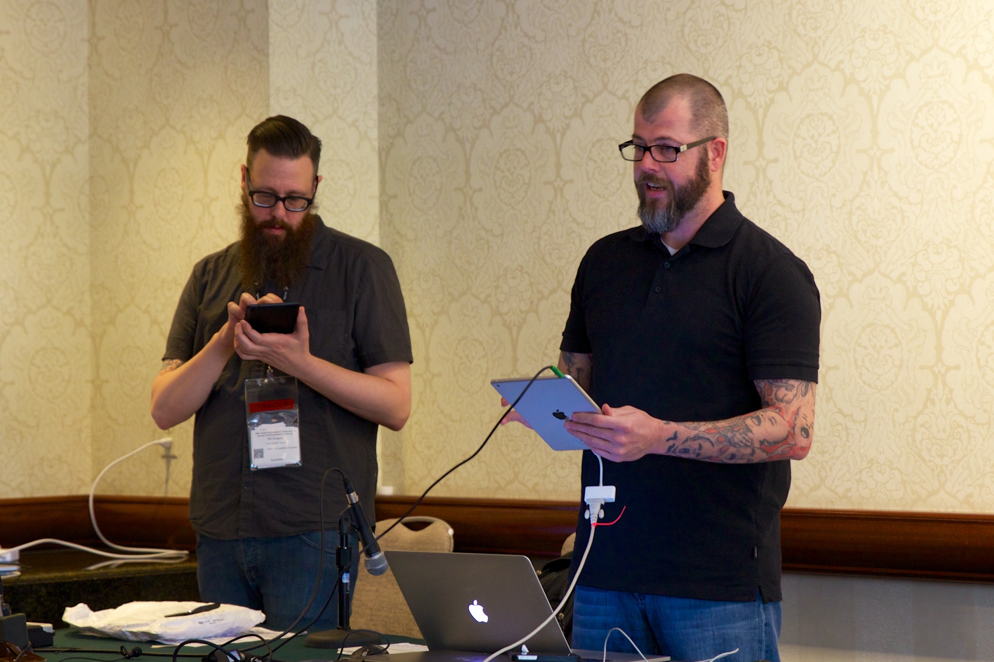
Billy Gregory and Karl Groves talk about demystifying and simplifying mobile testing with live demonstrations and straightforward techniques.
Having done plenty of mobile testing they realised that for the really hard stuff, you need a beard. Or a beer. Both is probably best.
Overview
All the major platforms have some kind of accessibility now.
Blackberry post some information, including a screen reader, although not many people seem to like it. But, there some stuff for hearing impairments to.
Windows phone has a bunch of options under ease of access, e.g. text-size, external screen readers.
Android has a number of features, the talkback screen reader, some 3rd party apps (although the reviews are not good).
iOS kicks-ass and will probably take the limelight. All built in, you’ve got VoiceOver, magnification, colour inversion, and much more.
In terms of what Karl would recommend, it would have to be iOS.
For the purpose of this talk, we’ll pretend that Windows phone and Blackberry don’t exist. And by the end we’ll wish Android didn’t…
Testing Environment
Good to have headphones, and a wireless keyboard as well. Even under iOS, when you try and swipe Fitt’s law can kick it. When there’s a web application, swiping can mean you land on something unrelated.
If there is a dense screen, for testing purpose you can use a wireless keyboard and activate key strokes. At least then you can verify if something works, rather than it just being really difficult.
iOS setup
NB: Karl uses “Airserver” for the presenting. It seems to have bug with repeat mirroring.
The webrotor you adjust with a twist-motion, and it shows & announces the speech options. The options available to you are based upon context. E.g. if you are in a web page you’ll have headings, links etc.
From there you can navigation by swiping down, e.g. by heading.
(AC: I did a cheat-sheet for iOS Voiceover.)
Android
Billy mentioned a few things Android is good at: Zoom features seems much better, and the developer options in the accessibility settings, as you can see the voice output.
In settings, accessibility is all the way down the bottom, but there you can turn TalkBack on.
TalkBack doesn’t have quite such full features as iOS.
To read next/previous you swipe right/up or left/down with one finger.
Select current item: double-tap anywhere on the screen.
Scroll: swipe up/down with two fingers.
Examples
Everyone got their phones on a started trying out the screenreader, chaos ensued!
I tried Canada.ca, which isn’t a bad site (as far as I can tell), but it’s tricky to navigation with TalkBack. From what people have said, TalkBack it particularly buggy with Chrome (the default browser), it’s better with Firefox.
NB: A nice setting in iOS to speed up typing is to choose ‘typing mode’ from the rotor and choose (swipe down) for ‘touch typing’. That selects the key when you raise your finger, rather than having to select and double-tap.
Question on Android VMs: You can’t really test with those, they are buggy and slow.
Question on the keyboard use: That’s really useful on figuring out what the focus is on, and what the order is. Sometimes there is little white space on the page, and it is difficult to tell if an issue is due to swiping or ordering.
Question on automated testing: Deque have something that can scan native apps for missing accessibility information.
“Appium” from Source Labs works with Silenium testing, that might help.
Other resources: If you have an Apple developer account, they have a nice walk through on the developers site.
Ted Drake tweeted about: How does a low vision person use iOS? @Karo_LifeinJoy explains how she uses zoom.

One contribution to “CSUN: Mobile Testing With the Viking & the Lumberjack”
Comments are closed.