The type of layout you choose for a web site is often considered a tricky decision, it seems you can never make a popular layout decision. However, there is a process to go through to make sure it’s as accessible as possible.
First decision
One of the main decision is whether the layout is fixed width, or liquid (or elastic). I posted to a local government usability/accessibility forum about this recently, but thought it would be good to expand on it a little.
Just to start off, trying to make web sites conform to a ‘picture’ (e.g. photoshop) representation is fundamentally flawed, simply because we don’t have that much control over the client end of the medium. There isn’t much disagreement about that amongst developers, but it isn’t always easy to explain that elsewhere.
Using relative units is a double-A checkpoint, although I would admit there is (or should be) some leeway in practice. I’m focusing on the layout aspects of the checkpoint here, assuming that fonts are relatively sized already.
Who does it matter to?
To put it in context, who is the guideline supposed to help? It affects everyone, but in terms of how people are affected, there are several main groups:
- The ‘normal’ group, with normal* vision and standard browsers;
- People who change their browser settings, or are on unusual resolutions;
- People who need increased font sizes, at normal resolutions;
- People who magnify the screen (and may adjust browser as well);
- People on linear browsers, such as screen readers, text browsers and some mobile devices.
(* I’m using normal as in ‘normal distribution’, i.e. within a standard deviation of average. No offense intended.)
Group e is catered to by using a CSS layout (properly), because the source order can be better controlled.
Group a should not be affected by whatever decision is taken on this issue, and get the design as intended.
That leaves those who most affected by this checkpoint, those who change font/screen size or magnify the screen.
What to test
In practice, for a layout to work on a wide range of screen resolutions and font sizes, it should be (at a minimum) tested at:
- 800×600 at max font size in IE, preferably with the accessibility options set (to ignore font sizes);
- 1024 at regular and large font sizes;
- 1600 at regular and large font sizes.
This is not the full extent of possible screen sizes, but it’s still a massive difference, doubling the width:
If the person needs a larger scaling of the text (group d), they should have an appropriate program (such as a screen magnifier). At that point another set of issues come into play, mainly due to multiple columns. (See Joe Clark’s zoom layouts for tackling that, and our followup.)
Combine fixed and flexible
If you’ve been testing sites across those resolutions and font sizes, you’ll probably notice that side columns don’t actually have to scale, if they have some buffer for text to scale up.
With the simple design of this site, using percentages for the columns works well, but taking my company’s site as a more complex design, the sides are fixed width:
The navigation on the left is a plentiful 185px wide, allowing for large words and multiple-word links to wrap. The right hand side (related links etc.) is a bit tighter, and we have to be careful of the content on that side.
However, if you test a site that has a narrow content column, reading becomes difficult when you bump up the font-size.
This affects me personally as I have a laptop with a 16″ screen, but a 1600 wide resolution. I have the DPI turned up, and larger font sizes, and still I have to scale up fonts on the web. It makes some fixed width designs very difficult.
Anyway, the conclusion I am building up to is that yes, there should definitely be flexibility in the design. In simple terms, the content area should scale, and other areas should be checked at various settings with buffer space around text areas.
Still not sure? Ok, let’s see what happens.
Fixed width tests
Taking the more extreme ends of the scale (800px wide with large fonts and 1600px wide with regular fonts), the fixed width is roughly the same as the elastic at 800px wide, but looks fairly silly on a larger resolution:

You can also play with the fixed width example page.
Font based layouts
It is possible to base the layout measurements on the user’s font size, which sounds great. However, in accessibility terms it tends to be a major blooper for those who need it most. At regular font size (for me), 750px wide is the same as 58.5em wide. But alter the font size and suddenly the layout isn’t connected to the window size anymore:
The worse your eyesight, the larger you have the font size, the more horizontal scrolling you get. I’ve tested sites that use this style of layout (and all the others) with people who have visual impairments, it was easily the worst method, fixed widths actually worked better!
Em and percentage widths?
There is an advantage to font based layouts though, and that is for people like me on stupidly high resolution monitors. When you have a large resolution and up the font sizes, the pages ‘zooms in’ (apart from images, unless you pull some funky tricks).
The obvious solution to font based layouts is to apply a max-width in percentage terms, e.g. 100%. This would prevent the horizontal scrolling, and work very much like Opera’s excellent ‘zoom’ feature:

Even reminding myself how Internet Explorer’s CSS expressions work from the original max-width in IE article, I couldn’t get this to work properly in IE 5-6: Em and max-width example page.
Setting a font size on the body (e.g. 80%) seems to prevent the font being reported as anything else. Anyone good with IE’s CSS expressions?
Rounding up
The best options for accessibility are still either a liquid layout (e.g. our Defacto CMS site), or an ‘elastic’ layout, which flexes up to a point, but then stops (e.g. this site).
If you want a black and white rule, then use relative units.
If you know enough to take a more considered approach, then use flexibility where appropriate and test it.
Addendum: reading line length
One of the arguments for fixed or em-width layouts is having an ‘optimal line length’.
Line length is far from a cut-and dried topic, especially online as Joe Clark pointed out before. Some of the best (most relevant) usability research I’ve come across comes from the “Software Usability Research Lab” (SURL) at Witchita University.
Their study on line-length matches the results of earlier and more comprehensive studies I remember (but don’t have links for).
“No effects of line length were found for comprehension or satisfaction, however, users indicated a strong preference for either the short or long line lengths.” (Although it wasn’t significant, the best cpl (characters per line) was 95 in this study.)
That is about as helpful for making a decision as a slap round the head. However, it does add weight to the liquid design argument, as then users have a choice. They may not know it, and you can constrain the choice somewhat (elastic rather than liquid layout), but you shouldn’t take away the choice. I remember a study that compared people’s reading speed and preference, and it showed that people’s speed and comprehension was quicker at their preferred line length, which varies from person to person.
You also have to accept that you can’t actually control someones reading length, even if you fix the width of the layout, as increasing the font size will affect the characters per line.
Tags:
Great article. I work for Florida Blind Services and am currently transforming my pages to xhtml and a tableless format. Your article helps support info I know but can’t enumerate! Thanks.
Hey, just came across this article and your page doesn’t correct in Opera 8.54. It looks fine in Firefox 1.5 though.
Hi Scott,
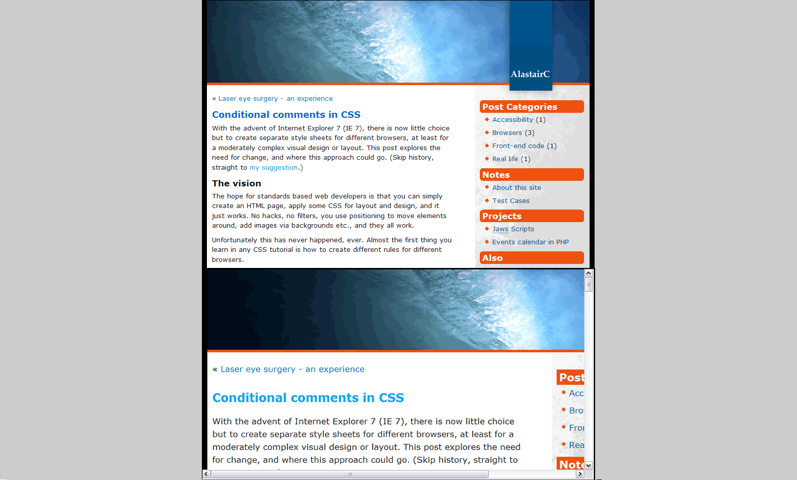
Yep, there is too much margin around the header image in Opera 8.5x. I’ve been meaning to do a test case, IE7 doesn’t get it right either.
Part of the problem is that Opera 9 beta renders it the same as Firefox… and I don’t know of a (valid) way to differentiate between Opera 8 & 9. As I said here:
http://alastairc.ac/2006/05/conditional-comments-in-css/
There does need to be a way…
Thanks, cool article. I’m in the process of redesigning my site and I think I’ve now decided on an elastic layout.
Great article. I’m hear after reading your article from .Net magazine which was also very interesting.
I’ve always used the ‘svendtofte’ method for max width and then customised it for a min width:
http://digitallyrefreshing.com/2006/09/29/too-wide-too-narrow/
But how are you implementing your max/min widths for IE6 on this site?
Thanks!
Hi Matthew,
If you have a look at the source code, you’ll see I bring in an IE < 7 style sheet. Since the expressions for IE are not valid CSS, they are brought in with IE conditional comments, to avoid conflicts with other browsers.
This then uses a similar method to svendtofte’s, but not using EMs, as that doesn’t work if you set the font size (as most sites do!).
I am doing a site for a charity (older people) and we want to use Joomla! CMS. This article shows up a real problem for us beacause as far as I know there is no template for CMSS that are elastic or meet many of these requirements. Any pointers?
Hi Roger, assuming that you are stuck with that CMS, and can’t update the templates, I would base the selection on the testing criteria above.
If it is fairly ‘spaceous’, and reacts well to browser-text resizing it should be ok.
Unless you can push the users towards Opera, in which case they will have a better time online in general…