 I’ve been meaning to sit down and take apart Tantek’s polygons for a while, partly because it looks impossible, and partly because it might be useful. Five years later and today was the day, although it turns out that the usefulness has some limits.
I saw the star, hexagon, octagon etc. and thought “WTF”, what? How? No images! Then I looked at the code, and actually, it isn’t very obvious what’s going on.
Having really dug through, it isn’t that complicated, but Tantek’s code is so efficient (with the multiple polygons inheriting similar things), that it’s really hard to work out. So I cut it down to one, and worked back up again.
Basic Principle
Getting angles with CSS can be accomplished with borders. Most borders are too thin for you to notice, but when you have a really thick borders, they meet at an angle. If they are the same thickness, the angle is 45 degrees. (NB: each of the examples is in it’s own page, in an object, generally treated like an iframe.)
The code for this is straightforward, just use massive borders:
.trapezoid {
	display:block;
	margin:0;
	padding:0;
	width:20px;
	height:20px;
	background: #000;
	border-style: solid;
 	border-color: red green blue orange;
	border-width:20px;
}
You don’t actually need content to have a box as such, just the borders:
You can vary the angle of the border meetings, creating some interesting effects.
Getting rid of a border generally removes that side, including the parts of the top & bottom that you might think would be there.
You can probably see how those polygons are created now, each angle is a corner of a square, for example, this is the top half of the hexagon example:
Hitting the usefulness limit
A lot of the trickier CSS in Tantek’s examples is actually stacking the elements on top of each other without any gaps. (Using things like inline-block and vertical-align:baseline.)
I was hoping that there would be some cool way of doing rounded corners, and I’m sure I saw Tantek do something similar. I couldn’t find an example, but remembered a quote of something like It’s a really big border-dot
.
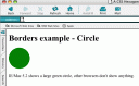
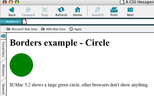
I worked it out, but unfortunately it only works in IE/Mac, and it’s somewhat buggy there as well. Still, doing a circle in CSS is pretty cool (test page):
Feeling that I had to use a polygon somewhere, I thought I’d ditch the (Gecko-only) corners on the sidebar headings and try ‘arrowed’ corners. Long term, it’s not going to replace images or CSS 3, but sod it, it’s my site!
Not wanting to sully my markup, I’m using JavaScript to add this within each heading:
<span class="t l"></span>
<span class="t r"></span>
Then add this CSS:
.t {display: none;}
/* hide from IE<6 */
html>body .t {
  display: block;
  margin:0;padding:0;
  width:0;height:0;
  border-style: solid;
  border-color: transparent #ec540f;
  border-width: 0.7em 0 0.7em 0.4em;
  position:absolute;
  top: 0;
}
/* l = left, r=right */
html>body .l {
  border-width: 0.7em 0.4em 0.7em 0;
  left: -0.4em;
}
html>body .r {
  right: -0.4em;
}
The heading is relatively positioned, so each of the above spans is then absolutely positioned just outside of the left and right.
IE7 doesn’t seem to respect the height properly, I had to increase the size of the borders to include the padding on the heading:
*+html>body .l {border-width: 0.8em 0.4em 0.8em 0;}
*+html>body .r {border-width: 0.8em 0 0.8em 0.4em;}
It seems to work fine in Firefox 2, Opera 9, Safari 2, and (with the tweak) IE 7.
For some far more fantastic uses, see:
CSS polygons may not be the answer for many practical web design problems, but I will always remember them as an example of stretching a mechanism for purposes other than the intended.
Technorati Tags:
just a quick note to say i really enjoyed the CMS accessibility talk this morning – it gave us all a lot to think (and talk) about. cheers!
Thanks Jon, it’s tricky as so much of it is in the detail, but I think quite a few important points came out that will save you effort in the long run.
Very neat. ’bout the cirle, You could use border-radius (and, of course, -moz-border-radius) to make a circle. Although it won’t be a perfect circle, at least not in my FF win/2.0.0.5.
http://gazonk.org/~wille/circle.html
Great idea Wilhelm, and it shows how these things are really working.
Thanks.