If the editor has followed the earlier HTML and CSS guidelines, many accessibility issues have been avoided already. This post is essentially a list of things a WYSIWYG editor could do to help authors not create accessibility barriers.
The methods of preventing problems tend to fall into three main types:
- Interface: making it more difficult to create inaccessible content with the interface, either with good defaults, or things like required fields. Generally my preferred method where possible.
- Presentation: Making inaccessible content look wrong. E.g. nested
blockquotes could have a red background. - Enforcement: Using scripting or server side processing to highlight and enforce fixes for accessibility issues. Actually my least favourite method due to poor machine detection and potential author-frustration.
The second method I’ve used for a while with developers and during QA, the best article I’ve seen about it is called: BRAT, but for the most part the errors being shown there shouldn’t be possible to create with an editor anyway.
Going through various aspects in roughly the WCAG 1 checklist order:
Suitable alternatives
An invisible aspect for most people, alternative texts have to be enforced, but also, it isn’t that easy to know what to put. If you enforce alt text without helping with the what, the people using it are likely to be resentful and put in random garbage.
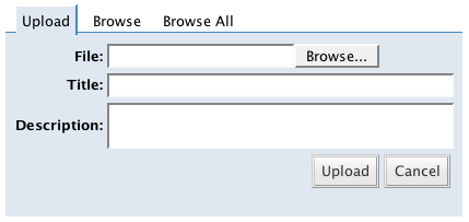
What is needed is contextual help, an aid at the time it’s needed most, when you are adding an image. Generally you’d add an image from file, and have a title and/or description field like this:
To encourage better use of alternative texts you would have to tackle it in several ways, whilst ensuring you don’t make it any harder to add an image. As well as training (i.e. telling people why they should include text alternatives), I would provide two layers of help:

Renaming the label “Alternative text” actually says what it is (an alternative), without getting it confused with a title, which is often taken to mean caption. I would also added a help icon with the most basic advice in the title, and it would link to a more extensive help page.
(Ironically I’ve used WordPress for years, and didn’t realise that adding a description could be used for what is effectively a longdesc.)
For the help page, I would create something concise from one of the better alternative text explanations (e.g. Jim Thatcher’s or Joe Clark’s).
The alternative text field should be a required field (at a minimum). If the editor is only for the content area, I can’t think of any justification for using null alternative texts, as it is part of the content. If editor is used for more than content, using an empty alt attribute might be needed.
There are certain alternative texts that should be discouraged, but possible, such as file names (ending with .jpg, .gif or .png), texts longer than 100 characters, and perhaps non-dictionary items. It is also a good idea to include alternative texts in any spelling checks that are performed, they can quite often go unnoticed until it turns up on Google images or you check the site in an alternative device.
If the editor allows the additions of other non-text objects (e.g. multimedia) then alternatives should be similarly enforced.
Headings
The checkpoint is to: Use header elements to convey document structure and use them according to specification.
The way that automated checkers have dealt with this has caused some strange and awkward authoring and templating practices. Basically, so long as you don’t descend more than one heading level at a time the automated checks will pass the page. On this basis, pages without headings, or with just levels 1 & 2, or 5 & 6 will pass, none of which are very helpful to people.
My criteria for this is that the main heading of the page should be an h1, and the other headings should mark the structure of the document in a why that helps understanding and navigation. Think of headings as creating an automatic table of contents and you shouldn’t go far wrong. Using headings ‘according to spec’ usually aligns with an understandable structure, but shouldn’t subsume it.

Perhaps it would be possible to detect if the content is of a certain length (e.g. over 300 words) and show a post screen for the heading, such as the document outline example above.
For the purpose of an editor, it is common for the main heading to be defined as part of the page setup, rather than in the editor. If that is the case, the interface could be restricted to only show from h2 onwards.
It is also important to make sure that authors don’t tend to use the wrong headings because of how they look. On one client site the authors preferred the look of h3s because they were smaller and bold, and used them rather than using any h2s (which were large and orange).
As well as making sure that using headings correctly looks right (and encouraging their use), you could add some script based checking. Perhaps something that creates an array of headings in the content area and checks for any headings that descend more than one at a time. Then add a class to erroneous headings that makes them look very wrong, e.g:
.heading-error {
   border: 1px #f00 dashed;
}
.heading-error:after {
   content: " - inconsistent heading level.";
}
Considering IE’s support for generated CSS content, a JavaScript equivalent is probably more effective.
The final check is that people aren’t creating defacto headings, e.g. a line of bold text. Again a JavaScript style check for any paragraph, div or line on it’s own that is wholly bold or strong would do the trick.
Lists and quotations
There is little an editor can automatically do to detect when someone should be using lists or quotations but is not. Detecting several instances of dash-space on new lines might have some limited value. In a similar way you could detect paragraphs surrounded by quote marks. However, neither of these are particularly robust ways, and should not be enforced or relied on.
I wrote about using a ‘quote’ button rather than an indent button in a previous article, and the editor should not allow nested quotes. If for some reason it cannot enforce that, you could set the CSS to prevent people doing that:
blockquote blockquote {
   background-color: red !important;
}
Link names
Link names should be descriptive of the target, which is difficult to automatically assess, but there are a few checks that could be run either whilst editing, or an on-save check.
A script could check each link on the page (ideally including all links, not just those in the content area), and do the following tests:
- Check for common non-descriptive names, such as “more”, “read more”, “click here”, and “here”.
- Compare the link text and URL for all
aelements, and highlight any where:- The same URL has different link text.
- The same link text has different URL.
Keywords first
It is helpful to put keywords first in any particular listing, whether it’s a list of links, or the headings on a page. If each link in a list of chapters starts with “Chapter”, it’s difficult to scan through visually, and even harder aurally. (Ahem, this page of all the WYSIWYG articles is a bad example.)
The only check I can think of for this is to use a script to check the first few characters (e.g. 6?), and highlight this as a potential problem.
Checks not covered
Quite a few items from the accessibility checklist have not been covered here because they either don’t apply to the context of editing a page with a WYSIWYG editor, or they (should) have been prevented from becoming issues by previous posts. However, there are some that I don’t think can be automatically checked or prevented easily, if at all:
- Changes in language: How do you check for a section in a foreign language?
- Use the clearest and simplest language appropriate for a site’s content: One of the most important, but most subjective issues.
- Flickering/blinking images or objects, or those with text within the image: Anything buried in an image or object is beyond any simple check.
Help for authors
Although the editing interface should be self-explanatory, ‘intuitive’ and in general not need help, some people will need it. Help for the meaning of accessibility issues, and what they can do to fix them should be built in as a natural part of the help. Apple’s help in OSX is pretty good because the help icon is usually context-sensitive, i.e. the help page you get depends on what you were trying to do.
Have I missed anything?
I am only one person, if anyone else has any useful tips or ideas, please do leave a comment. There are hundreds of CMSs, and I’ll try in include anything extra that you come up with, assuming that it hasn’t been covered already.
The next step in this series to coalesce the articles into a usable checklist for evaluating the editors.
Technorati Tags:
You would probably be interested in the Authoring Tool Accessibility Guidelines (a companion document to WCAG). The working group home page is http://www.w3.org/WAI/AU/.
The guidelines are still under development, so we would be very interested in hearing your feedback.
Hi Jan,
I am very interested, and I’ve been through the version 1 Authoring tools guidelines in detail for the editor checklist I’m producing. (The checklist should essentially be a specific version of the guidelines for WYSIWYG editors.)
I’m currently reading through the version 2 guidelines, partly for this, and partly for our CMS. It’s taking a little time to work out what applies and how, so if I have any comment to make I’ll check the site and see where I can contribute.