Following up on the responsibilities in accessibility, some of the most critical gaps at the moment are on the User Agent (UA) end. Improvements here would actually make the most difference to accessibility in general on the web. This post highlights the things I think would make the most difference to people’s experience of accessibility on the web. If I get into too much detail for you, skip to Profiles, that’s the most important aspect.
Sizing, layout and colours
Text sizing vs zoom
Text sizing is easy to set, easy to adjust, and easy to break a web site by making adjustments!
The site’s responsibility is to ensure that the layout copes with an increase in text-size, which has been made part of WCAG 2. (In hind site, 200% of very very small isn’t going to be partcularly big, but the chances are that the layout will have similarly small margin for expansion as well.) Much of it is good practice, and for a ‘how-to’ check out Dan Cederholm’s Bulletproof web design.
The user already has control over the text size, but it isn’t very usable. A recent extension for Firefox shows a great example of how it should work:

In this case, it also saves the preference on a per-site basis. It might even be included in Firefox 3 by default.
That’s good, it will help for people with minor visual impairments, or those with very high resolution displays. However, it isn’t enough for many. Opera’s full zoom (images and layout included) is a very powerful mechanism for coping with small text and layouts that won’t leave you squinting at images. (It would be even better if it could handle increasing the system fonts as well, the text in the zoom control is cut off on my PC.)
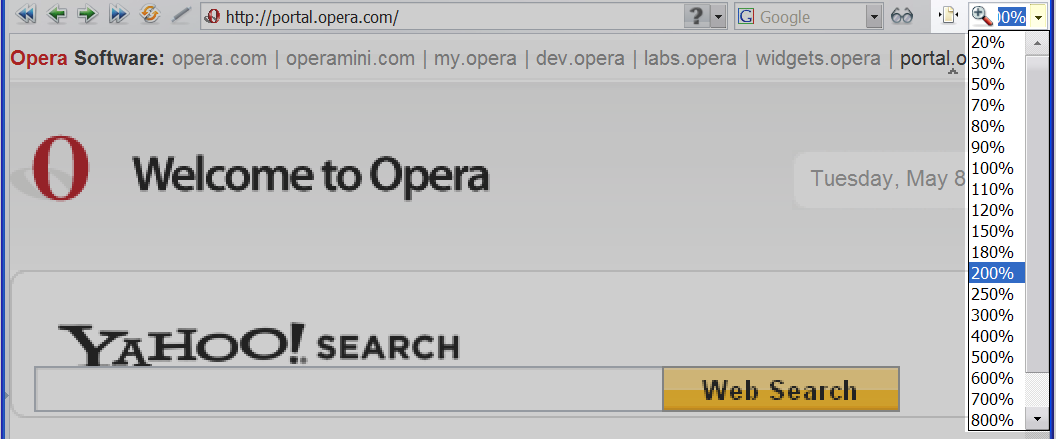
Opera’s zoom is better than other browser’s versions because you can turn on or off the ‘fit to width’ option, as well as setting global defaults. If you use a massively increased size (over 400%), it will switch to a one-column zoom layout. Apart from making users choose whether they want this functionality when they install, it’s difficult to see how this function could be improved.
Opera also allows the user to change the styles applied to the page, so you can use high or low contrast colour schemes and remove the layout:
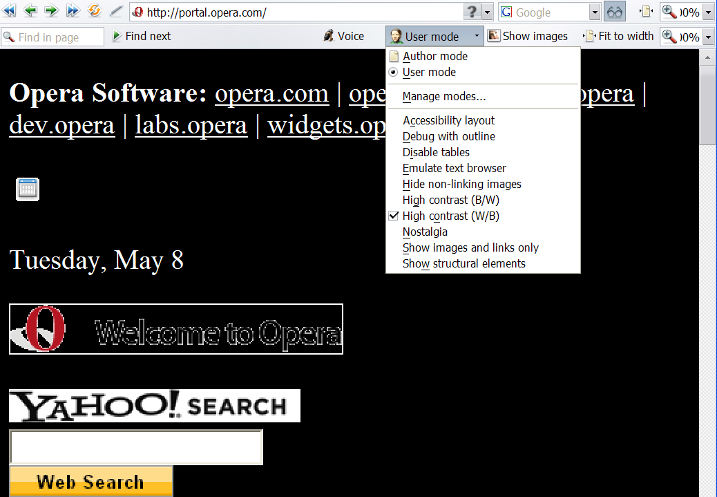
However, this feature is something of a sledgehammer on a walnut. It pretty much destroys any personality the site had, and some images (with transparencies) will be difficult to read. Given that our research into Zoom layouts suggested that a simple 2 column layout with well sized contrasting text was the best option for those with mild/moderate visual impairments, it is something that a site could handle better than the UA.
Ideally, a site would provide several alternative styles that still have some personality / branding, and allow the user to choose between them. In fact, the ideal would be that a user sets up (or is forced to choose) a ‘profile’ and they automatically get the best layout and colour scheme for them. (See profiles below.)
One thing that can be dealt with fairly well by the user agent is highlighting the keyboard focus. It has even been considered as a core part of Firefox. If a site provides these, great, but the user(-agent) can and should override them if that’s what the user wants. Given that people who don’t use the keyboard for navigation will probably never see this, it is probably best for browsers to have highlighting of focus enabled by default, with an option to turn it off.
Prevent ‘changes of context’ or flashing/blinking
Automatically refreshing or redirecting pages can be confusing, especially if you can’t take in the whole page at a glance. Flashing and blinking content is an obvious problem for those with epilepsy, and can be a severe distraction for people with cognitive issues.
All of these things can be turned off in the browser, but there are usability and experience problems with doing so across the board. Essentially, the user needs more control, more easily, than they currently have.
The parts are all in place, each problem can be turned off or prevented, but there isn’t an easy way to do so. Firefox’s accessibility toolbar has much of the functionality, but is not an extension aimed at people with disabilities as it includes everything possible, including tests. It also doesn’t include the required notifications.
Browser notifications
If things like automatic refreshes are a problem for the user, they need to be blocked in general, and allowed when the user wants. There are several interaction methods in use for this already, from adding an icon to the status bar, adding a large bar at the top, to pop-up dialogues. Each has a certain level of intrusion, depending on how much the browser developers wanted to interrupt the user.
I’m going to assume for the sake of conciseness that each of these methods is accessible, but obviously changing the status of an icon requires you to check, adding a bar (with sound effect) is noticed but can be ignored, and a dialogue requires you’re attention.
If you’ve set your browser to ignore pop-ups, redirects and refreshes, how should you be informed?
- Pop-up windows
- This has largely been dealt with by browsers, unwanted pop-ups no longer open new windows in most browsers. The status bar icon is used if anything, but now site’s generally know not to use unrequested pop-ups.
- Automatically refreshing pages
- If a page automatically updates (for a good reason), the chances are you would like to let it – when you are ready. This would lend itself to the status bar icon or top-bar approaches.
- Re-directs
- A slightly trickier one, as in some cases (ahem, Microsoft), you are sent via about 15 re-directs when you login to something. For these cases, you would want to allow re-directs on a site, domain or even time basis (e.g.
*.microsoft.comor 5 minutes). This lends itself to the top-bar or pop-up interaction style.
Animations
Animations can be very distracting, but they can also be real content, so a broad-brush rule to stop all animation will not be particularly useful. The Firefox extension Flash block has this covered for Flash, but from the accessibility point of view it would be best applied to all animations, including animated GIFs and any other objects.
An option like this where you selectively play what you want is ideal.
A slightly tricker problem is when JavaScript is used to move things around the page. It would be nice to stop large adds being moved over the content, but not to prevent the usability touches that show where a items has disappeared to (e.g. when a program minimises to the OSX dock).
For JavaScript, I would trial the prevention of movement based scripts from working, but put a ‘play’ button in a corner of the screen (with an audible beep) when something tries to move.
Skip links
Skip links are one of the few things I recommend people do from WCAG 1’s priority 3 guidelines. Getting around a page can be quite a time consuming process on a keyboard, whether or not you can see the page, it’s a linear process.
However, it is something that can be at least partly built into the user-agent. If there are a bunch of links with no non-link content, provide a key command to skip over it (JAWs uses N for this).
Currently, to provide a better experience the site can provide useful short cuts that make sense to those using a linear device (a screen reader, text browser or small screen device). For example, if your navigation is at the end, a "skip to menu" would be useful.
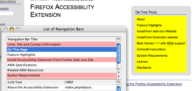
However, with a site that has a good (and consistent) structure, this is all available now. The Firefox accessibility extension includes several methods of navigating by page structure both visually and for screen reader usage:
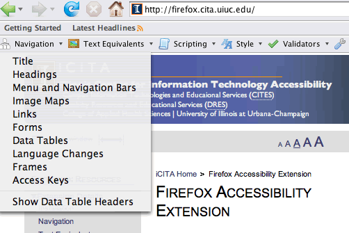
If you select the menu and navigation bars option, it highlights the menu bars that it picks up on the page:
The whole point of a well structured page is that you can programmatically identify these things, and give them meaningful names for people to use. Which brings us nicely onto the W3C’s ARIA work.
In future you should be able to use XHTML role landmarks to improve document navigation, in fact Firefox with the accessibility extension already has some support for this. Once these are reasonably well supported, skip-links become obsolete. A short cut in the meantime would be consistent id and class names (Doug Bowman’s presentation), as would some of the new elements from HTML5.
Accessing useful attributes
Some elements and attributes are already used, such as lang attributes that can be used by screen readers to automatically switch the speech synthesizer, and titles that provide explanation for abbreviations and form inputs. But there are quite a few that would be useful to add:
cite- On
blockquoteandq(mainly, butdelandinsas well), where the author can provide a reference URL. I make these explicit on this site with JavaScript, adding the cite as a link at the end of the quote, or as anonclickfor theq. title-
Titles are available for people with mice, Jaws or Windows Eyes. However the mechanism in screen readers isn’t that great. For links it is either ignored or replaces the link text (in Jaws), and it’s generally ignored on most elements.
What you could do with is an audible alert (called an ‘audio icon’ by some researchers) each time you find a title, and a keyboard command to read it out.
NB: There would have to be a preference to turn this off, as there are quite a lot of sites mis-using title.
hreflang- This underused attribute indicates the language of the target URL, and could be used to alert the user that it’s in a different language.
- Microformats
-
Although there isn’t a mainstream browser that is ‘microformat’ enabled by default yet, it would be pretty easy to give an alert when a microformat is encountered, and allow the user to sending it to the appropriate program. For example, in a screen reader it could use an audible alert to say that this element contains a microformat, and the user could interrogate the item to find there is an address, and add the contact details to their address book.
(My favorite example that doesn’t exist yet: taking a geo-location from a site that you can immediately download to a GPS device and find your way there – without sight.)
There maybe other useful attributes (or elements) for assistive technologies to use, any other suggestions?
In terms of responsibility, there is a responsibility on the user to know how to use their technology. I’ve observed usability testing with someone using JAWs, who came across a perfectly marked up data table, but said that she would contact the site and complain about the accessibility. She didn’t know how to use tables in JAWs. Of course nothing was said about this during the session, but we did not recommend that the site dispense with tables!
Profiles
This is the item that could make the most difference overall: allowing users to easily set up a profile that web sites can access and use to customise the experience.
Ideally this would be part of the browser, where it asks the user on first-loading whether they would like to set preferences to make sites easier to use (or words to that effect). Interestingly, Christian Heilmann had a similar suggestion at the recent WSG-UK meeting, where he suggested that large companies (like Yahoo!, Google & Microsoft) who have central identities for users could allow them to set an option such as “I use a screen reader”. It is certainly better than sniffing for assistive technology, which even the creators of Flash-aid would only use to give the user the option to opt-in to accessibility enhancements.
This isn’t a new concept, Kynn Bartlett was suggesting similar things (using XML/XSL) back in 2000. I see standardised user-profiles as the only realistic way to balance up the responsibilities of the site and user in a usable fashion. The basic principle is that the user-agent sends certain information in the http-request headers which the site can use to customise what the user receives.
To set this up, the user would be presented with the option to customise their experience, and could choose from options like:
- Increase the text size.
- Reduce the columns (where provided by the site).
- Reduce the columns anyway.
- Use alternative colour schemes when available.
- Enforce your own colour scheme.
- Prevent animations playing automatically.
- Show page navigation options.
- Prevent pages updating.
- Disable scripting when the site makes this possible.
Each one you ticked could then take you to further settings, such as how big should text be, and what your preferred colour scheme is.
The site would then check the user’s preference and adjust the HTML/CSS/scripts (or other technologies) appropriately. For example, if the user’s preference is for a light-on-dark colour scheme, the site could have one prepared that works with all the images, which is an issue if the user agent applies a colour scheme regardless. Another example is to disable the scripting when the site accepts that preference (i.e. it’s done unobtrusive scripting properly).
In this way the user can choose to completely over-ride the site (which is currently possible, just difficult), or use alternative displays when made available (and more usable) by the site.
Wow! Someone actually remembered my old Edapta work… I’m touched! *sniffle*
Alastair,
That’s a great idea. The only issue I can see is that, for the site developer, it increases exponentially the burden of testing as there are now so many more variations in user-agent behaviour.
Hi Tim, thanks for dropping by 🙂
It kind of depends how you view it, it could be less?
I’m pre-empting the next article really, but I beleive that the core responsibility on the development side is to separate content and style so you don’t create a barrier to the user adjusting the pages for themselves.
If you add extra functionality for accessibility (due to supporting particular audiences, a very ‘flashy’ pixel perfect site, or having the budget), I think it should be in quite a defined (standardised) way that supports the methods above.
To be fair, there aren’t more variations above than are available today, I’m just suggesting that they are made easier to find and use.