Doug Schepers on data visualisation with Web technologies such as SVG, Canvas, ARIA, and the Web Audio API, so that you can make accessible information graphics.
NB: I have tried to describe what was there, but please do check out Doug’s presentation and demos.
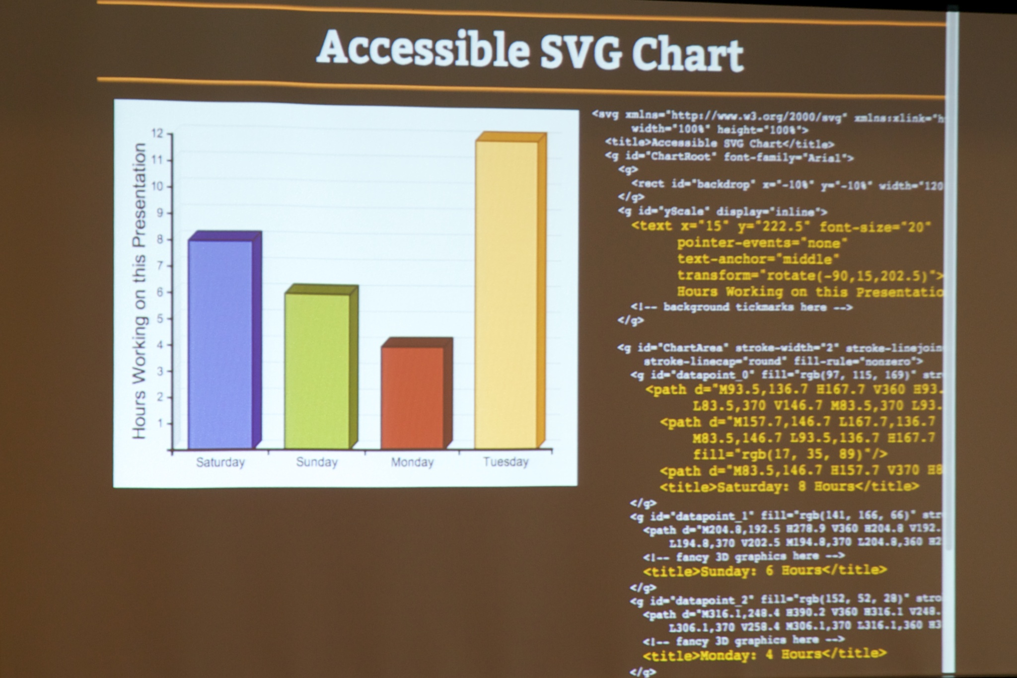
Doug (@shepazu) starts with a demo of the issue that SVG (Scaleable Vector Graphics) can help solve: A graphic (chart) is included in an article without sufficient alt text, then assume’s you can see the details of the chart when concluding the article.
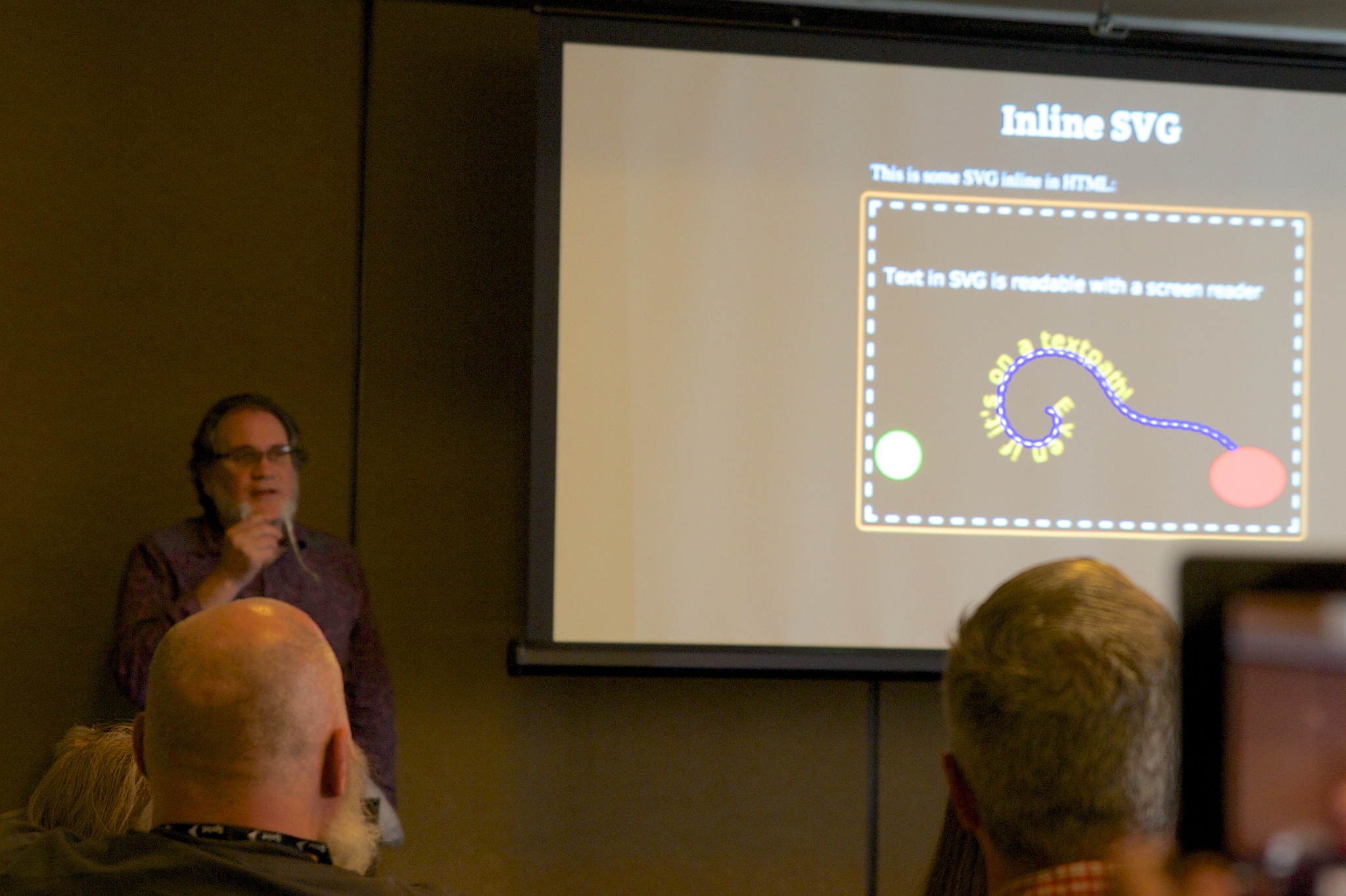
There is a slight caveat when talking about SVG though, in that support for SVG (at least in accessibility terms) is not 100% yet. There are two broad types and for Inline SVG (where it’s embedded in the HTML content) screen readers tend to do reasonably well. However, it’s less good for SVG brought in from an external file.
Doug notes that SVG has several advantages for infographics:
- Works well with “retina” displays because it scales.
- Data portability, as it’s machine readable, also good for search engines and screen readers.
(AC: I think there were a couple more points but I missed them.)
Considerations for data visualisation
Doug went through a few advantages of graphics, good practices and cognitive effects for information graphics in general.
Better for cognition
The “pictorial superiority effect”, where 75% of the sensory processing of the brain are taken up by vision. The brain is pre-disposed to visual interpretation.
Using visualisation has real advantages for people with cognitive disabilities. Amongst the general population, data-retention after 3 days is much better with use of pictures. The effect also increases with age, i.e. children are not as pictorial as adults. (AC: Surprising, I’ll need to look that up, Doug recommended “Brain rules” by John Medina.)
Visual processing
Doug showed a table of scores in a game for three players, highest overall score should win. It appeared that player one has the highest scores.
When shown as a diagram, you could tell player 2 won, as their bar was longest. Player two scored better on average, although not as highly as player 1 in some games.
Learning modes
When you use more than one modality (seeing, hearing, touching, writing), your learning improves.
Anecdote: A UI designer in Israel read about a study in Japan where more attractive interfaces were reported as easier to use. He didn’t think that would work in Israel as they are a touch people who prioritise functionality. He re-ran the study, and it did replicate the Japanese study.
Beauty is an accessibility requirement, just like it is for usability. It improves what people think they can do.
Visual bias
Doug shows a visual illusion of a pie chart with red, yellow and blue sections. The yellow section appears slightly bigger than red, but when in a bar chart it is obvious the red bar is higher. Pie charts suck for reading subtle data.
Visual vocabulary
We had to learn all these chart types: bar, pie, flow, gant, clock etc. They are a learned vocabulary, people tend to underestimate how much processing is needed for these so keep them simple.
Complexity
Complex visualisations can be very ugly, he shows a combined bar/line chart that’s very mixed up and virtually impossible to interpret.
You are the person in charge of portraying the data, so don’t just throw things on the screen. Write poetry, not novels. “Say” it as simply as possible. It is important for accessibility, and helpful for everyone else.
Showing a scatterplot with a magnifying glass circle, to demo what it’s like with a magnifier.
You loose context. These people are also called “phone users”.
SVG scales well, Doug demos the HTML5 logo at different sizes, and it adjusts. You can use media queries with SVG! (AC: Obvious in hindsight, but that hadn’t occurred to me.)
With data you can adjust the level of detail at different sizes.
Brewer Palette
This is a set of colours by Cynthia Brewer, a GIS/mapping person. In order to make colours easily distinguishable she made a set of 3 palettes.
- Discrete palette is for quant data, the colours are distinguishable.
- Sequential palette for ordered / stepped colours in close hues.
- Diverging palette for showing a range of things, that go through a couple of hues.
Doug shows a map of Australia’s regions in the discrete palette, which he then applies some fairly hideous patterns. However, this apparently ugly diagram would be great for a printed, embossed version for people who are blind.
Effectively a “haptic style sheet”.
Interactivity
Navigation challenges include sip-puff interactions, visual impairment, dynamically updated content, tabindex, document order & grouping etc.
Canvas and the shadow DOM
The shadow DOM is a little fragment inserted into the DOM under the canvas. One of the reasons it is there is for accessibility.
Doug demos a canvas chart with underlying markup that uses WAI-ARIA to mark it up.
The difference in SVG to canvas, each element in SVG knows what it is. Canvas doesn’t provide that hook for free, you have to make that happen.
ARIA attributes
Doug likes to use attribute selectors in CSS, e.g.
button[aria-pressed="true"] { fill:gold; }
Auditory
Doug shows a line chart that dips at the middle, dates 2007 – 2011.
If you can see it you can see the trend, which you can then play audibly. It produces a sound that goes up & down based on the hight of the chart, running left to right.
Olfactory
(AC: Funny, but you had to be there)
Future
An ARIA vocabulary is being worked on to codify it for SVG. At the moment it is the same as regular ARIA.
In future it will provide hooks for navigating, finding connections, and other SVG specific things. For example, highlighting reference points in a diagram.
Connectors is a new, upcoming spec.
Webplatform.org is the place to find information about this stuff.
There are very few W3C staff who can work on this, so if you are interested in SVG please join in!
One contribution to “CSUN: Invisible Visualization: Accessible Information Graphics with Web Tech”
Comments are closed.