Aaron Leventhal and Marc Zablastsky talk about “sitecues” from AI squared, a widget you can add to a site that enables zooming and auditory output.
Zoomtext claim 80% market share in the low-vision space. They believe they have a unique expertise in low-vision users and wanted to provide this to more people.
Why the product is needed
The sitecues product has been in progress for a couple of years, 18 months of build so far. They had thought there would be a download as part of that, but it is completely browser based now.
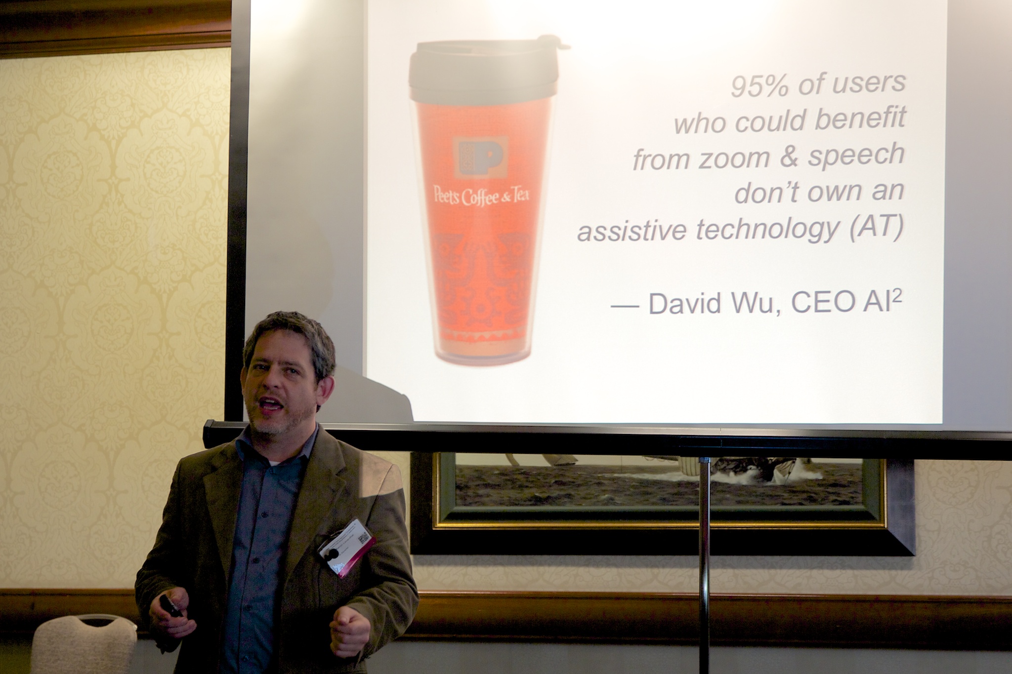
David Wu, CEO said 95% of people who would benefit from screen readers/zoom don’t use assistive technology (AT).
The ramp for getting people/organisations into accessibility is often:
- Checklists
- Testing with real users
- Changing the process
Really though, you’ve built a ramp with a section missing at the start as people don’t have the AT.
In order for people to be aware of AT they need to consider themselves disabled, and not that many people do. You also have to know that AT exists, find the one that fits your needs, pay for it, and then learn to use it.
People with AT tend to be savvy users with a clearly diagnosed disability. That’s about 0.15% of the population.
Who’s left out:
- 7% low Vision
- 10-15% Dyslexia
- 15% non-native speakers
- 21-40% Low literacy (1/5 have 1st or 2nd grade reading level)
- 35% Older generations with gradual sensory loss.
Sitecues aims to be a simple AT built into websites, looking at the market that’s 100 million individuals with a spending power of £150 billion (“Forrester and numerous sources”). (AC: I assume that is US figures.)
Features
It is easily discoverable
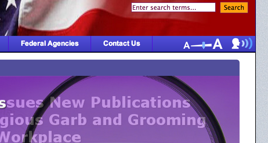
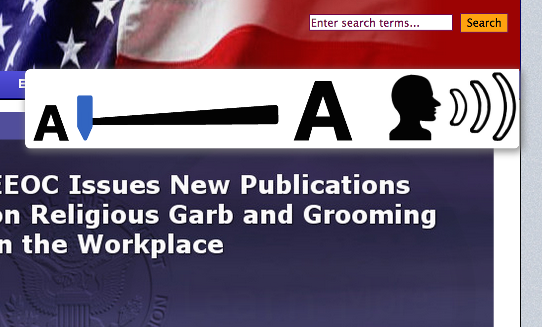
It is in the webpage, it is a slider going from small to big, and the widget expands when you mouse-over it, so it is very clear.
It is Universal
No manual, no jargon, no labels (as in “disability” or “accessibility”).
It is as simple as a dimmer switch.
Zoom interface
When you use the slider, going up a little zooms in a bit, and it auto-pans.
It also highlights and increases the size of the mouse pointer, and highlights the currently moused-over block.
It includes an ability to zoom in on particular parts of the page by pressing the spacebar. It blows up the element you’re mousing-over, lightbox style, space to close. (A bit like previewing files in OSX.) This can be applied to form controls as well.
Speech interface
Speech can be enabled by turning it on, mousing over the area of text and pressing space. It reads out with a very natural (female) voice. They are considering changing the default to a male voice, as it can be better understood by older users.
Other aspects
They check for use of browser zoom and adapt to that.
Mobile / tablet versions are in the works, as the features you would want are different.
The more the website has done for accessibility the better sitecues will work out of the box.
See some examples at eeoc.gov and texasat.net.
Business model
Their model is organisation-centric. The organisations were saying “we want one solution for all our customers”, and sitecues is platform independent. It it can be up and running in an hour, and it can provide metrics on usage, cookies provide a (non-personally identifiable) ID.
The licensing is based on traffic, so small sites (e.g. 10,000 visits or less) would be low thousands of dollars per year. The biggest cost component is licensing the TTS, so it is sized by traffic.
Questions
- Did you consider using a responsive design approach instead of panning?
- sitecues would work with that style of design, in fact it should be better. (AC: the examples don’t seem to be responsive but if it uses the zoom of the browser that makes sense.)
- “Essential accessibility” is gaining some traction, how does it compare?
- We believe our user-experience is a lot better, just look at the products. (They showed a screenshot of the other interfaces, they appear to have a good point.)
My thoughts
This appears to be the best of the site-based accessibility widgets available. Way back in 2006 I wrote about Subscription accessibility, at the time with Browsealoud in mind:
Whilst browsealoud is a good product to use, I don’t consider it a sustainable strategy. The product could work for all sites, but the company has decided on a strategy of charging site owners to ‘enable’ their site, at an expensive yearly cost. Nothing in the site is changed to enable speech, it is just that people with the plug-in are allowed to use the site.
This strategy is their prerogative, but I just don’t see it as the best solution. From the user’s point of view, there will always be some (in fact many) sites that are not enabled, either due to cost or not knowing of the product.
Sitecues does mitigate many of the issues I had at that time. For example, the super-simple interface means you don’t have to learn it, so it is less of an issue that not all sites have the widget. Also, the lack of download smooths the process considerably.
I think the last niggle would be that it feels like something that it would be better as a browser add-on, something on the user-agent side of things. Then a user that likes or needs it could use it across all websites.
On the other hand, we know how few people who need AT actually have it, so building it into sites makes sense from a marketing point of view.


One contribution to “CSUN: sitecues”
Comments are closed.