There are some interesting discussions on customisation going on with the work on WCAG 2.1, the much anticipated (I hope) update to the Web Content Accessibility Guidelines. This is a little inside-baseball, but I’ve tried to make it understandable for a wider accessibility-audience.
Disclaimer: I am a member of the Accessibility Guidelines Working Group, but these are purely my thoughts and do not represent the group.
When trying to make websites more accessible to more people, you run into issues working out who is responsible for what. Is it the browser, the site, or a bit of both?
For example, someone who needs to make things bigger can use the browser controls to increase the size of things by 200% fairly easily. At the other end of the scale a website could provide controls to simplify the layout and add easy-read icons to specified areas.
I won’t be making a judgement on whether or how much WCAG should require adaptation or personalisation, but I do want to work through what it means in practice.
Key terms if you are new to this level of accessibility nerdery:
- User-agent (UA):
- What a person uses to access a website, usually a browser but it can include plugins or assistive technology such as screenreaders.
- Author:
- The person(s) who make the website. A catch-all for designers, developers, website owners etc.
- SC
- Success Criteria, the testable statements within the accessibility guidelines. Most people just think of these as “the guidelines”, but it’s a level down.
I think there are four broad levels of user-adaptation that impact the effort required from authors.
1. Within the author’s default styles
Some adaptations easily work within the site’s styles with very little effort from site authors. The main one is to zoom in (or out). It is built into the browser interface, and generally works regardless of what the author does. It may not work well if it is not a responsive design, but it doesn’t break the layout.
Supporting this level of adaptation takes near zero effort on behalf of the author (if you cater to small-screen devices already). There is a potential new SC about supporting a 400% increase in the size of content which would push up the level of effort in some cases.
2. Overriding author styles without impacting layout
Some adaptations override the author styles but do not (generally) impact the layout, such as changing colors, font-family and spacing around text (up to a quite limited point). The font & colour adaptations are available in most browsers, but more hidden, somewhere in the settings.
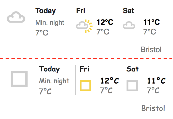
You might think that overriding the font-family works easily, but there are challenges. For example, it is easy to turn BBC.co.uk into comic-sans, but the weather icons disappear:

The CSS for one of those icons is:
.icon-cloud:before {

    content: '\F402';

}
I’m assuming this is an font icon, so overriding the fonts on the page kills them. Potential solutions are to either:
- Recommend people use SVG instead (and there are good reasons for that besides accessibility), or
- To come up with a way of identifying font-icons so they can be ignored when overriding fonts.
I am not sure what the answer is in that case, yet. There is a potential new SC for adapting text but the next step will be to work through those issues and figure out what can be done on the user-agent end, and what needs to be done by the authors.
Supporting this level of adaptation is essentially avoiding certain front-end web development techniques that prevent users from overriding styles. There is some effort involved, but it is certainly in the same league as current WCAG 2.0 SCs.
3. Overriding layout styles
For users who need more than a 400% increase in size, author styles simple don’t cut it. Even mobile-optimised navigation bars tend to overlap or cause horizontal scrolling when you get up to 600%. Large increases in spacing around text are also likely to break layouts.
The practical outcome from overriding the layout is that you pretty much override all the layout styles. My initial script to test this basically did this:
- Turn off all floats.
- Set a max-width & height of 100% on everything except data tables.
- Gather all the visible block elements and:
- Set position static, width & height auto, margin to 0, text alignment to left.
- Linearise flexbox elements.
- Wrap data-tables in a div and set them to horizontally scroll within that div if they are too wide.
It works well on a test page, but there is much more work to do in testing this!
The support required from the site authors is difficult to establish at the moment. When testing the script it works well on some pages, but falls apart on others. Layouts which involve heavy scripting seem to be a major problem, but it is possible there is a simple solution within the script. Or it might be a case of requiring people to keep layout in the CSS?
There is a new potential SC about letting people linearise a page.
4. Customisation
For an accessibility scenario I’m defining customisation as where the user sets their preferences in the user-agent, and the site provides different content, layout or functionality based on those choices.
NB: Personalisation and Customisation are often used interchangeably, my understanding is that customisation is where the user sets things explicitly (as is the case here), and personalisation is accomplished by the site based on behaviour, it ‘just happens’ without the user asking for it.
The preferences and customisations based on those preferences need to happen in a pre-agreed fashion, otherwise it will simply not work. However, it could be quite granular, a website could provide customisations for layout (e.g. a one-column view), but not for other preferences.
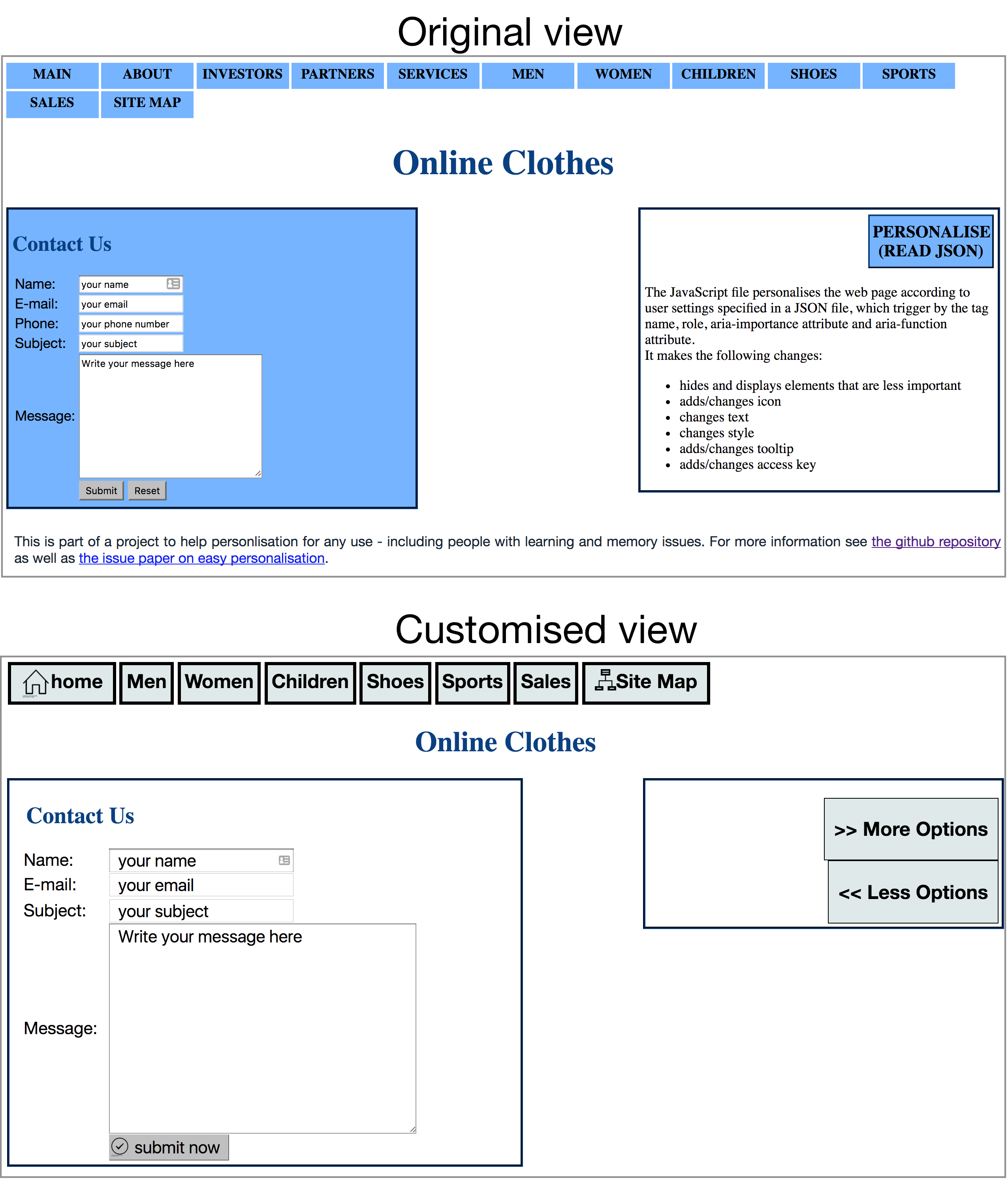
There is already some work on this, starting with cognitive issues in coga.personalisation demo.

Whether a site has a widget on the screen to apply the customisations is not the issue in terms of work needed, that ‘just’ affects the design. The main work is putting the structure in place to support the customisations. For a site of any complexity, it adds another level to browser testing.
I haven’t delved in deeply yet, but the nature of those customisations appears to be adding attributes to particular links and (importantly) allowing for layout variations when icons are added, options reduced and elements spaced differently.
The support required from authors is difficult for me to assess so far, there are several potential SCs to do with personalisation, such as support personalisation. Adding meta data is not a big deal, but I suspect that making the layout so flexible will be very difficult for more complex sites and applications.
So that’s my outline of the levels of effort required for customisation/adaptation by users. If you have any further comments or examples, or anything I can take back to the working group please comment below or ping me on twitter.
Interesting breakdown, Alastair. Always nice to have another way to slice up considerations! 🙂
After introducing the concept of User Agents, you don’t mention them too much as they apply to each of these levels. My sense is that a LOT of the problems we’re facing have to do with the inconsistency of browser features, both between various browsers on a platform (e.g., Chrome vs Firefox), and with the same browser on different platforms (e.g., Safari on OSX vs iOS). It would be nice if the activity in the User Agent working Group matched the level of discourse going on in the authoring group, as some tougher issues would be easier to crack at the UA level with some common features.
Hi Mike,
The is certainly more that could be done on the UA side, but the dynamics of change are different there.
For example, the W3C requires implementations for standards, and there hasn’t been enough activity with/from the browser makers or others.
I don’t think there is a UA accessibility guidelines group at the moment, the last version of the guidelines had to be published as a note, I assume due to lack of implementations.
So that does put more pressure on the content side of the equation, but there is only so far you can go whilst keeping it feasible.
I have been wondering if a failure of your linearize js might not indicate a failure of SC 1.3.2.
F1: Failure of Success Criterion 1.3.2 due to changing the meaning of content by positioning information with CSS
Maybe linearize just brings forward explicitly what SC 1.3.2 (Meaningful Sequence) required implicitly. What do you think?
That would be one failure, but I think there are several others not covered. E.g. positioning things with JavaScript that means linearised content then overlaps.