There are many new, potential guidelines (success criteria) up for review as part of the WCAG 2.1 work and I’d like to provide an overview of one of them: Graphics Contrast.
NB: I don’t speak for the Accessibility Guidelines Working Group, this is an informal exploration and request for feedback.
The proposed Success Criteria (SC)
The working draft for graphics contrast will be the most up to date, currently it is:
1.4.12 Graphics Contrast
The visual presentation of graphical objects that are essential for understanding the content or functionality have a contrast ratio of at least 4.5:1 against the adjacent color(s), except for the following: (Level AA)
- Thicker
- For graphical objects with a minimum width and height of at least 3 CSS pixels, the graphic has a contrast ratio of at least 3:1.
- Sensory
- Non-text content that is primarily intended to create a visual sensory experience has no contrast requirement;
- Logotypes
- Graphics that are part of a logo or brand name have no minimum contrast requirement.
- Essential
- A particular presentation of the graphical is essential to the information being conveyed.
The rational for this criteria is fairly simple: People with low vision struggle to see things without much contrast. If you don’t have a visual impairment you’ll still notice the difference when using a screen in sunlight, just imagine that’s your best view.
Conceptually it is very similar to the current 1.4.3 Contrast (Minimum), but applying to graphics. In order to do that there are several key things to understand.
"graphical object"
Borrowing from the issue page: The term “graphical object” is intended to apply to stand-alone icons such as a print icon (with no text), and the important parts of a more complex diagram such as each line in a graph.
The bit of the graphic you would need to discern is whatever is need for “understanding” of it’s purpose or meaning.
Taking a typical social media icon with the original on the left:

You don’t need to discern the circle around the icon to understand it, just the logo, so that is the ‘graphical object’.
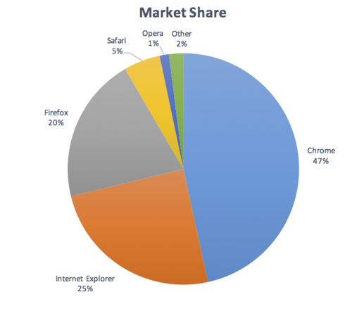
In a more complex example you get many graphical objects, such as a pie chart:
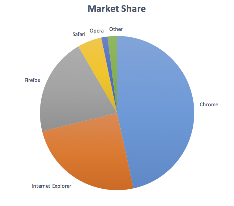
In order to understand how big each slice of the pie is, you need to discern the joins between them, each slice is a ‘graphical object’. In a line chart, you would need to discern the lines and the axis, so they would be the graphical objects.
The key factor is: What do you need to discern in order to understand it?
"Essential for understanding"
Not every graphical object needs to have sufficient contrast with its surroundings, only those that are required to understand what the graphic is conveying.
The basic meaning of essential for a web page is: If you took it away, would you still be able to use & understand the page? If the answer is yes then it is essential.
For example:
In this simple example the icons (reaction, edit, and delete) do not have any text, and their contrast is around 2:1. A low vision user would really struggle to notice those, or discern them properly if they knew they were there.
These are essential for understanding, and each one is a graphical object.
A more complex example is a line graph from Wikipedia:
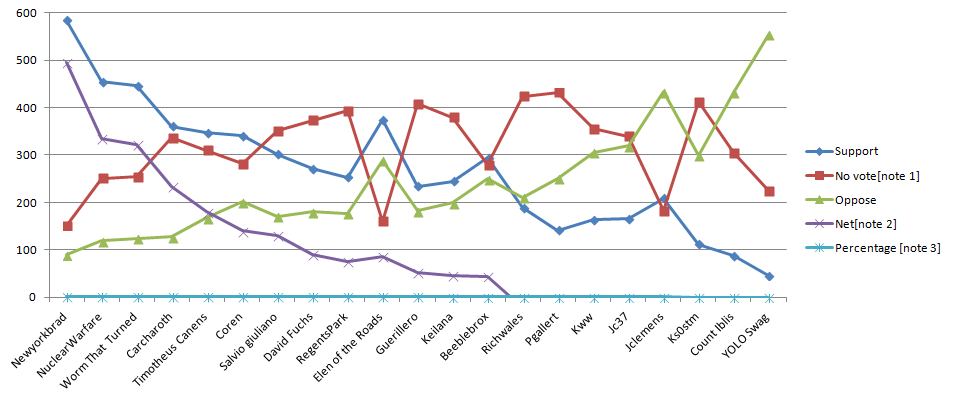
In order to understand the graph you need to discern the shapes (or colour, but we can’t rely on sensory characteristics). Therefore each coloured shape is a ‘graphical object’ in the graph (which is over 3px in the original page) and should be over 3:1 against the white background. Most of them have good contrast except the green triangles. Notably the purple crosses are not 3px thick, but the contrast is 5:1 and the main line width is 3px wide.
Text included
Part of being ‘essential’, means that you have to discern the graphical object to understand the content. If there is text that says the same thing (and meets WCAG), then the graphic is not essential.
In a case where the information is available in text, so long as the text has sufficient contrast then it does not present a problem.
Reversing that, for a search box with default text of ‘search’ in a very low-contrast colour, the strong magnifying glass can then be considered ‘essential for understanding, and with 5:1 contrast ratio (and 2px thick), it meets the criteria.
Exceptions
The “thicker” exception is aimed at aligning with the text-contrast, where larger/bolder text can have less contrast because it is more visible.
“Sensory” and “logotypes” are aimed at allowing pictures and logos, hopefully fairly straightforward.
“Essential” is aimed at allowing things like exams showing subtle medical diagrams, where changing the contrast would prevent you from understanding the meaning of the picture.
Dynamic examples
Some graphics may have interactions that either vary the contrast, or display the information as text when you mouseover/tap/focus each graphical object. I won’t embed an example, but there are some good examples as part of Oracle Jet.
That is not mentioned specifically in the SC, but I think it is part of the structure of WCAG 2.x that if the information is available via an accessible method then the content “conforms”.
Responsive graphics
A common question is “what about graphics which change size, how do you measure 3px?”. If an image changes size depending on the browser window, fiddle with your window until the graphic is at its smallest. Then you can use a tool like the colour-contrast analyser to pick a colour, and it will show you the pixels.
Or you can use the browser’s code inspect to add a 3px border around the image and compare the size. Just note that the measure is in CSS pixels, which is newly defined in WCAG 2.1.
Examples – help needed
I did quite a few examples previously, but that was in October and I don’t want to bring up the election statistics again… so I’m looking for more!
Having read all of that, do you know of examples that don’t fit?
- Graphics that should be considered accessible but would fail this SC?
- Graphics that would pass when they shouldn’t?
If so please post a link below.
To comment about the SC in general please add a new issue on Github.