We’re starting to hit a problem with the new CSS methods (Flexbox and Grid), and how people using a keyboard (or equivalent) interact with a page. I’m not the first to say the keyboard order should follow the CSS, but I’d like to highlight some recent examples from work (anonymised).
The problem is not just that designers / developers won’t think about the keyboard focus order. The problem is that even if you do, you still can’t make it work!
Apart from Firefox the keyboard focus order follows the DOM order (see some examples from Adrian Roselli). However, with flexbox and grid, the layout can be independent from that order. This is a good thing overall, and allows a lot more flexibility and power when it comes to responsive layouts.
There are extreme examples where the order gets randomised, such as using CSS variables and flexbox order to change a table.
However, even when you use that flexibility for a more standard layout it is leading to some intractable problems.
Simple responsive layout
Recently we created some layouts for a site that is pretty simple (visually) with: Header, content area, a live block to show when an event was on (sometimes there), and a footer. At desktop(ish) sizes the content was on the left, the live-block on the right, so we wanted the keyboard order to go:
- Header
- Content
- Live block
- Footer
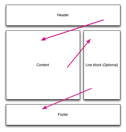
This is simple to achieve with floats, flexbox or grids, the trouble comes when you also think about the smaller screen, one-column view.
If the content is after the header at desktop size, then the live block (a key widget to show at the top) will be second at smaller sizes, which is not what we wanted.
Our desired small screen view conflicts with the keyboard order for larger screens.
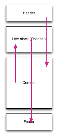
So for people using VoiceOver on iOS (with some vision), or switch access, and probably other keyboard-equivalent inputs, this is very difficult. It pings up and down the page, making it very difficult to anticipate the next focus point or understand your place in the page.
Navigation order in a header
Another example is when you have a header with a ‘meta’ nav. For example, the your-account link. Something that is less important than the main navigation, so typically goes in the top-right at larger sizes.
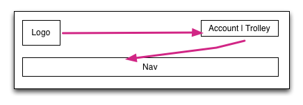
When you switch to a smaller screen you probably use a ‘hamburger menu’ or something to show the options. The meta-nav is less important than the navigation and would generally go underneath. With modern CSS that is pretty straightforward, but again causes a really confusing order for keyboard users.
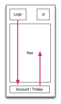
Some might be wondering “But who uses a keyboard on mobile?”, and I would point out that switch access is very effective on iOS. It also affects anyone who has some vision but uses VoiceOver on iOS or Talkback on Android.
The Filament group have been testing this, and noted it impacts many websites:
the majority of layouts we see on the web do not strictly follow HTML source order, and for good reason: across viewport sizes, the usability of a design can be dramatically improved by shifting the visual hierarchy, scale, and order of the elements in a page. Indeed, the great promise of CSS was to free us from the constraints of binding our HTML to any particular visual presentation.
And there are no great solutions:
Given the choices of A) dynamically adapting our HTML source order for every breakpoint, B) sending different HTML sources to each client, or C) renumbering the tabindex attributes of all focusable elements to match their rendered order, we emphatically choose option D) “Nope”.
I agree. They could only mitigate the problem with navigational cues and skip links. It wasn’t a lack of effort, it was a lack of a reasonable solution.
What’s the solution?
It has to be solved by the browsers.
For Flexbox the easy answer is for Firefox to maintain this ‘bug’ and follow the order set in the CSS. Other browsers should implement this as well.
I haven’t used Grids in anger, but I suspect that it would be possible to infer an order from the grid definition. Across each column, then down each row. I think Opera used to have an algorithm for this in the pre-blink days?
The bottom line at the moment is that the new (and much needed) CSS layout methods are going to cause more and more issues for keyboard users as they become more used.
Even when developers try to provide a good focus order it will become very confusing in some scenarios because re-configuring the order at different screen sizes does not apply to the keyboard focus order.
Updates
Thanks Jennifer Sutton for pointing me to the filament group’s article which I’ve now quoted from, and good further reading from an MDN article, Léonie Watson’s article on flexbox & keyboard, and Susan Robertson’s article on CSS Grid: Responsive and Accessibility.
Counter point
Patrick pointed to a scenario where the source order not matching the visual order can be useful.
It would not be good to tab through all of the content before getting to the table of contents, in fact it makes the TOC pointless for that audience.
However, I can’t help thinking that this is the exception that proves the rule, it is one of the infinitesimally small number of times when someone who fully considers the accessibility of the layout makes a conscious choice about the ordering and adjusts the source order with that in mind.
When discussing what the default should be, I still think we should optimise for the un-thinking case.
I spotted a discusion of this on the WICG discourse site which I’ve joined in.
Hi Alastair, thanks for this nice outline of the focus order problem!
In your examples, would it not be preferable to serve a different content order based on the viewport width at load time? It might be confusing for users who change viewport width on the fly (including by zooming in) as a script would reorder the DOM, but that case is likely to be much rarer than the case of users not changing width / zoom level?
I’d note that it’s not just focus order, but reading order (virtual cursor) in general as well.
The snag with all this is that there may well be situations where an author who knows what they’re doing is explicitly relying on logical order being different from visual order. Forcing the focus/reading order to follow visual order then in effect hinders authors from doing that. So there’s likely no real solution, but rather a question of: does focus/reading order always have to match exactly the visual order? If not, would forcing it this way make it impossible for authors in the know to achieve it with other means (to make a more logical order that’s separate from visual order)? Or put another way: is it safe to assume authors will always get it wrong?
Hi Detlev,
That’s a hell of a script to do just for this purpose, either you are not relying on responsive design (by adding device-detection on the server-side), or re-ordering things on the fly. Either of those is pretty flakey.
Patrick:
Can you think of an example that doesn’t then hinder the visual focus order already? This has been an issue before flexbox and grid, I’m just anticipating that the use of those will make it more common.
Increasingly it seems in our work that having one interface across all devices is the best approach, rather than having a different one for screenreaders or other ATs.
I think it is safer, and if it is the default across browsers it will be easy to test and check behaviour.
Re-ordering content: We do it here, for example: http://www.incobs.de/
..moving the ‘Activities’ and the ‘Product groups’ menus up to right after search on narrow viewports. Sure it is an effort, but once the building blocks are there, doing it again should be easier? (Not sure how much that has added to the cost of the design, to be honest).
Sure, but how many reasonably accessibility-aware devs would do that? Zero devs without a reasonable amount of knowledge on this would even think to add that sort of function.
I didn’t consider it, partly because it adds to the complexity, and partly because it feels like something that should be done by the UA.
It might seem ok for a one-off, but the whole point of grids (especially) in CSS is to make the layout declarative, not something you have to program around.
For what it’s worth, Firefox’s behavior has been fixed in version 55, which comes out in August, so it now aligns with other browsers.
https://bugzilla.mozilla.org/show_bug.cgi?id=812687
Could you patch up some of the issues with Javascript as an enhancement?
`document.getElementById(“basket”).tabIndex = 3;`
I’m not sure how well that works given your scenarios above… and of course, you can never rely on JS running but it might help some scenarios.
That would be hideous, completely undermining the reason for using flexbox or grids!
I realise this is your blog and it’s not a democracy but helpful/insightful replies foster learning for everyone. If you’re going to disregard a suggestion it would be great if you throw in the reasons why.
Sorry, I assumed it was self evident. The point of using something like flexbox is to make layout easier and more efficient. Trying to then tack on a manual system of adjusting the ordering is not easy or efficient, and very likely to break because it is invisible to the next dev who takes over the site.
Also, tabindex only affects…well…the order in which things receive focus when tabbed to. Does not affect AT reading order. Does not affect order in which things receive focus on mobile AT swipe left/right. etc.
Yes, Opera/Presto had what they called “spatial navigation” (shift arrows).
And I think it’s a solution. Because tab navigation following the DOM order is totally legitimate.
Let the user choose how she wishes to navigate : logically (DOM), or spatially (CSS positioning).
It might completely remove the need for author’s tabIndex, which I find intrusive as a user, and cumbersome as an author.
Hi David,
I don’t think it is a solution, Spacial navigation (thanks to Léonie for the link) is useful, but does not help people using a switch, or a screenreader with some vision.
If you use a switch (example of switch usage), you have to use the order that your browser thinks you should go in, you don’t have up/down/left/right. You have forward, and loop around and forward again. (You also have back if you use a screenreader with some vision.)
At the very least I’d like to see an option (available to the user) to follow a predictable layout order rather than the DOM order.
That should be easier to achieve than the 2D spacial navigation,
I don’t know if a “predictable layout order” always exists. But if it does, I agree with you.
I’m not sure it does with floats (at least in a way a browser could predict reliably), but it does for flexbox, and with the tracks concept it should be relatively easy for grids. (Easier than 2D spacial navigation at least.)
Yes, floats, and also absolute and fixed positioning.
Coming up with a consistent 1D order might be as subjective as finding a 2D navigation.
Great post Alastair, it’s something I’ve been struggling to get right recently – nicely summed up. Thanks!
Thanks, if you have any other practical examples you can share, please do.