I’ve recently moved to using GMail as my primary interface, and I noticed a new mobile feature. (I haven’t changed email address, it’s just for interface and access reasons.) The mobile access for GMail is much better than the one I installed on my hosting, which frankly was unusable on my phone despite an excellent mobile browser.
Standard mobile GMail
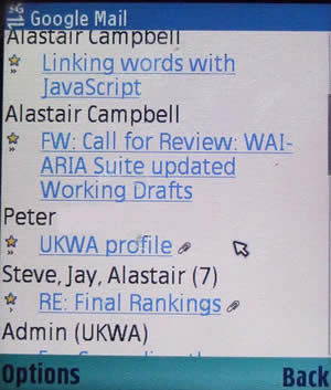
I was quite happy with the standard GMail on my mobile (a Nokia N80), it was quick and reliable:

It wasn’t just better than the free webmail client I had used (which, to be fair, was aimed at desktop browsers), it was also better than the phone’s inbuilt email system. When using two different computers (on two platforms) as well as a phone, I need server-side storage so IMAP has been my method of choice. Unfortunately, the inbuilt email on the N80 doesn’t handle that very well.
So I was happily using GMail on my mobile, and then I noticed a Get faster GMail
link at the top of my inbox. Speed? Hmm, it was already quick. I was suspicious I might end up downgrading my service!
However, it turned out to be speeding up the interaction, not raw speed.
Java based GMail client
If you have a Symbian S60 phone, you will get that link and you can download the 111k GMail client.
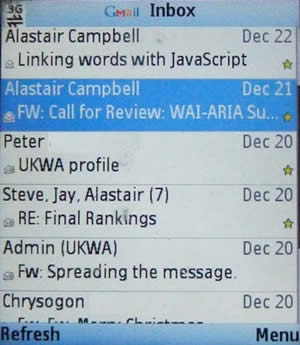
The data is similar, heck, even the display isn’t that different:

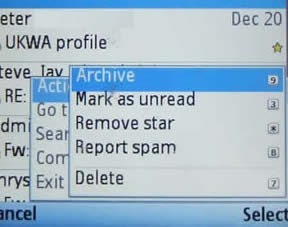
However, what makes this about five times better in use, is the menu.
What do you do with email before even reading them? In my case, a few spam still get through, so quite often I have to send a few emails to the trash immediately. If you haven’t set up filters for some things, you might want to send them off to the Archive immediately as well.
With a web based interface, the best approach you could have would be to include tick-boxes by each email, and then go to the bottom (or top) and perform an action on the selected emails. But the GMail client makes this even easier:

Each common action is not only available for each item as you select it, it is available via an ‘accesskey’.
Don’t get me wrong, I still think accesskeys are not useful on the web at large, but for a platform-specific application like this, they move the interaction from sluggish to slick. The interface also makes these keys discoverable, although I do wonder if people might think the number next to each email is a short-cut?
With GMail’s standard ‘conversation’ convention, where replies are included within one page (like threading in traditional email clients), and it’s well implemented hiding of quoted text, your inbox just feels less cluttered. It is also the first time I’ve felt a little stirring of convergance, I’m using the same interface (or as near as) on different devices in different contexts.
The only press release I could find on this was on the Nokia forum… Uh oh, this is starting to sound like an advert, this doesn’t mean I’ve forgiven Google for using CAPTCHA, and for some reason it’s dropping emails to me from my blog.
Now if only I could sync my phone’s calendar with my Google calendar…
Technorati Tags: