This post is far too late, I really should have said this earlier, but I think the terms being used for various layout types are confusing. The top two articles for “Elastic Design” on Google are Roger Johansson Fixed or fluid width? Elastic! and Alistapart’s Elastic design by Patrick Griffiths. Both good articles, and recommended reading (before this article if you aren’t familiar with them).
So why the post? Well, I think “elastic” is the wrong term for what the Alistapart layout achieves. There needs to be another term for font-based layouts. Also, there is a mistaken assumption about the accessibility of font-based layouts.
Terms
Many moons ago I read a post from Roger Johansson on his re-design of a University site. This was the first time I’d seen conditional comments used for applying a max-width in Internet Explorer, a real eye-opener at the time and the reason I remember it. The design used a percentage based layout with a max-width. The term elastic wasn’t used at the time, but was later in Fixed or fluid width? Elastic!: Flexible up to a point, and then it stops flexing, just like elastic.
Current Definitions
The current definitions since the Alistapart article for layout terms seems to be:
- Fixed
- A layout that does not flex in any way, defined with pixel widths.
- Fluid/Flexible
- A layout that flexes with the window size, based on percentage widths.
Elastic- A layout that flexes with the font size.
- Fixed
- A layout that does not flex in any way, defined with pixel widths.
- Fluid/Flexible
- A layout that flexes with the window size, based on percentage widths.
Font-based- A layout that flexes with the font size.
- Elastic
- The technique for capping the possible sizes of the layout.
Unfortunately elastic is being used for font-based sizing, which I find confusing.
I would prefer elastic be closer to it’s off-line counterpart, referring to the use of a max/min width technique so that whichever flexible option (percentage or font) is chosen, it doesn’t fall apart under extreme conditions.
However, I don’t have a pithy name for font-based sizing, any suggestions?
Proposed definitions
NB: I’m going to use these terms for the rest of the article.
I do realise that layouts can combine elements of all of these, for example you could have fixed width columns within a flexible container. However, there is generally a ‘top-level’ method used for the layout as a whole, which is what concerns me most.
Accessibility of font-based layouts
I’m not an accessibility extremist, I don’t think it’s practical to have everything completely flexible. Actually, it’s because I’ve seen the trouble it can cause that I think that.
One of the largest groups with a disability (that affects how they use the web) is those with mild or moderate visual impairment, i.e. those that need magnification but not a screen reader. You would think that a font-based layout would be great for this audience, as it scales with their font-size. But there is a problem:
People with a visual impairment often combine a low resolution (800/1024 wide) with large font sizes.
I’ve usability tested a quite a few web sites with this audience, and a font-based width will perform worse than a fixed width. The simple reason is that so much of the content was off-screen that people missed things. They also had to contend with a lot of horizontal scrolling.
Recommended approaches
The best performing sites across various conditions were those that used a fluid+elastic layout, i.e. percentage based with a max/min applied. Optimise for around 1000px wide, but making sure it works well at 800 and 1,280 resolutions as well.
That isn’t to say there isn’t a place for font-based layouts, but there is a problem: IE6 doesn’t allow a max width on a font-based layout. I.e. you can’t get the same effect as:
#mainwrap {width: 60em; max-width: 100%;}The effect of this problem is similar to IE7’s zoom, in that it creates lots of horizontal scrolling. Note that IE7’s handling of font-sizing is the same as IE6 (with regard to pixel fonts), and it’s zoom doesn’t handle max-widths (test case):
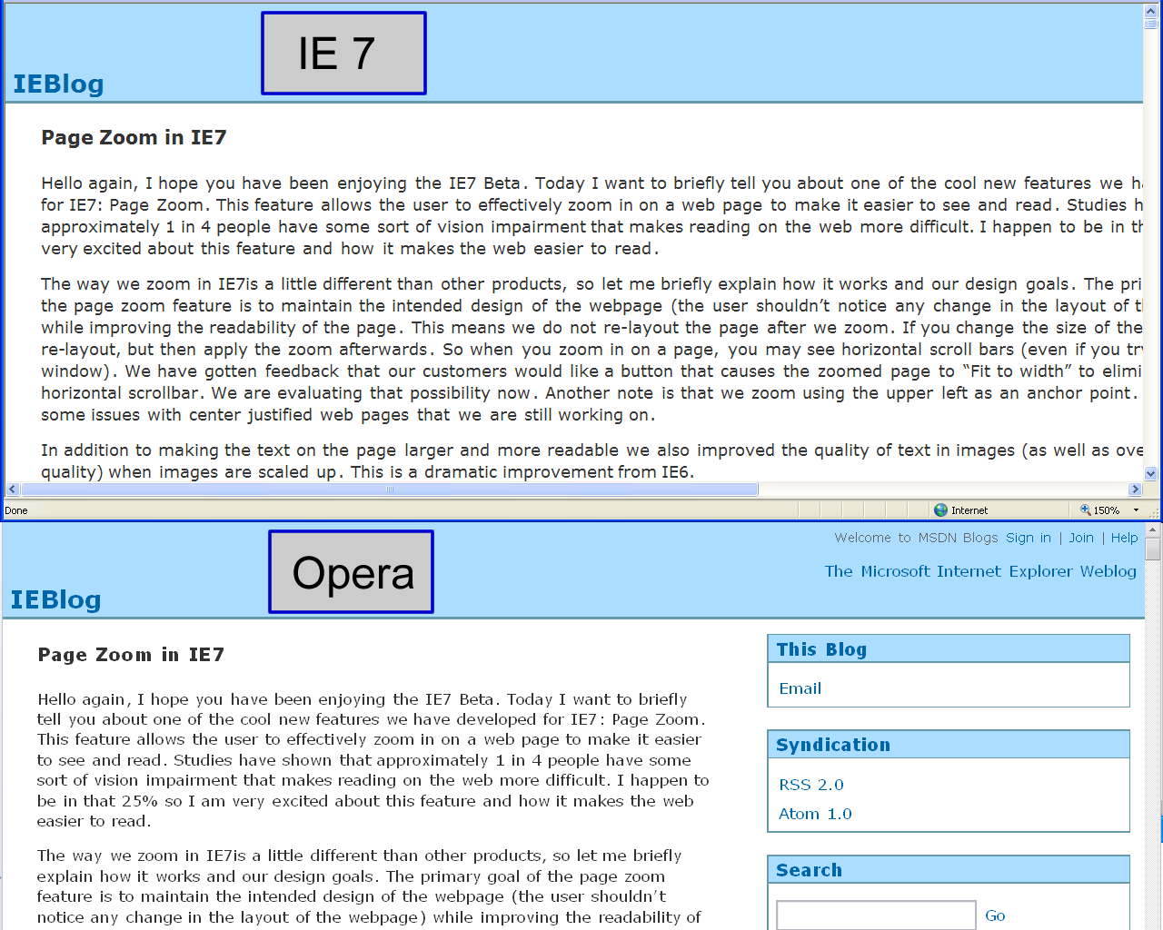
This makes IE7’s zoom good for (small) fixed width sites, but not for those designed with accessibility in mind.
I’ve unsuccessfully tried a few methods of creating a font-based+elastic layout with conditional comments and CSS expressions, but I’m still open to suggestions. If there were a solution to this issue, font-based layouts could be as accessible as percentage based ones.
See also a follow up article about font-based layouts.
How does setting
min-widthandmax-widthon a percentage layout makes it perform better?By setting
max-widthto anemorpxvalue, I imagined it would reduce readability for the below users:1280px,1600px,1980px, and more). They’d end up with short line lengths relative to the width they set their browser.1600pxwide screen. He uses a default text size.I’ve got no means to test this in reality, this is just guesswork. Did the research you did include these user groups?
Oh crap, looks like I suck at HTML. Sorry. 🙁
Ach, I need to adjust the styling for lists within comments as well! You’d only missed a closing slash on one of the code bits, no worries.
Because (assuming there’s enough flexibility) you can get quite a wide range of widths, without horizontal scrolling. I had meant percentage with with a max
pxvalue.We were focusing on visual impairments at the time, but consider these scenarios:
emwidth they can’t get at some of the content without horizontal scrolling (which on a screen magnifier is not easy to deal with, or even notice).1200px, the line length is less than they would like.Which is harder to deal with? I don’t want to put one situation above another, but how much trouble would your dad have with a content page on this site, or on Nomensa.com.
There may some some reduced readability, but surely that’s better than not seeing content/navigation? I’ve not come across your first example, people who require larger text sizes don’t tend to run at high resolution – it makes things smaller!
Bottom line: with an em based width and no max-width (in IE), none of the situations you outline are as good as with a percentage width.
Hi guys.
I’ve had this one with Ben (I hope I can call you Ben now 🙂 over on Accessify. Although I don’t doubt his dad’s preferences for a second, unfortunately he’s in the minority, even for dyslexics. Most dyslexics (myslef included) can’t stand the veiwport bigger than the page thing that IE7’s Zoom does. In fact its an almighty pain, as I (we) get lost scanning across the line.
IE’s propriatory Zoom method is still the best for most IMO, but is still not available through the browser itself.
I’ve recently knocked up this free google gadget for folks to see what our stuff does:
Talklets Google Gadget
Our zoom, like all others ain’t perfect. But the IE scripting zoom zooms images, and text and rarely breaks the page, and doesn’t require scrolling left and right, hindering those with scanning difficulties (and annoying most other users).
The tricky thing is Ben’s Dad won’t be alone, but like I say, its worth noting that if he like IE7’s zoom he’s not the “average dyslexic”.
Happy Newyear BTW.
When you say method, I assume you mean the CSS
zoomthingy? I take it that it is what your gadget uses?From a quick look, it would be equivalent to Opera’s if it re-sized the images in the same way as the Opera/IE7 browser zoom. Still, better than the default IE7 zoom for most purposes.
Yes. or Javascript (boo hisss,I hear you jeer). As in
document.body.style.zoom=1.5;
I do like Opera’s and yes I think its better than IEs Magnifier Zoom, but Its still not quite my favourite. Mainly because it breaks more pages than the IE’s scripting zoom. I had a rather heated but eventually ammicable debate about that too over on the accesify forum. The images of note are towards the bottom of the page. I wish now I’d grabbed the image of when Opera actually SHRUNK the text, in order to fit it on the screen (I guess) after enlargeing elements to the left of it… Very bad. But yes, its still a good effort.
I wish I’d seen that thread, unfortunately forum’s don’t do pingbacks, so I missed that. I hope people don’t mind me re-opening it…
what about ‘proportional layout’ rather than ‘elastic’, since its size is proportional to the font-size ?
Rubberbands are elastic, Web pages are not.
If you write something or draw a picture on a wide rubberband and stretch it out, the writing and drawing become distorted. This is a property of elastic and Web sites designed to accomodate various browser widths don’t behave like this.
Dynamic width, Fluid width, etc. are more accurate terms describing the effect.
Manu3000: Unfortinately I don’t see ‘proportional layout’ as better because it doesn’t say what it is proportional to. Neither does ‘fluid’, but that has been estabilshed somewhat for any ‘flexible layout. It is the differentiator I’m looking for I guess. It doesn’t have to be (and probably won’t ever be) known by end users, but something for developers to get hold of.
David: Yes, writing on a rubber band would be distorted, but that isn’t what I was getting at. “Elastic” as a term I intended to mean ‘stretch up to a limit then stop’ (or snap 😉 ), rather than the current meaning of ‘vary with font-size’, which has no connection to the off-line metaphor.
… And then there are Jello layouts (which IE7 also manages to solidify).
Phil: My dad doesn’t use IE7 zoom. He uses a very wide browser at a totally normal text size. I thought that’s what I wrote…
Alastair, sorry but my question about layout performance wasn’t clear. What I meant was, how does adding size limitations via
min-widthandmax-widthto a percentage-based layout make it perform better than the same percent-based layout without those limits?Hopefully this clarification will make it easier to understand the potentional problems I outlined. By adding artificial limits you surely degrade performance for users outside of those limits?
oops
Ah! I get you now. I missread lots. Even the stuff I write. 🙂
Hi Ben,
Sorry for missing this for so long, GMail has been dropping the emails from my blog 🙁 .
Thank you though, you really made me think about it, this was my thought process:
This isn’t exactly what I was saying. I said:
Compared to a font based layout, they caused horizontal scrolling quickly for people with visual impairments. I have no doubt about that issue, in usability testing it caused massive problems on a bill paying type site that was otherwise quite normal.
For the user’s you outlined, I do have to question who they are? Who requires regular text sizes and a wide browser size? (That is essentially what the requirements came down to.)
If you didn’t apply a max-width, then many people would get a 100% wide site at regular size with massively wide reading width completely out of portortion with the intended design.
A user style sheet of:
* {max-width: 100% !important;}would sort that out, but it isn’t so easy the other way around.
There are quite a few conditions here, I was initially talking about font based layouts compared to percentage layouts (without any min/max widths), where the outcome (performance) is clear.
Horizontal scrolling takes font-based layouts of the useful equation. Without an effective max-width for IE6 or IE7, they are still not useful.
If you take visual impairment for a moment (not the only thing to consider, but just for a moment), then the likelihood is that a design probably works at it’s intended size (font and layout).
If you expand that design in proportion, the design works for people with visual impairments, until it expands out of the viewport.
No one likes it expanding out of the viewport, it create horizontal scrolling which is difficult for everyone, but especially those with access issues.
Therefore you need a ‘fit to width’ option, that tries to expand the size of elements and still not expand out of the viewport.
I don’t want to discount any individual’s experience, but everything I’ve found points to smaller widths than I would prefer!
Yes, I would like to say the people should choose their own widths, and ideally I would like to be able to define some combination of percentage and font based widths, but if you get that complicated you have to be on the user agent side of the equation.
E.g. Opera will expand a font-based width until it hits the viewport size, and if you ‘fit to width’, the proportions become percentage (in most cases I’ve tried).
But in marketing terms (for the masses), a very wide size completely out of proportion with the design is not going to cut it. Flexing is good, but you can take it too far.
(Phil, who were you talking to?)
So, you’re saying that
max-widthis useful onem-based layouts because it stops them overflowing the viewport? Yep, that sounds fine to me.But what I’m interested in is percentage layouts! 😀
AlastairC wrote:
The number of pixels on a typical monitor increases over time. Remember when
640x480was the norm? :p Now the norm is gradually heading towards double that (1280x960). Some people’s hardware is way ahead of the norm.This means the size of
1pxchanges — mostly decreasing. So vision impaired users will need bigger and bigger text (when measured inpx) for it to be the same physical size on their screen.For example:
Text displayed at the same
pxsize on a1280x1024pixel screen would be about 1.25 times physically smaller than on the same screen at1024x768. So the user of the1280x1024setup has to bump the text size up 1.25 times further.Because their screen is the same physical width, setting a
pxlimit of1024pxwould force them to use line lengths about 1.25 times shorter than what they were comfortable with before. This less comfortable reading means and more scrolling.So the limit has made it less accessible?
As I’ve mentioned, my dad always runs a maximised browser, even on our
1600x1200monitor. He finds longer line lengths easier to read. I sometimes prefer long lines for long documents so I can skim them more quickly. Unlimited resizing is a usability bonus for me. An arbitrary limit removes the possibility of that bonus.Sites like @media 2007 show you can keep design lovelyness whilst still having unlimited resizing.
So, I still don’t get why a
pxlimit is needed. Maybe a follow-up article is in order…or do I need my head examined? 🙁Hi Ben,
You’ve actually hit the nail on the head as to why I prefer the zoom method compared to text-resizing: 1px has gotten a lot smaller, so images are smaller than they used to be (on many newer screens).
More than ever, the pixel is a relative unit.
Having long lines (e.g. more than this site allows) at standard zoom is fairly unusual, and because of the conflict with visual impairments it isn’t easy to design for both without the user-agent doing something special, or using a style switcher.
Btw, check the @media site at 800 wide, it could do with a min-width.
Some sites are fine at large sizes and regular font sizes, but some are not. If my company’s site (Nomensa) were expanded to 1900px wide with that design, it would be uncomfortable for the majority of people, and it wouldn’t look right (e.g. the boxes). It allows flexibility for fonts and layout up to a (quite high) point.
I don’t think you will get far insisting that all sites have to be designed in a way that makes massive expansion look ok. Either the user-agent side of the equation needs to improve, or you need a more adaptive approach like the recent alistapart article.
And yes, there will be an article about this (well, layouts and zoom), it’s been in my drafts longer than any other article!
The page won’t be uncomfortably wide at
1900pxfor people who like very long lines; it would actually be more comfortable. Also, setting themax-widthto1050pxmeans even users who’d like modestly longer lines (such as1280px) have their preference blocked.And then there’s the issue of text size. For someone browsing at a larger-than-default text size,
1280pxlines (or even1900pxlines) may actually contain fewer characters than1024pxlines at the default text size.And as we agree, on a high-resolution screen
1pxwouldn’t be as physically wide as you might expect. The dots per inch (DPI) setting for the monitor could be higher, so any browser which respected this would be using larger-than-default text. You could have the same number of characters per line in1900pxin this setup as you do at1024pxat default text sizes.Adding a
pxupper limit prevents a website from being resolution independent (aka device independent), something which is becoming ever more important as screens get more diverse.Am I making any sense at all? 🙁 I’ll wait for the next article…
True, but not for the majority, and it isn’t something you can have both ways without a style switcher or something on the user-agent end.
I don’t think any of them do, which kind of scuppers that line of thinking. Firefox used to have an option for it that worked to a degree, but that was dropped in 2.0 from what I can see. Basically, without a zoom, 1px is a static measure. In the scenario you are arguing for, you would have a situation (say at 1900 wide) where the text is enlarged but the images are not, which might be fine for text but would images tiny.
In any case, if 1px isn’t static, then the max-width in px would be proportional, as that measure would be bigger. Basically you’d be in the same position as having a zoom, and I don’t think is what you are trying to get.
Hi, thanks for your useful article and clear definitions about layout kinds.
I beg you to introduce me to some example of websites with flexible layout & font based layout & elastic layout& fluid+elastic layout.
Hi Saerona,
Well, this site is fluid and (by my definition) elastic, as are the sites my company does (see Nomensa’s portfolio).
For font-based, I can’t think of any off hand (that are public), but the alistapart example should show you what it’s like.
I don’t know if this is still relevant, but I was just searching on how to solve the max-width problem in IE and nowhere seems to have one for percentages… After reading other pixel based max-width I came up with this:
img {
max-width:98%;
width:expression(
this.width > this.parentNode.width ?
“98%”:
“auto” );
}
seems to work great. hopefully this helps (even if it is a bit late)
Hi Nikk,
Thanks for that, I’m not sure it would work for a layout div with a width in EM values (due to the font-value in IE not changing with the user’s font-size), but I’ll certainly try it on this site for the pictures!
Actually, I take it back, it is not very consistent (and my not even work)… I think there was a caching issue that made it seem like it was working… I’m keeping at it though, so hopefully I’ll find something…
You’re completely right once again Alistair. At the time ALA printed the article on elastic sizing I stepped back and decided not to go down that path for very much the reasons you explain in this article. Although I have to admit the ALA article set a lot of people off making these elastic layouts.
A funny tale is that I remember my first ever CSS layout adventure where I made an elastic layout almost by accident, naively, and everyone around me said it was wrong. I put my hands into special gloves and stopped touching myself there immediately!
I tend to give IE a fixed width (stuff them) and everyone else gets a percentage based width using max and min widths. It seems to work the best with the least complaints (not sure what my personal site does at present as I’m reworking new templates etc).
No elastic is the wrong name. How about pseudo-elastic design…???