Layouts are becoming an issue again. The (browser) landscape is changing, as are the fashion in layouts, but not really in unison. Before I continue, I should state that my perspective is not one of a visual designer’s, so my decisions tend to be weighted towards usability & accessibility.
EM based layouts becoming more popular?
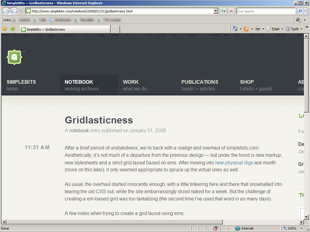
Recently Dan Cederholm released his new layout ‘gridlasticness‘, an EM based layout that expands with your font-size choice.
I’ve looked at accessible layouts before, and bemoaned the fact that elastic layouts are mis-named. My main point was that font-based layouts will cause issues for people with visual impairments. When usability testing with people at RNIB centers, a fairly standard setup was an 800 or 1024 width screen, and large fonts.
That means lots of horizontal scrolling. In usability testing I’ve seen people get really frustrated with horizontal scrolling. Or when they don’t notice the scrolling, frustrated with trying to do things that should be easy, and are easy if you can see the right side of the screen!
This part of Dan’s post worries me:
Understand that when building an already-wide layout, it’ll get really wide, really fast. That’s OK. Wide is the new drop shadow.
If you’re someone that often needs to adjust your font-size, you’d be encouraged to tick the “ignore site’s font sizes” setting in IE (or use larger sizing in your prefered browser), and you would immediately get substantial horizontal scrolling:
I’m not singling out Dan here, font-based layouts are popping up in quite a few places, such as the new Odeon site. He just happened to draw my attention to it and mention the fashion aspect.
Now, I can understand giving a greater weight towards design aspects, and maintaining the grid (although I wouldn’t do the same). However, I find the timing curious, as these changes seem likely to be obsolete soon.
Browser zooming coming of age
Firefox 3 has a full zoom (rather than text-zoom), and you get pretty much the same effect as the EM based layout. Except that the browser zoom is often better, as (unless it’s a font-based layout), it can try and fit the page to the viewport.
In a very little testing, Opera’s version still seems more effective with the fit-to-width option enabled, and of course IE7’s trails behind with it’s linear-only zoom. (Side prediction: I suspect that IE8’s zoom will be better, but not when using IE7’s rendering.)
The bottom line is, that when these browsers are the mainstream, the differences between pixel and font-sizing becomes academic. Of course, I still find sizing layouts based on the viewport more robust over font or pixels methods, but when browser zooming is standard it will be more difficult to argue.
Ironically Simplebits old design using percentages works much better with zooming that fits-to width. What’s the big deal with font-based layouts, what have I missed?
I wouldn’t call myself a designer, but what I like about the em-based layout is that is keeps design proportions as you scale.
But as you note, you risk the horizontal scrolling, quickly.
One way to avoid the horizontal scrolling is to use a max width of 100% or 99% etc. What this will mean is that your site will scale in proportion but up to a point. These trade-offs I think will be specific to each site. It may not always be appropriate. (IE6 of course doesn’t support it — the CSS expression hack might work, but it might cause your browser CPU to spike. You might not need it in most cases for IE6’s main font sizes, either. Just depends on your site design)
I see some sites scale the images as well as text, though I usually prefer to scale the text (ignoring zoom capabilities in browsers for the moment!). Images for rounded corners do not need to scale. Sometimes what I do with pictures or things like rounded sides to a tab is make a slightly larger image so more is revealed as you scale.
I have been using em-based layout for a few years now, for a news-oriented site, and it seems to work quite well (and helps avoid very wide lines of text for larger resolutions). But other sites I have worked on benefit from viewport-based layouts… Just depends, I guess…?
This can be achieved easily if you use the Yahoo YUI CSS framework for Grids and Fonts. Everything scales perfectly.
Hi Ben, none of the YUI examples use an EM layout, so I think you might have missed the point of the article.
This is an interesting point. I’m personally a fan of SimpleBit’s redesign, and have mentioned it elsewhere. But I never considered the frustration that people with visual impairments would face when upscaling their font sizes all of a sudden required horizontal scrolling.
I can understand why Cederholm would like the option of using an em-based design, though: it combines the aesthetic continuity of a grid (your columns are always proportionately identical) with the flexibility of a fluid layout.
I haven’t tried Firefox 3 Beta yet, but if the zooming is as good as you say, perhaps em-based designs will begin to die out before they really become widely accepted and used. Like laserdiscs.
If you look at the code and the YUI CSS docs, you’ll see that the measures are calculated in px and all have to be converted to ems. So when the examples say 974px, the CSS is actually using 74em. 974px is the actual number of pixels in 74ems at the default font size set in YUI Fonts CSS.
Hi Ben,
I’m still not clear where you’re going with this? Ok, so you can change a YUI grid to EMs, but how does that get around the problem with EM layouts outlined above?
Alastair:
The YUI grids uses em-based CSS. If the designer uses pixels in his YUI grids design, the design won’t resize correctly. The YUI CSS documentation requires that all horizontal measures be specified in ems.
You claimed that the YUI grids CSS weren’t em-based layouts because you saw the examples measured in pixels. However, the measures are actually in ems. As you know, an em is relative to font-size.
The YUI grids CSS depends on the YUI Fonts CSS which normalizes all browsers to 1em = 13px regardless of the user’s own preferences.
Am I still being obtuse?
Ok, fair point, the YUI layouts are based in EMs (despite being labeled as !)
But that is not a good thing, which was the point of the article above.
In Firefox 3 (with zoom) you’ll get more horizontal scrolling sooner with the EM based layout. (E.g. 974px compared to 100%.)
I like to make my elastic layouts hybrids incorporating max-width. That way they enlarge up until the point that they fill the viewport (or whatever max-width is specified), then revert to liquid. I dislike unconstrained elastic sites because, to me, they seem to be more focused on a so-called purity, which is fine, but not when it’s at the expense of usability.
Hi Mike,
Have you got that working in IE? I didn’t manage that when I considered accessible layouts before.
Thanks for blogging about this. I’ve always wondered why people consider em-based layout more accessible. It’s a strange assumption to think that people with vision problems have much larger monitors than the rest of us!
Sometimes they do (e.g. in the RNIB centre), but generally set to a resolution width of 800 or 1024!
Hi Alastair,
In regards to getting IE working with max width:
Per my original comment, I have used max width too, for IE as well (IE7 works. For IE 6 if you really want it, you have to used an expression hack which might lead to performance problems depending on what else is happening on your page).
Regarding IE7, because by default it has zooming going on, you have to go to the View menu and set the text size there to see it taking effect, or make the window narrower, or both!)
I have used this on my blog as well as elsewhere, and so far it seems okay. On my blog, when the size doesn’t fit, the right bar simply “floats” to the bottom, which is fine for me.
Hope that helps?
In a round-about way, Alastair. Obviously max-width isn’t supported by IE, but IE has another limitation which actually serves as a saving grace: It will only enlarge by two measurements (though I suppose the developer could set a min-max font size range).
If you start narrow enough, you can design it so it won’t spill out if fully enlarged. I can show two examples:
1) This site I build a couple years ago and is soon going to be redone. It should enlarge fully in IE and stay within 800×600. It’s so narrow because I messed up the font sizing and it triggers the IE font sizing bug. Otherwise it could be initially wider.
2) My Zen Garden submission. I’m pretty this fits IE at 800×600 sans-scroll.
The first version of Accessites was a hybrid, too. In most browsers it’d go all the way down to about 480 pixels wide (looking good, no scroll bar, with text enlarged two sizes), but in IE anything smaller than 720 pixels or something like that and it’d get the scroll bar.
Hi Mike,
The first does (unless you set the browser to ignore font-sizes), the Zen Garden one fits nicely into 1024.
I was hoping that there was some equivalent to:
#layout {width: 15em;
max-width: 100%;
min-width: 750px;
}
But the problem seems to be that as soon as there are font-sizes set, EM layout widths evaluate to a pixel value that doesn’t change with the user’s text size setting.
Without that sort of robustness in IE, it makes EM layouts difficult.
You’re approach seems to be to restrict the width so that at the larger text setting it fits the width IE. That’s fine in those cases, but I would want the robustness of a proper max-width for some sites.
IE makes many things difficult. Imagine how much easier web development would be if we didn’t have to contend with IE or if it used the Gecko rendering engine. *sigh*
As you’ve pointed out, this approach seems to have gained traction with those that want to maintain a consistent design (namely, a grid), whilst showing some (misguided) consideration towards accessibility and user control.
I’ve been looking at the ‘consistent grid – but accessible’ problem myself.
From a design standpoint a fixed width is nice, you get absolute control, unfortunately this comes at the cost of flexibility for the user and the site’s performance in different environments.
A solution that covers all of these points is a flexible grid. It works as you would expect with the new browser scaling techniques, and allows for the maximum degree of user customisation – while maintaining a consistently designed grid.
See it in action:
http://www.2dforever.com
http://www.stainlessvision.com
If you want to view it big, max out your browser window, and bump up the font size. Small? shrink your window and reduce your font size.
Hi Tom,
That seems to be a percentage width layout with either naturally expanding, or EM based heights?
Nice image re-sizing 🙂
That’s it exactly Al, except great care and attention is taken to preserving the grid.
The images fit exactly to the grid depending on their proportions. A tall image will only occupy three or four columns, a wide image will occupy all six.
A custom smoothing technique is used to avoid pixellated browser resizing – demonstrated in the images above 😉
I’ve been working on a couple of layouts only to discover FireFox’s re-sizes fonts that are set to specific sizes. Needless to say that a single increase in size ‘breaks’ my designs:
http://www.ladomery.com/ca/layout.master.2.html
http://beta.tabletpc.it/tablet-pc/portege-3500
I appreciate that this is useful to users, but I disagree with the approach that a designer’s choice of font size can be ‘over-ruled’.
Shouldn’t his/her decisions be resepcted?
I’ll have to re-work my layouts and probably change the design to accommodate this dynamic. What I resent, though, is that my creativity (if you can call it that) is limited.
Of course this is all about making sites accessible. Well, I think that the zoom function in FF3 works wonderfully for that. Also, an alternative text-only version can be served too (which can be made to work for mobile).
Or is this thinking a bit arrogant?
Following on my last comment…
Maybe the solution for me is adopting what you call a hybrid zoomed layout?
http://presentations.nomensa.com/techshare2005_zoom/examples/nomensa_site/new_light.html
Have a look into ‘bulletproof’ web design, increasing text size can be catered for.
Something you’ll have to get used to I’m afraid, the user is in control of how they received the content. They might override the text size, colours, layout etc.
The zoom in Opera/Firefox 3/IE 8 may make text-sizing redundent, however, in the short term they will add complications rather than making it easier. (I.e. there are more variations to test).
We’ve implemented the hybrid layout idea on defacto-cms.com. You could have a less robust default layout, and provide a couple of variations. However, it would still be good practice (at the very least) to make sure you’re primary layout is fairly robust. Different systems can have different fonts, regardless of text-size, that would interfere with exact sizing..