I had submitted a comment on WCAG about relative units, and looking through my incoming links with Google’s new external links tool, I discovered that they had taken it on, partially.
The response
Individual issues/comments are either missing or protected (it’s difficult to tell), but the search results for person 35436 (Loretta Guarino Reid?) show that the relative units issue was accepted.
After my comment, the response is:
Status: Resolved (comment accepted).
Great! Err, resolved how? It goes on:
LGR: While much of this is a user agent issue, we know there is some author responsibility. We need to capture that distinction.
I’m concerned that the proposed SC could be satisfied by ignoring the text scaling request altogether.
Discussed in the 19 October 2006 telecon:
Resolution: return 1437 back to team B
WAI-WCAG minutes 19th Jan 2007
I’m not sure who team B is, but if there is a proposed SC relevant to scaling fonts, I couldn’t see it.
With some more internal stuff, it seems that my comment is probably a duplicate of 469:
Discussed in the 25 January 2007 telecon:
accepted by unanimous consent
WAI-WCAGA minutes 25th Jan 2007Resolution – Pending Response:
{accept}@@SEE LC-469
I was pleasantly surprised to see a response to the commenter (me):
@@Response to commenter
Although resizing is primarily a user agent function, we have added new success criteria to address the author’s responsibility for supporting text resizing:
Level 2: Visually rendered text can be resized without assistive technology up to 200 percent without loss of content or functionality.
Level 3: Visually rendered text can be resized without assistive technology up to 200 percent without loss of content or functionality in a way that does not require the user to scroll horizontally.
Ok, that seems reasonable for the issue of font-scaling, but I’m not sure it’s practical to put all the layout scaling issues into the corner of the user-agent.
Internet Explorer 7’s zoom doesn’t really cut it from an accessibility point of view, and given the cost of screen magnifiers, I really think it has to be something that browsers take on upto a certain level of magnification (200% ish). Beyond that point, you would have trouble using the computer without a screen magnifier, let alone a web site.
Relying on user agents
There isn’t a good spec (or any spec?) for defining how scalable layouts should work. There is nothing to show user-agents how they should adjust for different types of layout, or for developers to specify what user agents should do.
Scaling up the font sizes to 200% is a good start, but trapped within a fixed layout designed for regular font sizes, I’m not sure fonts are enough. The main problem is that there are so many ways of laying out web pages, from tables, to floats, to absolute positioning, with different units for each method (px, percentage and em being the main ones ).
In my opinion, Opera is the most advanced browser in this regard, and uses two related mechanisms to adapt pages: Zoom from 20% to 1000%, and ‘fit to page’.
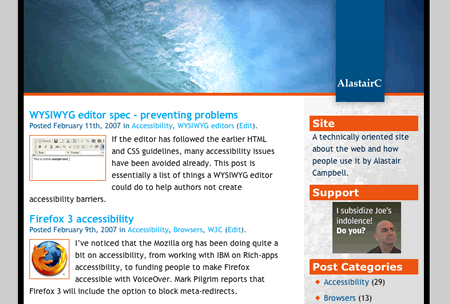
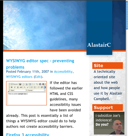
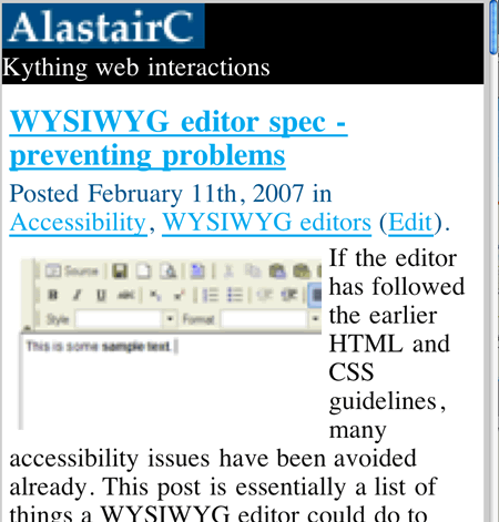
Without ‘fit to page’, the zoom works as Internet Explorers, and creates horizontal scrolling . These three pictures show the adaptations that Opera makes with ‘fit to page’ on my homepage at different sizes. At 100%:

At 200%, Opera fits the content to the width, and uses the proportions for the column widths (which shouldn’t be too hard in this case as they are set in percentages, but it works on other units as well).

At 400%, Opera takes on a Zoom layout approach, reducing the content to one column with minimal styling:

That’s all well and good, but there are times when these algorythms can fall down. As Phil Teare pointed out on accessify, the navigation at the top of CNN shrinks in size, because Opera is trying to fit a fixed-width table full of images into the width:
The CNN example is unusual, but there are just so many ways of laying sites out at the moment, unless CSS3’s layout module makes it through soon I can’t see user agents being able to account for them all.
I’m glad relative font-sizing got back into WCAG 2, but I don’t think it’s enough.

Hi Alastair,
Do you mean you cannot get directly to the issue with this URL?
Never mind who team B is. The WCAG Working Group set up three parallel teams to work on proposal to close the last call issues; each team tackled a different set of success criteria and brought its proposals to the working group for discussion. The intention was to use the working groups resources more efficiently.
The “Working Group Notes” are just for internal discussions; the actual response to the submitter of a comment is always in the “Resolution” section.
The new success criteria are currently only available in an “editor’s draft“.
Hi Christophe,
Thanks for that, it looks like the linking issues have been resolved, I was not able to follow some of the links.
It looks like this is the new inclusion in that draft.