Category Archives: Browsers
Use case for high-DPI zoom
In PPK's much needed research into how browsers handle media queries, he suggests that there isn't a use case for increasing the DPI when zooming in. I think I have one.
Design bomb in W3C’s garden
 A post came up in my feed called the BOMB in the GARDEN by Matthew Butterick. I found it... frustrating. I don't think the solutions would help with the issues he raises.
 Browser zoom great for accessibility
 A reply to recent posts about text-sizing being necessary, and outlining why responsive design works better with zoom.
 How to hold your iPad
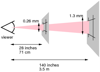
 Taking my arguments about pixels being relative another step, the CSS pixel sizes that device makers use actually tell us the distance away from your eye that they think you should hold a device. Applying a bit of maths lets us work out what that distance is.
 Screen resolution by ratio
 Daniel Davis posted a simple survey of screen sizes which jogged my memory and I thought I would add some more data. I looked at the Google Analytics (GA) for a site I have access to with traffic in the low millions per month, and took a sample of that for December.
 Text size and screen ratios
 The recent 'vexing viewports' article on Alistapart is a call on device manufacturers to choose a reasonable CSS-pixel resolution for each device so that responsive design works. This is something I totally agree with and support, but I'm not sure the iPad mini example they use is as clear it seems.
 In defence of pixels
 I keep reading recommendations for using EMs or other typographical units for layout, which I still don't understand. At best it is an extra layer of abstraction, at worst it is misleading and likely to cause more issues than it solves. I will try to demonstrate why pixels are the best relative unit.
 Relative pixels
Layout methods in web design have gone through a transition in the last few years, unfortunately we're still using floats a lot, but flexible layouts have made a comeback in the form of responsive design - which is great. Recently though, I have been puzzled by people suggesting that we should use EMs for layout...
Zooming bug in Webkit
 I've noticed a bug in Webkit browsers that impacts accessibility: Zooming in does not trigger media queries. Responsive design techniques can really help people who zoom in with their browser, but not in Chrome or Safari at the moment.
 The “Open Web Stack” – Snappy acronym needed
 Chris Mills at the Web Standards project posted up an open letter to the W3C about the new "HTML5 logo", which I commented on, but it seems comments are off. So here's what I wrote...