I recently started experimenting with flexbox. On this blog. Without enough testing. Or at least, without the kind of testing I would do for a work project. It’s a live experiment! Here are the bugs I ran into.
Working from CSS tricks excellent Flexbox guide, I got the main layout together pretty quickly. It worked across the most recent versions of Firefox/Chrome/Safari.
However, when I opened it in IE11 things were funky, with two main bugs.
1. Vertical centering with min-height
A known bug, the “flex items” in the header area were aligned to the top of the page, instead of halfway down the header.
It seems IE needs an explicit height set on the flex container, whereas I had used min-height. Not using a set height it one of the traditional practices of accessibility, as then people expanding text don’t get it cut off.
With a responsive layout you have reasonable control of zoom, so fixing the height is not the end of the world, I can live with that.
The second bug is trickier, and I can’t find any reports of it yet.
2. Horizontal scrolling with flex grow
The header area of the page expands to the right, creating horizontal scrolling, but only at certain widths.

The widths aspect is unpredictable, it would expand to the right at around 1000px wide, come back at 1050px, and then expand again above 1,100px.
I cut it down to a simple test-case and found that you need three things to get this bug. The triggering code is:
.flex-container {
  display: flex;
  justify-content: space-around;
}
.flex-item {
    flex-grow: 1;
    max-width: 750px;
}
You need:
- a flex-container with a
justify-contentvalue ofspace-aroundorflex-end, and - a flex-item with flex-grow, and
- a (triggered) max-width value
With those triggers in place the content zooms off the right of the screen.
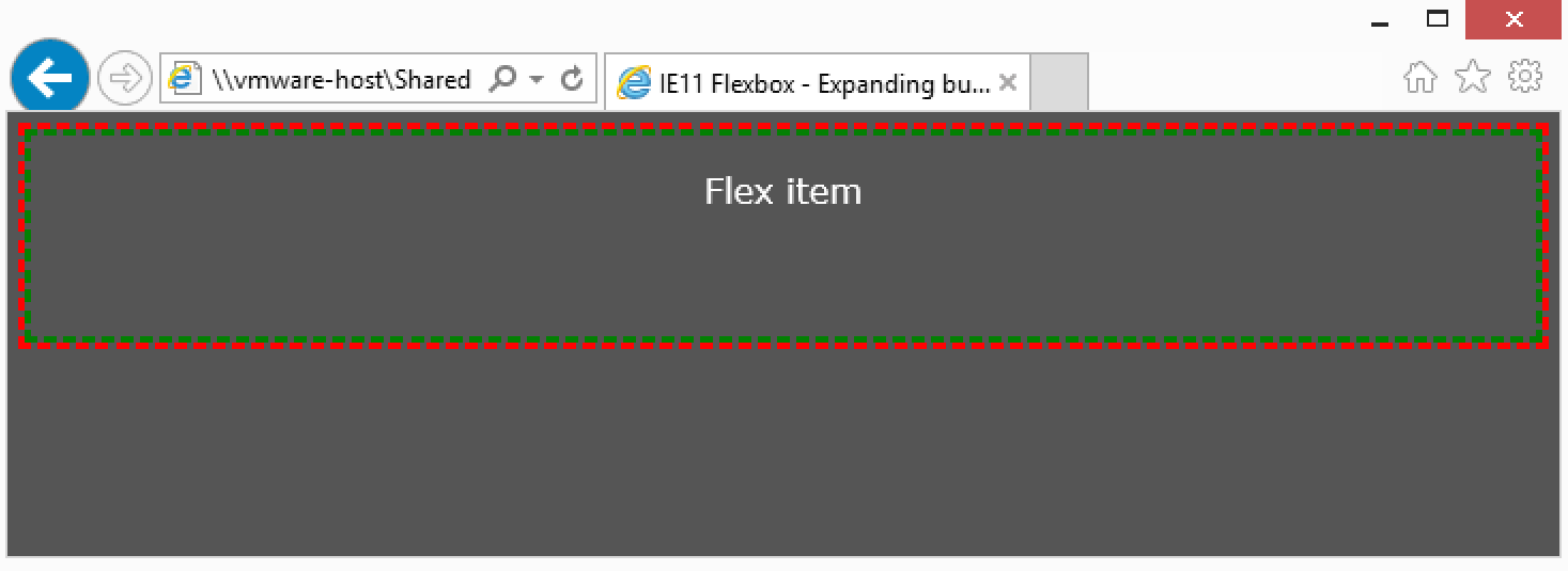
The test-case shows three states at different browser widths.
At a small size the explicit width of the flex-item is fine:
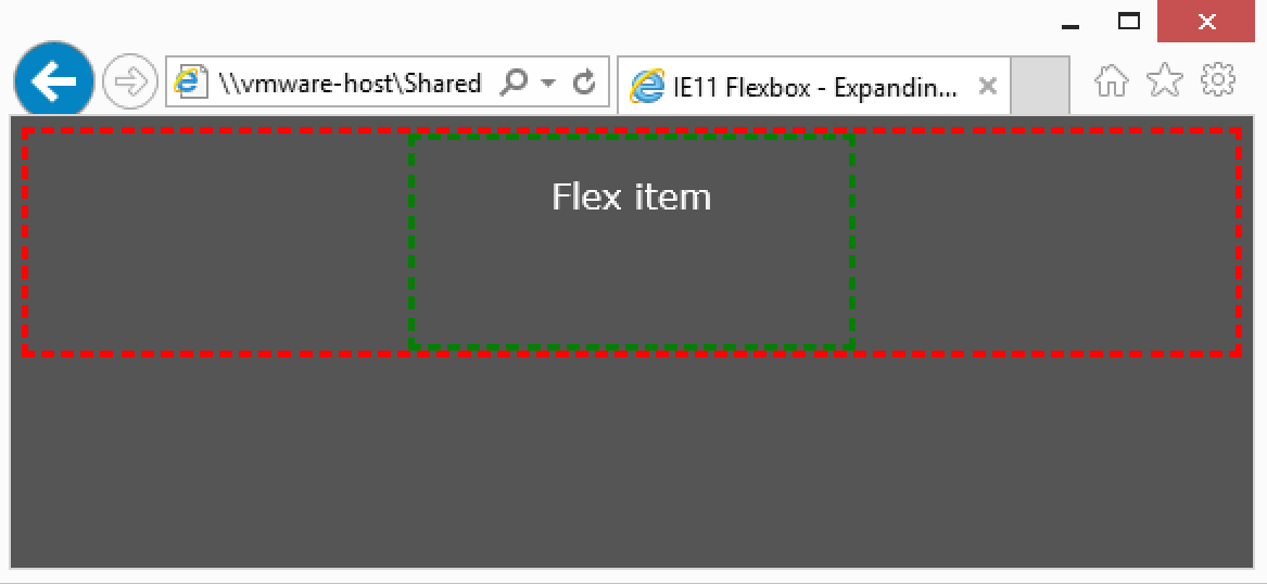
When flex-grow is enabled and the max-width is not triggered (i.e. the flex item is less wide than the max-width value) it simply fills the container, as expected:
With all the triggers in place, the content heads off the screen to the right:
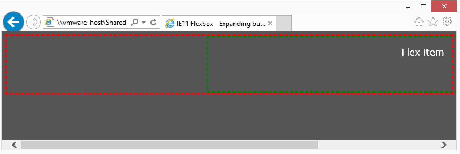
For the purpose of working around this I will either apply the max-width to a child element, or set an explicit width when the max-width would apply.
Reported to IE here, it is apparently fixed in the latest builds, hopefully that will get pushed out soon.
I believe the second bug also triggers vertically, when you have vertical flexing and a max-height.
Hmm weird, i had no issue with using IE on Flexbox. I don’t even need a forced height. All i needed was flex:1 on any of the parents and perhaps height:100% on the body to get it working.
My main issue with flexbox is that there is no real way to force the height to be whatever the height of the child is if its set to display:flex inside a parent that also has this. Unless i explicitely use display:block than it works but than i lose flexing of width. But thats in all major browsers.
Anyways, IE works fine on my end, perhaps you can post some more code?
Hi Martin, I worked around it on the site, but did you try the simple test case? http://alastairc.ac/testing/ie11-flexbug-simple.html
If you expand from under 700px wide to over 750px wide, you’ll see the issue.