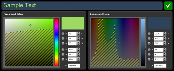
A friend & colleague of mine, Tom Hooper, has just released the beta version of a new tool. Although everyone (who cares) has probably heard of colour contrast analysers, this does the opposite, and shows you accessible colours.
This tool allows you to visualise good colour combinations on a Photoshop style colour picker. It’s primary use is finding acceptable colours from an existing inaccessible combination – while maintaining the aesthetic appeal of the original.
Tom created it for internal use to speed up his design process, but I think it’s good enough to make available now, even though Tom wants to add more to it. Although I don’t do design as such, if I did, this would be a very useful tool to choose colours from. Just click on the SWF download at the bottom of the Colour Contrast Visualiser page, or download the AIR version for local use.
